Fixing Uneven Embroidery Letters: Expert Tips

By diver361 in Embroidery machine practice
· 1,628 views
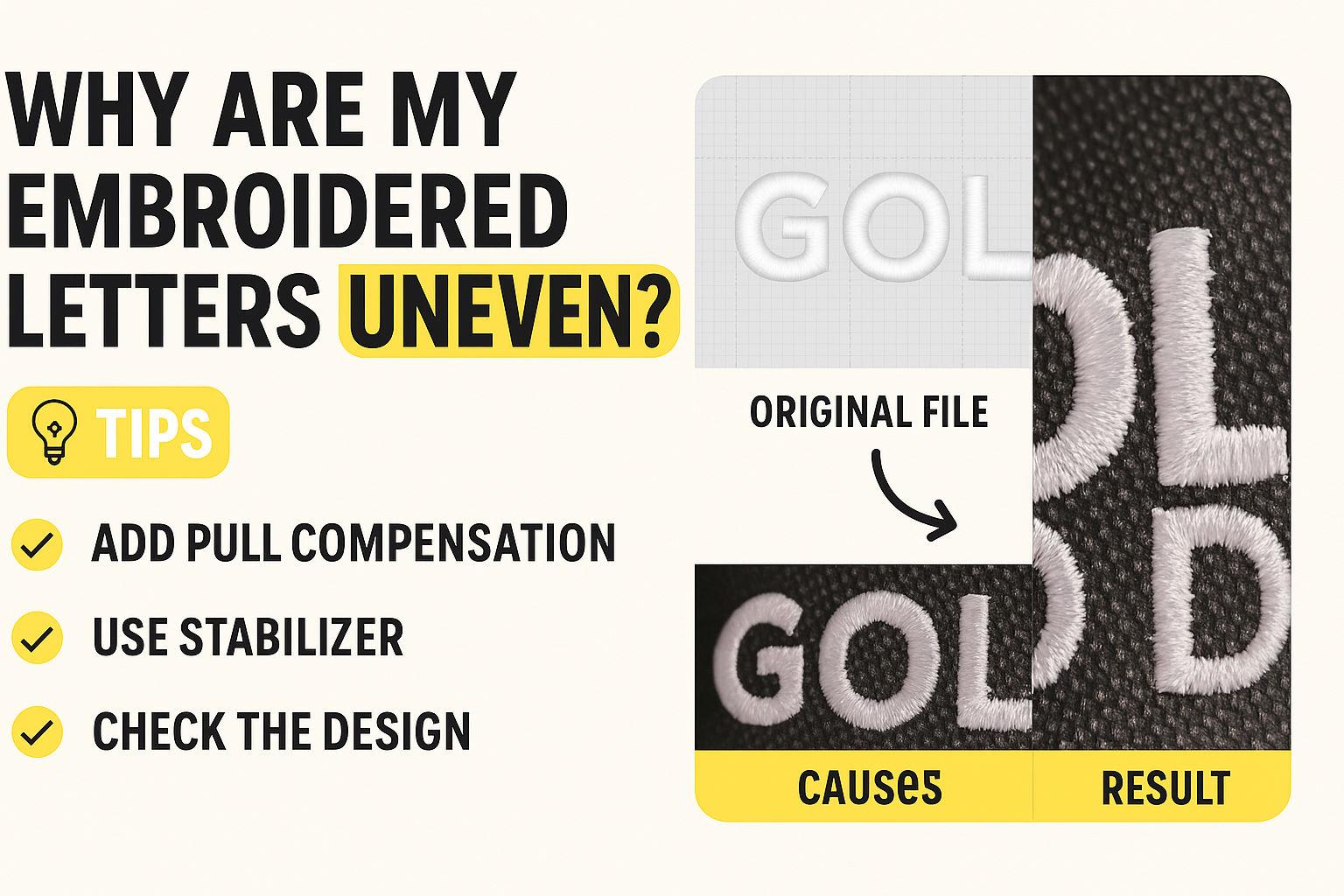
Why Are My Embroidered Letters Uneven? 🧵 A Professional Breakdown of a Common Digitizing Issue
Machine embroidery can look flawless—until it doesn’t. If you've ever stitched out text and noticed that your letters come out uneven, like in the image below, you're not alone. This issue plagues both beginners and seasoned embroiderers. Let’s take a closer look at why it happens and how to fix it like a pro.
What Happened Here? 🧐
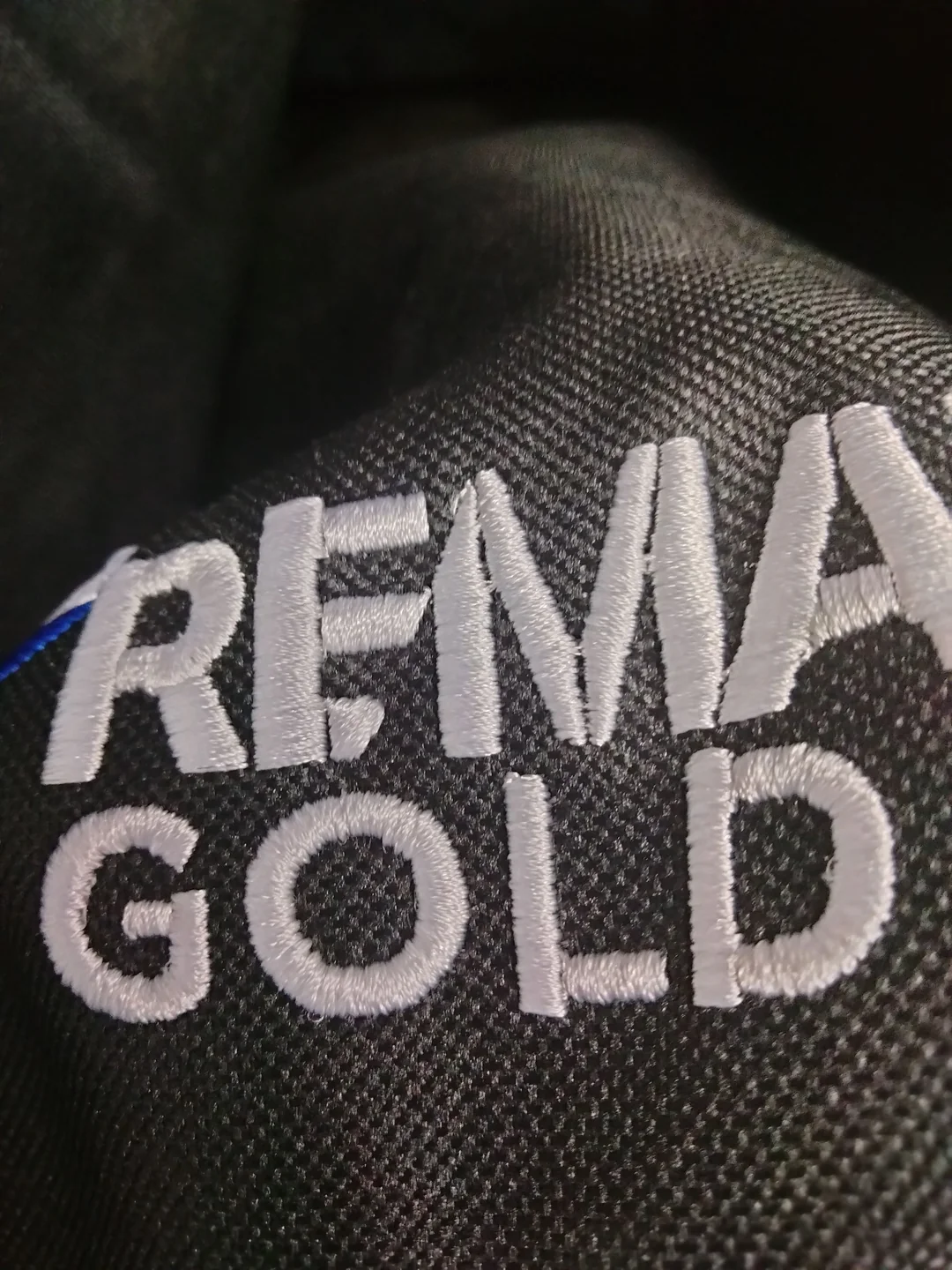
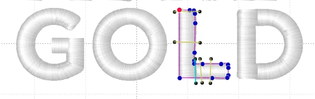
In the above example, the letters “GOLD” appear visibly misaligned. While the original file (left) shows a clean, balanced satin stitch layout, the stitched result on the bag (right) looks distorted, especially the “L” and “D.”
So, what went wrong?
🧷 Common Causes of Uneven Embroidered Letters
✂️ 1. Push and Pull Distortion
This is the #1 suspect. Push and pull distortion happens when the fabric shifts during stitching, causing stitches to either elongate or compress in unintended ways. You’ll often see vertical columns (like "L") stretching or getting narrow at the base.
✅ Pro Tip:
Shorten vertical columns slightly when digitizing, especially for letters like I, L, M, N, E to compensate for pull. Rounder letters like C, O, G naturally look fuller, so adjust widths accordingly.
📐 2. Lack of Stabilizer
Even structured materials like duffle bags need some stabilizer, especially when fine detail or precision matters.
✅ Pro Tip:
Always use tear-away or cut-away stabilizer, even for thick fabrics. If hooping is tricky, float a few pieces underneath. It doesn’t have to be hooped to work!
🧵 3. Digitizing Strategy
How you digitize your lettering impacts the final stitch. The order of stitching and the splits in your shapes can lead to distortion if not handled correctly.
Questions to Ask:
Does your letter “E” stitch vertical first or horizontal?
Are you using enough pull compensation for each part?
Are the stitches traveling efficiently between sections?
✅ Pro Tip:
Adjust pull compensation on all split sections, especially on edges and corners. Double-check underlay and stitch direction.
🔄 4. Stitch Order Matters
Letters stitched out in the wrong order can lead to dragging and misalignment. For example, if one side of the "L" is stitched first and then the horizontal bar is tacked on, the second part may appear lower or shifted.
🧷 5. Not a Hooping Issue
Many blame the hooping when issues arise, but in this case, it’s not a hooping error. The design can stitch well even without firm hooping—if it's digitized correctly for the material.
✅ Summary: How to Fix Uneven Embroidered Letters
Problem | Fix |
|---|---|
Push/pull distortion | Add pull compensation and shorten vertical strokes |
No stabilizer | Float or hoop tear-away backing, even on thick fabric |
Poor stitch order | Re-sequence digitizing path for balanced stitching |
Uneven splits in letters | Add underlay and fine-tune compensation on each section |
Structured fabric myths | Even stiff fabric can shift – use stabilizer for precision |
💬 Final Thoughts
The devil is in the details when it comes to machine embroidery. If your letters look off, it’s most likely a digitizing issue—not hooping. Understanding how stitch direction, compensation, and stabilization interact is key to professional-looking embroidery.
Even a powerful machine like the Ricoma MT can’t compensate for improper digitizing. Master your settings, use stabilizer strategically, and digitize with pull/push in mind.
📌 Have you faced similar embroidery issues?
Share your experience in the comments below or tag us with your fixes and fails. Let’s stitch smarter—together!
Recommended Comments