The Ultimate Guide to Embroidered Automotive Hoodies
Embroidered Car Logo Hoodies: When Horsepower Meets Thread 🚗✨
Car people don’t just drive their passion — they wear it.
An embroidered hoodie with an automotive logo feels like a subtle pit-lane badge: clean, confident, and unmistakably premium.
Prints fade. Stickers peel.
But a carefully digitized and stitched logo?
That looks like it belongs in a showroom.
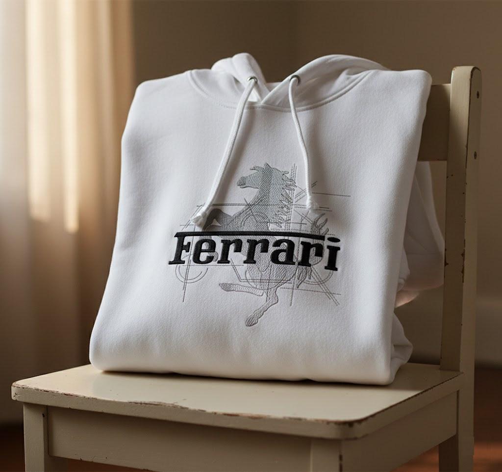
As an example, imagine a crisp white hoodie with a refined horse and lettering:
➡️ Ferrari modern logo embroidery design
In this guide we’ll look at car-logo hoodies as a systematic project:
Where to place embroidery so it’s visible but doesn’t restrict movement
Technical challenges of embroidering on hoodies
The most popular hoodie colors for auto themes
What we can learn from similar products online
Seller & designer tips (highlighted as grey blocks)
1. Where to Place Car Logos on a Hoodie? 📍
Car logos are visual anchors. Placement must balance comfort, visibility and style.
Best placements
Left chest (classic “garage” look)
Subtle, professional, great for clubs and service teams
Works perfectly for smaller emblems
Center chest (streetwear & fan style)
Ideal for larger, bold logos (Ferrari, Porsche, BMW letters, etc.)
Immediately visible in photos and social media
Sleeve placement (secondary logos / text)
Great for model names (GT, Turbo, Type-R) or racing stripes
Adds a “technical” motorsport feel
Upper back (big emblem or team name)
Works well for clubs, racing teams, events
Often combined with smaller front logo
DESIGNER TIP: Avoid placing dense embroidery across the belly or lower ribs — it folds when you sit and can feel stiff when driving. Upper chest and shoulders are both comfortable and highly visible.
2. Hoodie Colors That Work Best With Car Logos 🎨
Looking at fan merch, tuning shops and automotive lifestyle brands, the same colors appear again and again:
Black – #1 for car enthusiasts; hides grease & feels aggressive
Charcoal / Dark Grey – technical, modern, slightly softer than black
White – premium, clean, “show car only” vibes
Navy – classic, works great with corporate and racing logos
Red – iconic for performance brands and racing history
Color pairing ideas
Black hoodie + white or metallic-grey embroidery → stealth race car
White hoodie + black + grey logo (like a technical sketch) → design studio mood
Red hoodie + white embroidery → track-day fan energy
SELLER TIP: Offer one “safe” color (black or dark grey) and one “hero” color (white or red). Most customers choose the safe one, but the hero version makes your product photos unforgettable.
3. Technical Challenges: Why Hoodies Are Tricky for Embroidery ⚙️🧵
Hoodies are thick, stretchy and often brushed with fleece on the inside. This creates several challenges:
3.1 Stretch & Distortion
Knit fabric stretches in the hoop. Lines that should be straight (for example, the Ferrari text or a grille) can curve.
Solution:
Use a cut-away stabilizer (not tear-away)
Don’t over-tighten the hoop; let the fabric lie naturally
Use good underlay in digitizing to support edges
3.2 Fleece “Swallowing” the Stitches
Fleece and heavy knits can “eat” small details, especially in fine line work (prancing horses, detailed rims, etc.).
Solution:
Add a water-soluble topper on top while stitching
Slightly increase satin stitch width
Avoid micro-details at small sizes
3.3 Seam & Pocket Interference
Center fronts with kangaroo pockets and thick seams can throw off registration.
Solution:
Keep the main logo above the pocket top line
Avoid stitching across seams whenever possible
Use careful marking and test hooping
DESIGNER TIP: Automotive logos are full of geometry. Any distortion is immediately visible. Invest extra time in stabilizing and test-stitching — it pays off in a “factory-clean” look.
4. Choosing the Right Automotive Motif 🚗🏁
When you look at car-themed hoodies online, certain patterns repeat:
What works best
Strong silhouettes – horses, bulls, shields, wings, simple crests
Clean typography – brand names, model codes (GT3, RS, EVO)
Minimal color count – 1–3 colors keeps the logo elegant
Technical line art – blueprint-inspired outlines and sketch lines
What to avoid
Overly detailed car photos or complex scenes
Tiny text under the logo (becomes unreadable)
Heavy gradients or large, solid thread blocks that make the fabric stiff
Example: the Ferrari modern logo embroidery design uses a horse silhouette and clean type — perfect for hoodies, because it keeps the brand recognizable even at medium size.
SELLER TIP: Car fans hate “almost right” logos. Keep shapes and proportions accurate; it’s better to simplify than to distort.
5. Recommended Logo Sizes for Hoodies 📏
You want the logo big enough to make a statement, but small enough to stay comfortable when sitting, driving or leaning forward.
Front chest (center)
Adults: 18–25 cm (7–10 in) wide
Teens / smaller sizes: 15–20 cm (6–8 in)
Left chest
All sizes: 8–11 cm (3–4.5 in) wide
Upper back
Adults: 25–30 cm (10–12 in) wide
DESIGNER TIP: Use a smaller logo on the left chest and keep the big, dramatic emblem for the back or a separate “track day” version. This lets you sell two styles from one design.
6. Insights From Similar Products Online 🔍
Looking at embroidered automotive hoodies in fan shops, racing merch and lifestyle brands, we see some repeating themes:
Monochrome embroidery feels most premium (black on black, grey on white)
Simple, centered designs outsell busy compositions
Limited editions tied to a model or race year create urgency
Photos that show the hoodie in a garage, on a track, or next to a car convert better than plain studio shots
Car people don’t just buy a hoodie — they buy a piece of the lifestyle.
7. Final Lap: Why Car Logo Hoodies Work So Well 🏁
Embroidered automotive hoodies combine:
The emotion of driving
The status of a brand
The comfort of everyday streetwear
Done right, they feel like something between team apparel and designer fashion — equally at home in a pit lane, a café, or on a Sunday drive.
Stabilize carefully, choose strong motifs, pick colors that match the brand’s DNA, and your hoodie will feel less like merch… and more like a piece of the machine.
Start with one refined emblem — like the Ferrari modern logo embroidery design — and build a full “garage” collection from there 🚗🔥


Recommended Comments
Join the conversation
You can post now and register later. If you have an account, sign in now to post with your account.