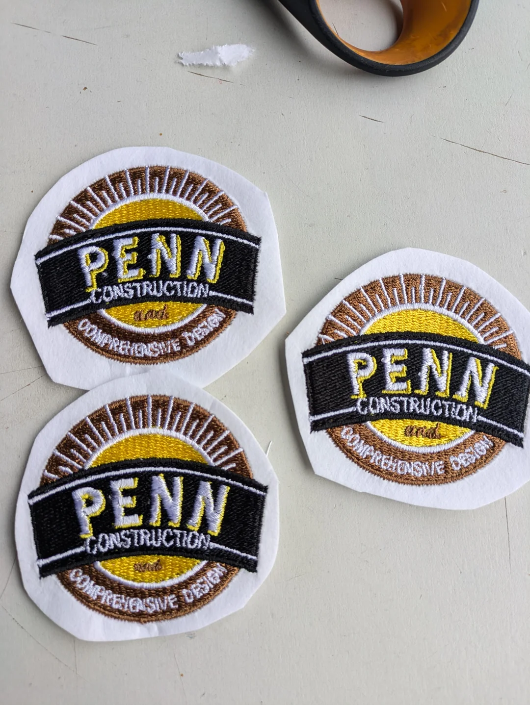
Recently, I was asked to recreate an embroidery design for a client who used to outsource their patches but now wants to support local makers. It sounded simple enough—just reproduce an existing 2.25-inch patch. I’ve done similar work before, so I figured I’d digitize it myself and get stitching.
Cue: frustration.
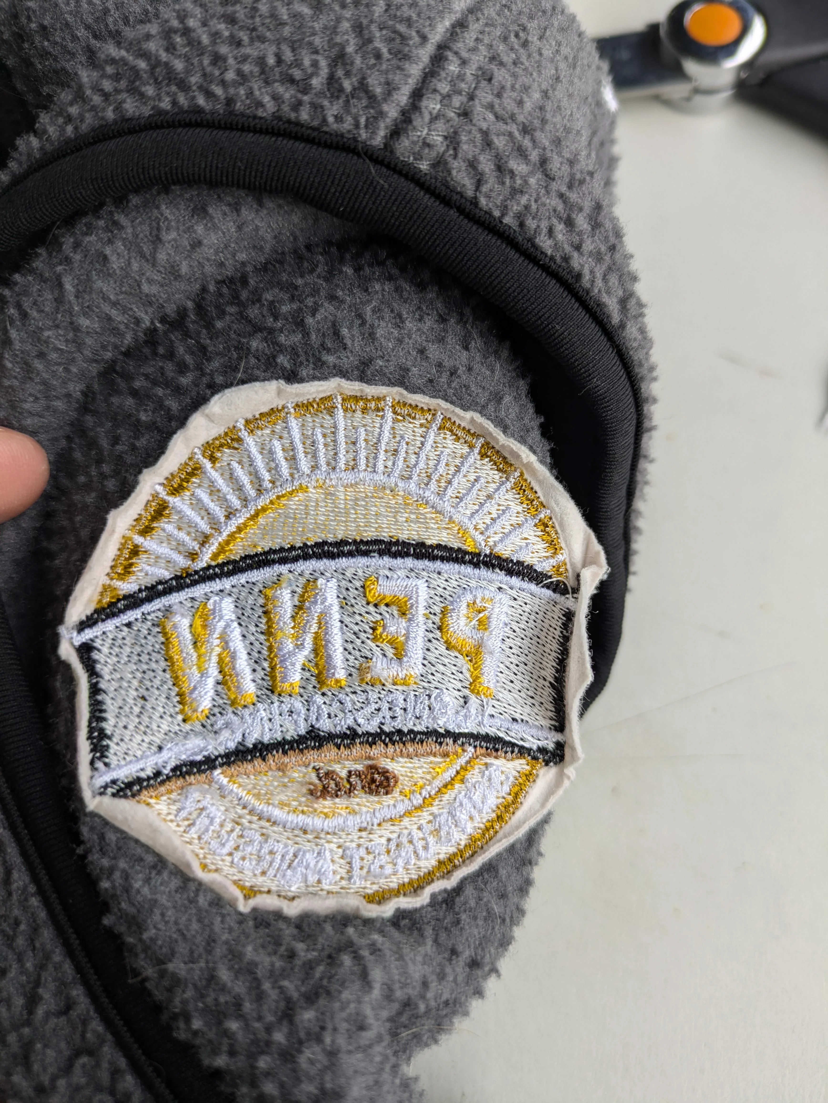
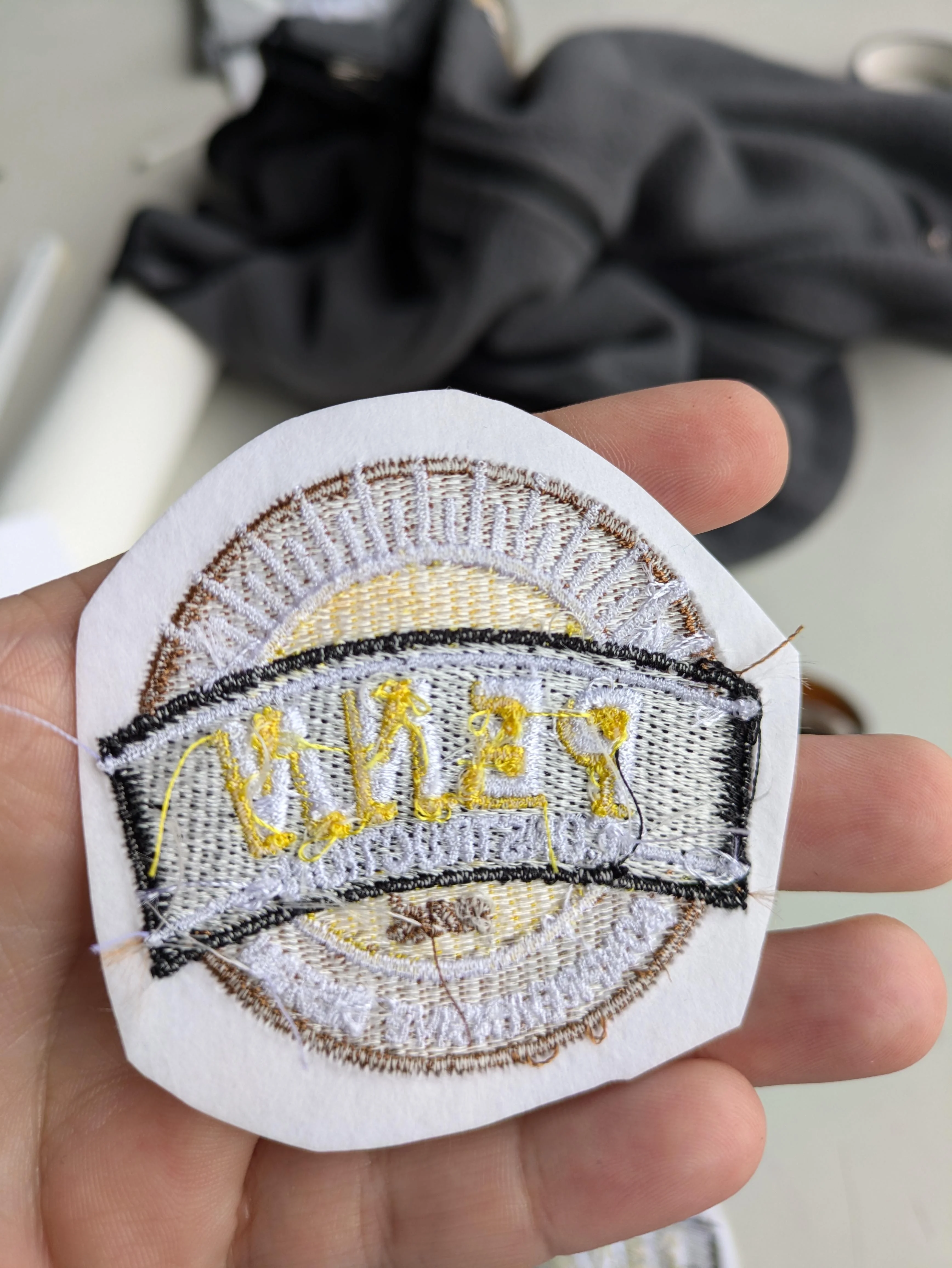
No matter how many adjustments I made to the file or tweaks I tried on the machine, I couldn’t get it to look as clean and professional as the original version. The fill stitches looked okay, and tension wasn’t the issue (I double-checked needle gauges and everything), but the lettering—especially at the bottom—just wouldn’t cooperate.

So... Is It Me? Or Is It My Machine?
At a certain point, I started to wonder if the real issue was my Ricoma machine. It seems like it's just not built for super fine lettering, especially when it gets down to those 2-inch patch sizes. I know machines have their quirks, but when your file looks great on screen and stitches out like a mess, it’s enough to drive you up the wall.
The Community Weighs In: Actual Life-Saving Tips
Thankfully, I wasn’t alone in this. I reached out and got some solid advice from folks who've been in the same boat:
1. Design Size vs. Font Size
Even though the patch is 2.25 inches (which matched the original), that still doesn’t leave a lot of space for clean, crisp lettering. Fonts get tricky fast when they drop below a certain size, especially if you're using standard 40wt thread and a 75/11 needle.
2. Stitch Strategy Tweaks
-
For the yellow outline around “Penn”, instead of outlining it literally, try making a wider fill base and letting the white letters overlap slightly.
-
Add or adjust pull compensation: set it between .010 and .012 for better coverage.
-
Don’t skip underlay, even for thin elements like ribbon lines. A single run underlay can stabilize the stitches and reduce distortion.
-
Bump density to .014 for words like "Construction" or "Comprehensive Design" that sit on curves or small spaces.
3. Small Fonts Need Special Tools
For really fine lettering:
-
Use 60wt thread (Gunold is a favorite for this).
-
Switch to a 65/9 needle for better control and less distortion.
-
Increase density slightly (around .011) to help with clarity.
4. Removing Underlay Isn’t Always the Fix
I was removing underlay from thinner text elements because it was getting messy, but without it, things didn’t look much better either. Sometimes, the messiness is a sign the design just needs more support—not less.
On the Topic of Outsourcing: A Learning Perspective
I got a few suggestions to outsource the digitizing entirely—just pay the $25 and be done with it. And honestly, I get that. Sometimes, it is the smartest path.
But here’s where I stand: I already spent a year having my designs digitized professionally. I’ve studied every stitch from those files, reverse-engineered how they’re built, and have been digitizing my own work for over a year and a half now. Most of the time, the results are solid. But these patch-style designs really push the limits, and that’s exactly why I want to do this myself.
I have the time. I have the drive. And this project gives me a chance to truly figure it out—not just imitate the look, but understand the logic behind it.
A Reminder to Fellow Creators
If you're in the same boat—frustrated with inconsistent results and tempted to throw in the towel—you're not alone. Sometimes, the hardest projects are the ones that push your skills to the next level. Take the feedback that helps, ignore the noise that doesn't, and give yourself space to improve.
At the end of the day, I’m not just trying to make this patch. I’m trying to master the craft.
Have you wrestled with small fonts, tricky underlays, or machine limitations? Drop your thoughts below or send me your go-to fixes. Let’s keep learning together, one stitch at a time.


Recommended Comments
Join the conversation
You can post now and register later. If you have an account, sign in now to post with your account.