
Original text by Marina Belova
Color blending adds realism to the design, which is often desirable when embroidering flowers and animals; logos also come with gradients.
Everyone can use the color blending technique, and it does not matter, which machine embroidery software you employ.
There are several ways of making realistic-looking blends:
- Use the software capabilities, applying the automatic gradient effect to the object.
- Show the color tones and gradations, using a simple running stitch and standard fill. The latter can be only achieved manually and, in my opinion, requires exceptional digitizing skills.
- Creating tonal gradations by mixing fill stitch or satin stitch layers of varying density and thread color.
Automatic gradients
Modern embroidery software offers its users an automatic gradient fill for blending colors and creating the effect of the smooth transition from one color to the other. This effect is present in many editors, but only for the fills. Let's see what possibilities this method can offer, using a standalone machine embroidery editor called Stitch Era Universal. You can download it here.
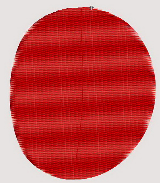
I chose a sole-colored object of a simple shape and filled it with the ordinary unidirectional Tatami.
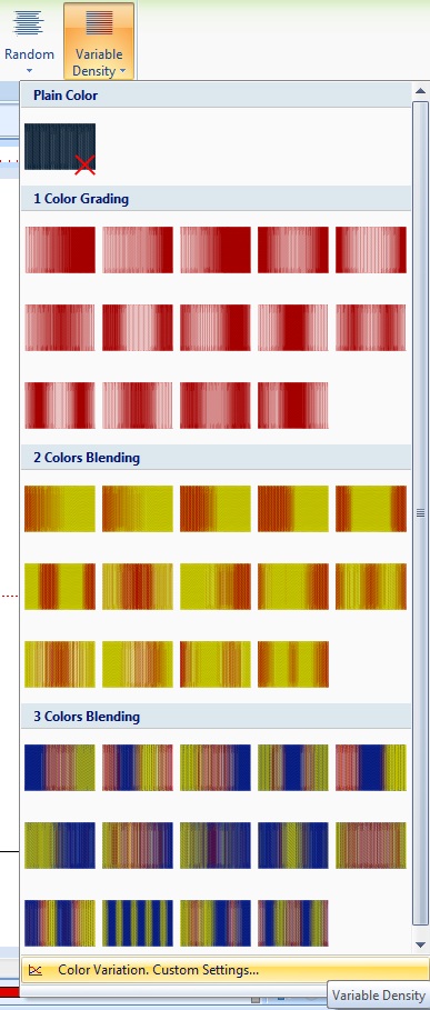
3 types of automatic Gradient fills that use 1—3 colors can be applied:
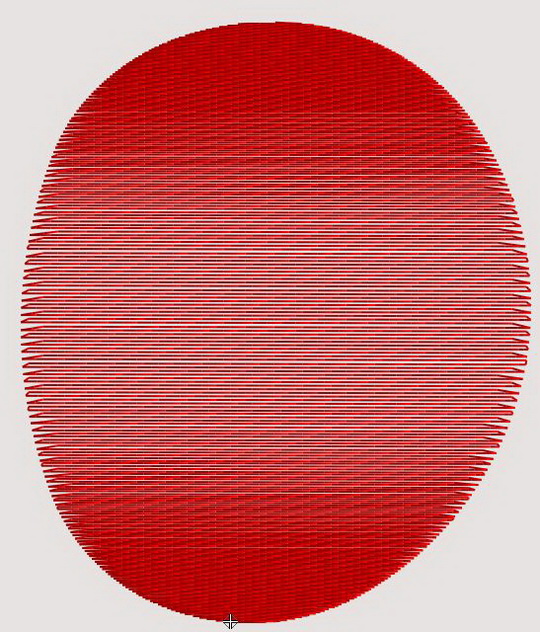
In case you use only 1 color, it will look something like this: The result depends on the type of gradient used. This is what I got:
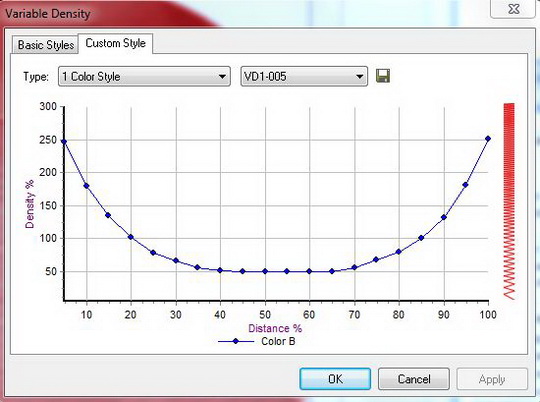
In the panel on the picture below you can see how much the density value will increase or decrease after this effect has been applied. And not only see: you can create your own gradient type with your own density values right there:
This is what I got with 2 colors:
After I chose a 2-color gradient and the way it should look, the editor automatically generated 2 objects of different colors and with different types of gradient applied to them. The stitches were packed tightly in one of them, and sparse in another. You can see and adjust it, using the panel pictured below:
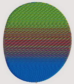
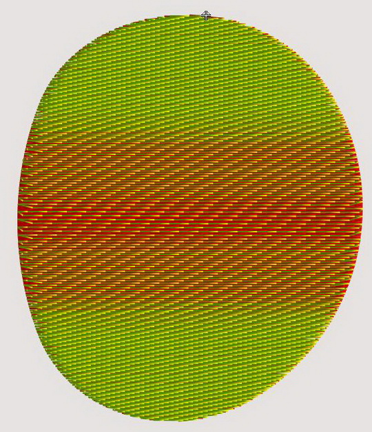
When I applied a 3-color gradient to the same object, I got this:
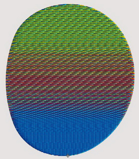
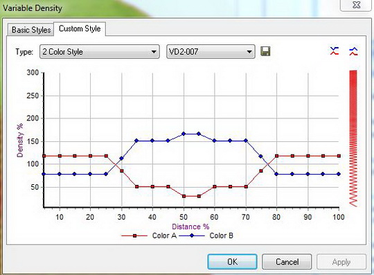
In this case, the editor automatically generated 3 objects of different colors with different types of the gradient. You can see and adjust the density distribution, using the panel pictured below:
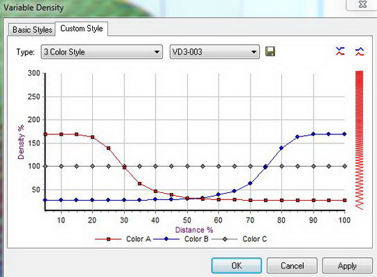
As you can see on the chart, the 3rd color has consistent density, and the first 2 change their density in different directions: the stitches are closely spaced in the 1st, and sparse in the 2nd, and vice versa.
This editor gives you a room to play with gradients, for it allows to make adjustments. And this is extremely helpful when you create color blending effects in machine embroidery.
The same settings can be applied to satins.
The color transfer with the help of the running stitch and a standard fill
This method is based on the use of a filling pattern, which creates the background that is emphasized by the running stitches on the front.
The filling pattern may be unidirectional or curved along 1 or 2 lines. On the top of the pattern, you draw a running stitch by hand, in order to create dancing shadows. You set the stitch density, the stitch direction — it should match the one in the lowest level — and the stitch length. The running stitch may follow a number of trajectories.
In order emphasize the contour of the objects, you need to place the running stitches so that they would follow the shape of the outline.
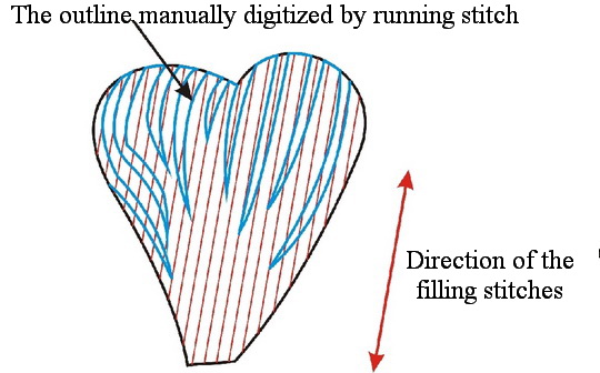
The stitches of that type do not intermingle with the stitches in the lower level and therefore create the contour effect.
To achieve the color blending effect with the help of this method you need to position the running stitches in the same direction as the stitches in the lower level. You should get something like this:
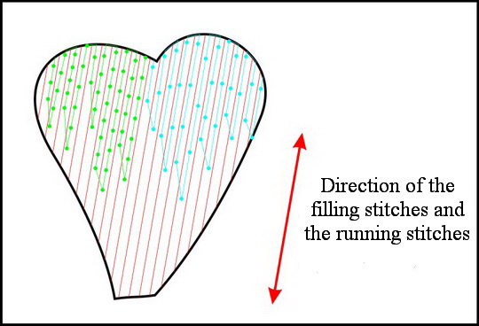
All outer colors are "painted" by the running stitch against the background layer. Only the stitch length varies in order to achieve the "sinking" stitches effect.
I've seen John Deer applying this technique in masterly fashion — not only for the fills but for the satins, too. I particularly liked the way he created color blends using nothing but running stitch.
Technically, this method can be recreated in a simple mode. Instead of drawing everything manually, you can replace them with satin stitches or fills, having set the proper density, stitch direction and stitch length.
Mixing colors by playing with density values
This is the most complex of the traditional color blending techniques, where the tonal gradation is achieved by intermixing the layers of different colors. Applicable both to the fills and the satins.
In this case, you create several contours and place them on top of each other. You'll need to pay attention to the density of each layer so that not to get the embroidery that sticks out.
Color blending: general recommendations.
When gradually reducing stitch density, keep in mind that the density value of the next layer should be a multiple of the layer number: 0.4 mm for the 1st, 0.8 mm for the 2nd, 1.2 mm for the 3d, and so on.
While digitizing, you should also remember that the shadow layers, despite being of low density, also cause push and pull effect.
Feathering is good for smooth tonal gradation.
The use of the threads of different brands and structure, but of the same color helps a great deal (this one is true for other color blending methods).
In order to achieve the "moving stitches" effect along the outline, you can try to split the shading layer into narrow satin columns and overlap them, changing the stitch direction only slightly in every one of them, creating the illusion of movement along a curve.
Be careful to avoid placing stitches along the specified line, because setting the trajectory automatically rarely achieves a good result. It is often better to use simple running stitches, added manually.
You can achieve the realistic look in any embroidery editor that has a basic set of tools. One thing is the necessity to control the density, stitch length, and texture. The knowledge of how to place the stitches manually is 90% of success. You should not forget that a satisfactory result can hardly be achieved by breaking the general rules of using the color wheel.
Edited by Irina
-
 1
1
There are no reviews to display.