Original text by Marina Belova
I wonder if anyone will ever argue that blending thread colors in machine embroidery is slightly different from blending printing colors or paints? But then again, even in painting, there have long been attempts to prove I.Newton’s classic theory of colors wrong. For those who are interested, there’s a book by Michael Wilcox called Blue and Yellow Don’t Make Green – go and read it.
But let’s get back to the topic. All guides, books, and other information materials on color formation in machine embroidery are nevertheless based on Newton’s classic color wheel. For the sheer reason that you have nothing except them and your own experience to rely upon. Besides, choosing a right color with the help of the color wheel is much better than without it. Especially for the neophytes.
That’s why I will take the liberty of touching on the subject of color in a machine embroidery design.
Colors can be divided into 2 groups:
- Chromatic – the colors of the spectrum.
- Achromatic – white, black and all shades of gray.
Let’s look at the canonical 12-part color wheel made of chromatic colors:
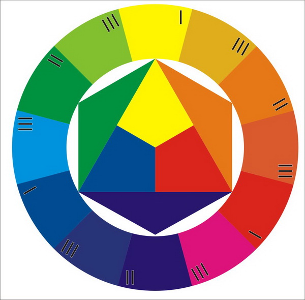
It’s basis is formed by just 3 colors: yellow, red and blue (marked “I” in the photo). These are called primary colors, as they cannot be obtained by mixing other colors together.
Secondary colors result from the intemingling of the two primary colors. In the photo, they are marked “II”. These are orange, green and purple.
Tertiary colors are made by mixing two of the secondary colors (marked “III” in the photo). These are yellow-orange, red-orange, red-purple, blue-purple, blue-green and yellow-green.
Also, there are such concepts as:
Color hue – a property of color that defines its tone; we usually have separate names for them (lilac, magenta, etc.).
Lightness – the shade of lightness/darkness. To get a shade you add some white or black to your source color. A mixture of color with white is called tint, and a mixture of color with black is shade.
Saturation is the degree of intensity and purity of the color.
Color temperature is connected to the idea of colors being “cool” or “warm”. On the basis of this idea, all colors are divided into warm, cool and neutral.
There are several ways of creating harmonious color schemes, containing 2–4 colors, with the help of the wheel. For example:
Mono – includes one color in different values. In this case, we only add shades and tints.
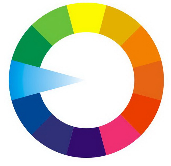
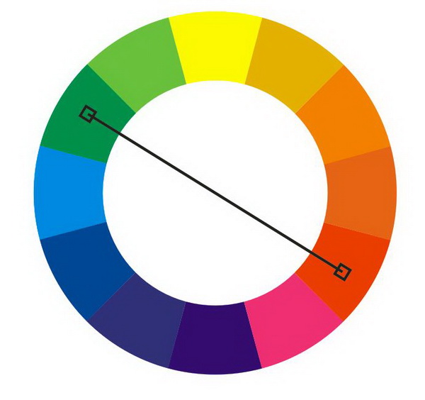
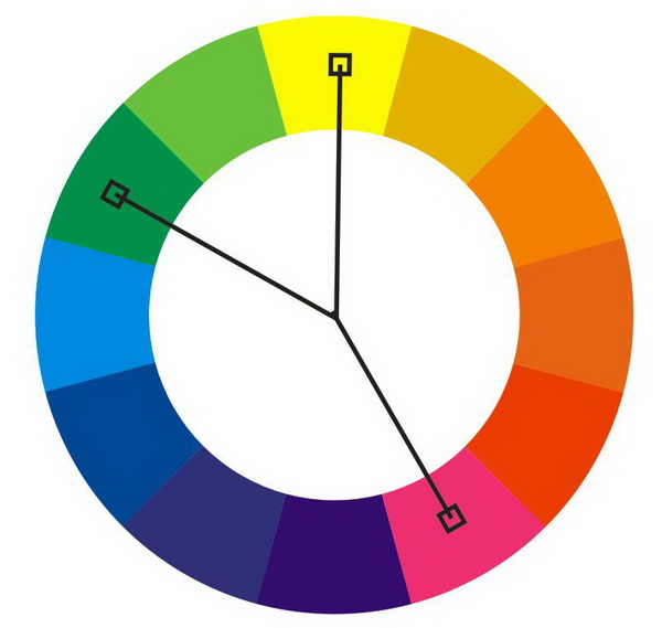
Complementary – mixing of 2 (contrasting) colors on the opposite sides of the diagonal.
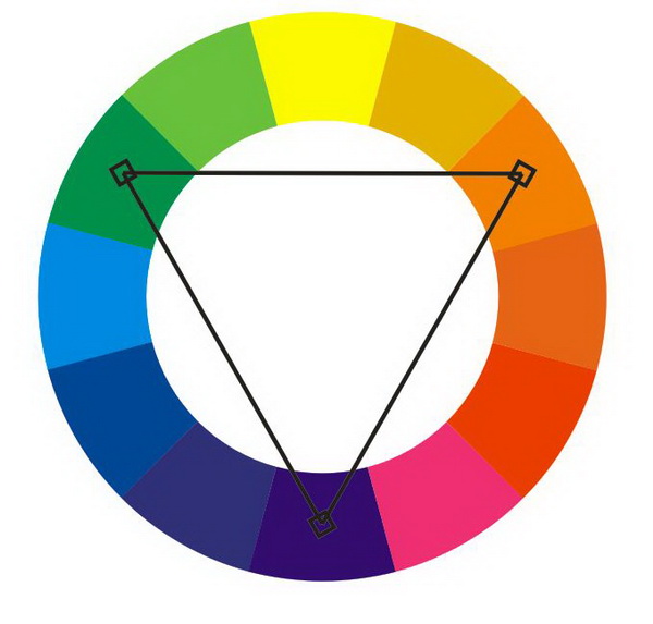
Triadic – mixing of 3 colors that are located at the corners of the equilateral triangle:
Mixing 3 analogous colors: Analogous colors are those that follow each other on the color wheel.
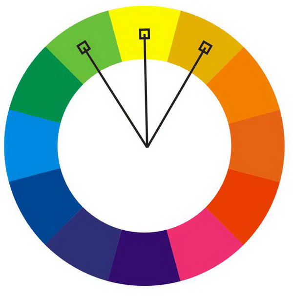
Split-complementary: mixing 3 colors – two analogous and one contrasting.
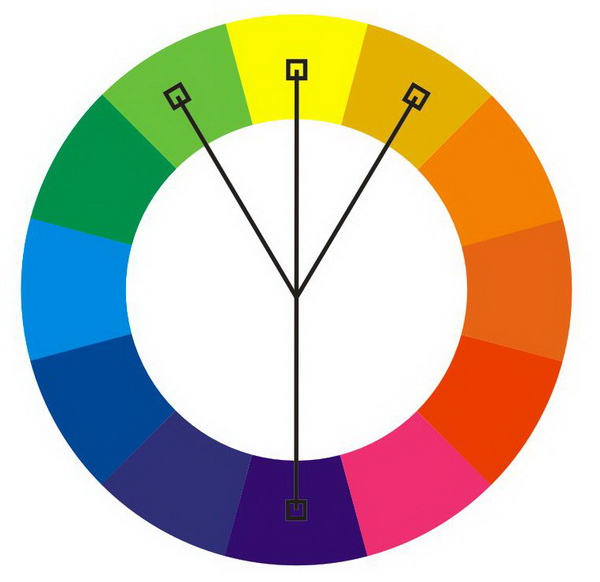
Mixing 4 colors: 3 analogous and 1 contrasting.
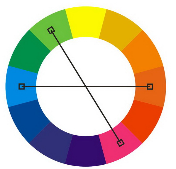
Tetrad: mixing 4 colors arranged into two complementary pairs.
Besides the ones above, there are other color harmonies that can be found in books and on the Web. The only thing left is to do is to practice, and don’t forget that the threads cannot blend together like paints. Also, the stitch types, stitch angles, textures selected will make their not so small impact on the end result.
I’m curious if any software has algorithms helping to choose threads automatically, on the basis of the existing thread color palette, but using the methods described above?


Recommended Comments
Join the conversation
You can post now and register later. If you have an account, sign in now to post with your account.