Original text by Marina Belova
There is an enormous load of information on how to digitize embroidery designs for caps. But for some unknown reason, every time I see a new design which has to be placed on the cap front, I begin to panic and wonder: which of the well-known rules will work for this particular case? And every time I feel like a novice, though, from the theoretical perspective, everything seems to be clear.
So, I'll proceed to the theory of creating embroidery designs for caps.
- It's better to create simple and big designs. Extra details that can be spared should be removed.
- The design is usually 2.25 inches (55 mm) high and 4.5 inches (112.5 mm) wide. To be sure which elements of the design will end up in the resulting embroidery, it is usually recommended to print the design at one-to-one scale and place it onto the fabric where the embroidery will be located. It will be instantly evident which of the details will be embroidered, and which ones won't.
- The density of the embroidery can be increased a bit compared to the standard value for such fabrics (for example, 0.3—0.35 mm for twill). But it seems to me that the density value should be the one the designer prefers.
- Remove the understitching from the object's edges (more than 0.7 mm).
- The test sample minimum size is 6—7 mm.
- Avoid intricate outlines (double runs of satin stitches, satin stitch + running stitch combinations and so on).
- Avoid the long jumps between the objects.
- As the cap front in not a flat, but a rounded surface, there is a higher possibility of distorting the outline during the embroidery, and of failing to match the outlines or just to land in the allotted space when aligning the parts together. To avoid this, you need to follow simple instructions concerning the order in which the parts should be embroidered:
- Big objects or the ones in the center are embroidered first.
- Then come the color changes. For example, if you have a letter with an outline, it's better to embroider the outline right after the letter has been finished.
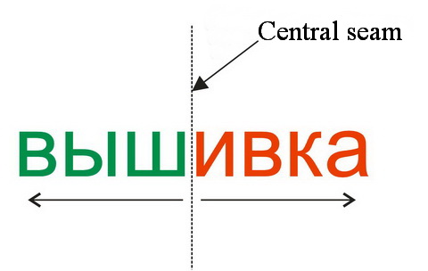
- Embroidery should be planned from the center outwards and from the peak to the top of the cap. On the picture below you can see the classic example of the word written on the cap front. In this case, the embroidery sequence will be as follows: first the letters "ивка" embroidered from the central seam to the side and then "шыв":

- It is important to avoid letters crossing the seam where possible, shifting the inscription to the side.
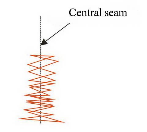
- If you have to embroider a letter over a seam, after all, you can try to flatten it. The recommendation for such cases states that you should cover the seam with a zig-zag stitch added specifically for that reason. The thread color is usually chosen so that it matches the color of the fabric of which the cap was made:

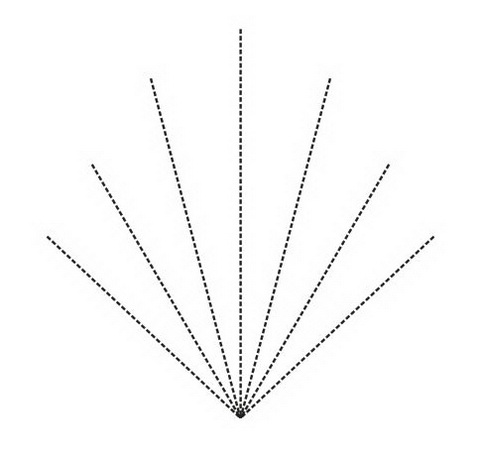
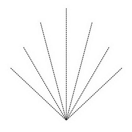
- To smooth the cap surface before the embroidery, you can use the next trick: place an underlay of a particular kind, shaped as the leaf veins, and of the same color as the cap (one of the radial underlays):

- It is always worth considering a possibility of attaching an applique — all you need is to sew in onto the cap.
Everything seems to be clear. And yet, every time is like the first one when you're dealing with caps so that you need to use your head. And of course, take advice from much more competent people with more experience.
Speaking of which, how do you create such designs?


There are no reviews to display.