Today I suddenly decided to check an assertion, which I read somewhere and took on faith, that the multidirectional filling stitches warp the embroidery so much that it is extremely difficult to take it under control. That's why such effects should be applied with care.
The same source (and not only that, for this is written in many other places) stated that the best complex fill is the one composed of unidirectional stitches, better horizontally oriented, because it allegedly warps the fabric less that the other and is easy to work with. This is the classical view on machine embroidery digitizing. It's not a coincidence that a vast number of designs is made with unidirectional stitches.
And though I have said a hundred times that you should not just believe in something, there never was a good time for checking it out. So, I fell for that bait, too. But I conducted an experiment of my own.
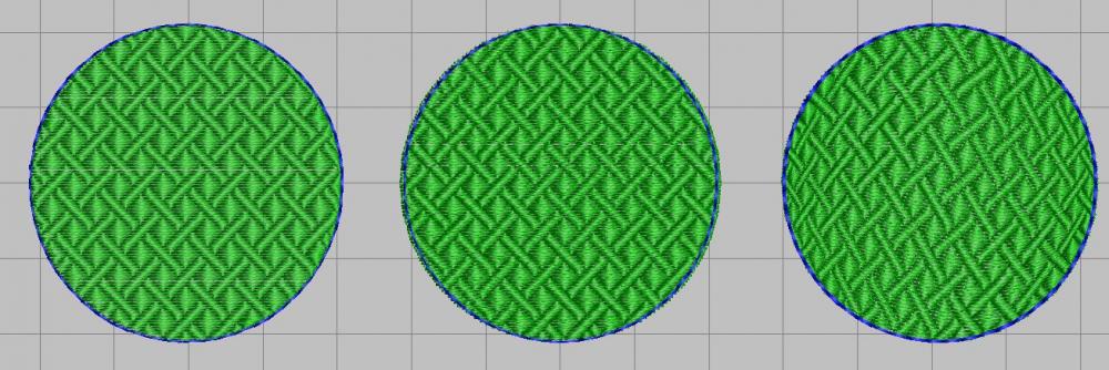
Out of leisure interest I made the simplest sequence possible: three circles with the contour made by three simple stitch lines.
This is a more realistic look:
The left circle has a fill composed of simple horizontally oriented tiles without any understitching or pull compensation + a plain contour. The edge of the fill and the contour coincide perfectly. The central circle is very much like the first one, except it has the understitching as well (full grid) and pull compensation (0.6 mm), and also stretch compensation (I trimmed away 2 or 3 stitches from the top and the bottom). The right circle is again pretty much the same as the left, but I changed the direction of stitches, having made them curvy by using the Liquid Effect, kept the pull compensation as in the second example, but discarded the stretch compensation to see what would happen if I did.
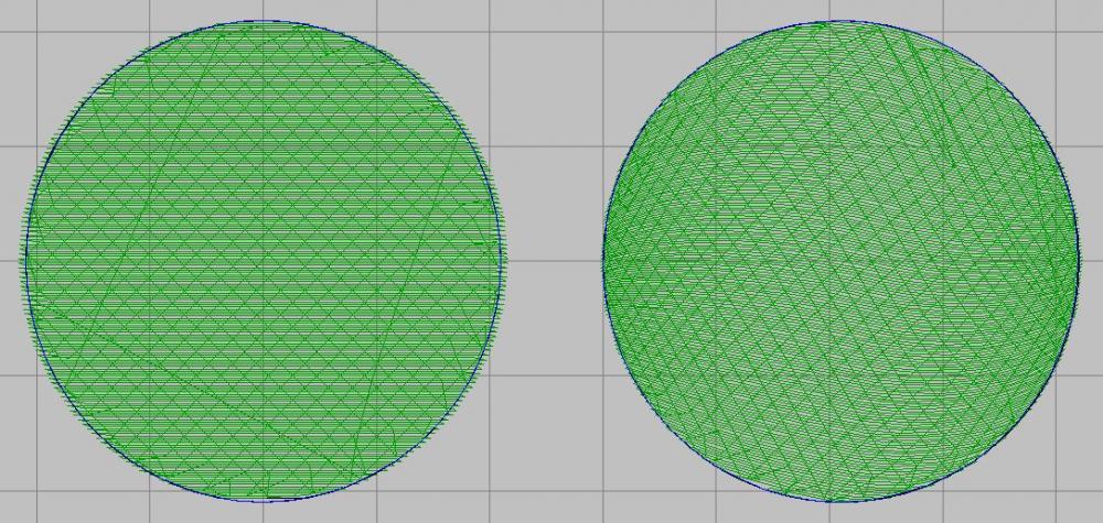
One should point out that Wilcom does the pull compensation in a rather strange way when creating the curve stitch effects. If a 0.6 mm compensation is very much visible with unidirectional stitches, in this case it is not clear if the editor does compensate these 0.6 mm, how and where:
However strange it looked on the screen, I nevertheless proceeded with the embroidery. I embroidered all of this in one hoop, using a sheet of printing paper as a stabilizer. Here is what I got:
If we look at every one of these pieces separately, we'll see that:
- The left circle has a slight pull (on the right and left the fill does not reach the contour) and stretch (the edge of the fill on the top is beyond the contour).
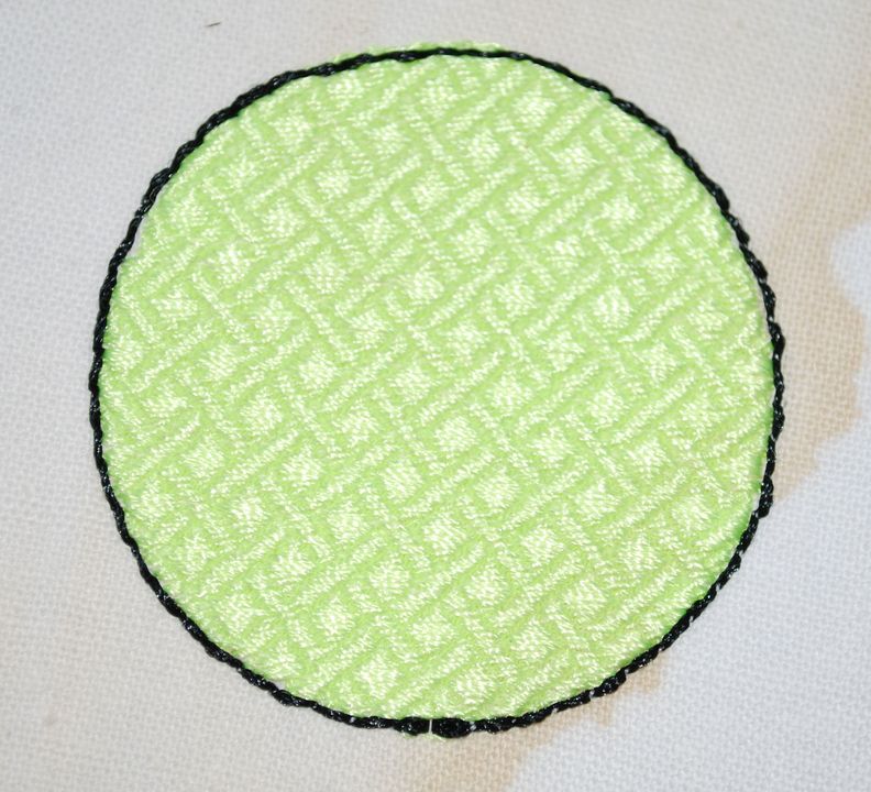
- The central circle was embroidered almost without these defects:
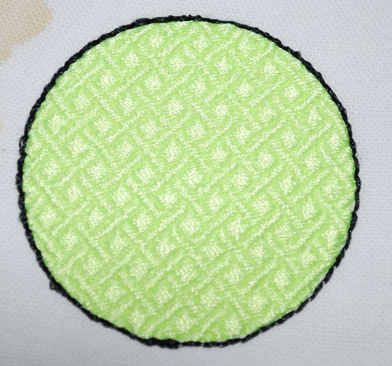
- And the right circle with multidirectional stitches emerged nearly perfect. Whilst according to the theory they should have looked like this:
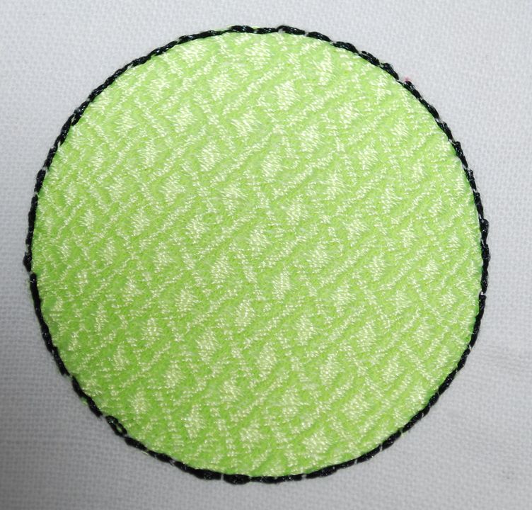
And this despite the fact that I did not do anything to prevent the stretching; as the for pull compensation, calculated by the editor according to my data, it was minimal. The only visible difference is that the fabric around the embroidery is puckered a bit more than it would around the standard fill. But this is not critical and can be easily corrected by ironing. It turns out that to create an embroidery design using this type of filling stitches is somewhat easier, but ironing and getting into shape will take a bit longer than usual.
As they say, you win some, you lose some. It turns out that the easiest method of getting a good result is not doing everything by book, but going outside the established framework. The fact that horizontal and vertical stitches are not the best ones in the context of embroidery deformation is known, perhaps, to every novice. And this example proves it once more.
Edited by Irina




Recommended Comments
Join the conversation
You can post now and register later. If you have an account, sign in now to post with your account.