Original text by Marina Belova
I've written on the subject of color blending in machine embroidery several times, covering the basic blending principles and also 2 methods of doing it. Today I'll add one more method to the aforementioned two.
You can see the examples of this technique in the works of at least 2 famous embroidery persons: Bonnie Nielsen of Madeira and Niamh and her team embroidery. I like the ingenuity and the expressiveness of this color blending style, its devil-may-carishness, and chaotic nature.
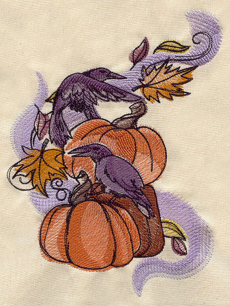
Its key point is to superimpose low-density layers of fill stitches (either flat or motif ones). The density, stitch direction, and texture of each layer may vary. And the most important thing – the design is not filled completely as it is custom in standard digitizing (from one outline to the other), but instead, the layers are put on top of each other in blots of a different shape. The next layer may or may not be of a different color or shade, they may all be of the same color, it's the density that creates the color depth.
I.e. you should get something like in the case:

In this case, not only the fabric but also its texture and color play an important role. All this is visible between the stitches and makes embroidery especially beautiful. I also like that registering of the outlines is not important here – it is a different digitizing style.
Of course, it is not applicable to any kind of embroidery, but for the works in a modern style, it is rather good. This style bewitches me. And I understand that I cannot use just like that, but at the first sight, it looks easy enough.
Edited by Irina


There are no reviews to display.