

Original text by Marina Belova
Even now I consider digitizing letters one of the most complex subjects in machine embroidery, of which I cannot tell much. I have more questions than answers because this embroidery technique requires accuracy and precision so that people could read the letters afterward. But there are some rules of digitizing characters over 5 mm high that I use in my work, and I'll gladly share them with you.
1. It is not important in what direction you'll stitch: from right to left or from left to right.
2. Letters over 5 mm high can be embroidered directly on the fabric, but smaller ones require a fill put under them.
3. No character stroke should be less than 1 mm wide. Adherence to this rule often leads to changing the size or width of the letter or even the font itself.
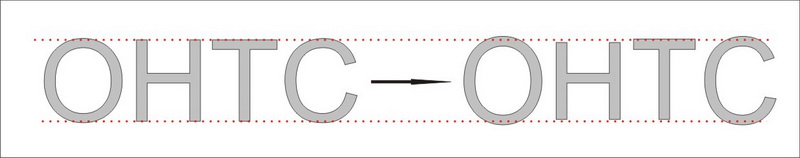
4. The letters extend over the baseline even more than they do in print. This is caused by push and pull compensation. I.e. you'll need to trim several stitches off the open edges of the letters and also increase the width of the columns. Letters that have openings in them, for example, "a", "o", "e", should be increased by 3–4% in size. This holds for both upper and lower-case letters. The result of your digitizing should look something like this:
I first learned about the extension of the letters about two years ago, and it was like a revelation to me.
5. Don't forget to measure the letter voids. They should be no less than 1 mm in diameter. If they are smaller, you'll need to increase them in size, otherwise, they will remain stitched and the letter will not be recognized.
6. Stitch type requirements are much more strict than in ordinary machine embroidery:
- Any element less 1 mm wide is made with running stitches (manual, single/double/triple run or bean). The optimal stitch length for the outlines is 2.5–3 mm.
- The elements 1–7 mm wide are embroidered with satins.
- The elements 7–10 mm wide are embroidered with split satins.
- Also, all elements more than 3 mm wide can be digitized with filling stitches. At the same time stitch length can be increased up to 4–4.5 mm in large areas.
7. An underlay of a corresponding type should be used. Main recommendations are as follows:
- Center run under columns 1–2 mm wide with stitch length equal to 1.5–2.2mm; variable stitch length is also possible.
- Edge run under columns 2–3 mm wide, with stitch length equal to 1.5–1.8 mm.
- If columns are more 3 mm wide, put zigzag + edge run under them.
8. You may consider these underlays, which, in my opinion, can only be applied to the simplest fonts like Arial:
- When letters are under 7 mm high, use center run with stitch length equal to 1.5–2.2mm, variable stitch length is also possible.
- For letters 7–12 mm high – zigzag or double zigzag.
- For letters 12–20 mm high – zigzag + edge run or zigzag + edge run.
- Full lattice at 90 degrees or at 45 and 135 degrees under fills.
Of course, these recommendations do not say anything about the fabric that will be used for the embroidery. You should take the fabric properties into consideration.
8. Density:
- For narrow (under 3 mm) segments of the letters, stitch density should be lowered by circa 0.4 mm.
- For the columns between 3 and 5 mm use standard 0.4 mm density.
- For the columns over 5 mm, the density should be increased.
- Light-colored threads, when used for the fills, require higher stitch density than dark ones.
- In order not to change density manually, thus dividing one outline into numerous segments, you can use variable density options if it is present if your embroidery software.
- You should remember that the excess density results in embroidery deformation.
9. Trimming: to be or not to be? Perhaps, the hardest question of all:
- It's better to use jump stitches between the two nearest points wherever possible.
- If the distance between the two letters is 1–1.5 mm, trimming is not necessary.
- But when this distance is more than 2 mm, you should consider making a trim.
- Don't make a straight line of jump stitches, it will be visible to the eye. Better to use connector stitches on different levels.
10. Needles and threads:
- #40 embroidery threads for the designs of normal size. The thinner the needle, the better – 70/10 or at least 75/11 is the best.
- #60 threads for small letters and elements of the design; 65/9 is the matching needle.
Here are the questions that I don't yet have the answers to:
- Should the serifs and crosslines in digitized letters overlap as if they were written by hand I've seen this assertion more than once and found it debatable.
- How to digitize corners properly?
- How to digitize serifs properly?
- How to outline letters in a right way? You can also read about digitizing low letters here.
Edited by Irina
-
 1
1
-
 1
1
There are no reviews to display.