Jump to content
  • Articles

    Our website articles

    The rules of creating a design for caps

    By Irina, in Machine embroidery materials and technology, , 0 comments, 2,859 views
    Original text by Marina Belova 
    There is an enormous load of information on how to digitize embroidery designs for caps. But for some unknown reason, every time I see a new design which has to be placed on the cap front, I begin to panic and wonder: which of the well-known rules will work for this particular case? And every time I feel like a novice, though, from the theoretical perspective, everything seems to be clear. 
    So, I'll proceed to the theory of creating embroidery designs for caps. 
    It's better to create simple and big designs. Extra details that can be spared should be removed.  The design is usually 2.25 inches (55 mm) high and 4.5 inches (112.5 mm) wide. To be sure which elements of the design will end up in the resulting embroidery, it is usually recommended to print the design at one-to-one scale and place it onto the fabric where the embroidery will be located. It will be instantly evident which of the details will be embroidered, and which ones won't.  The density of the embroidery can be increased a bit compared to the standard value for such fabrics (for example, 0.3—0.35 mm for twill). But it seems to me that the density value should be the one the designer prefers.  Remove the understitching from the object's edges (more than 0.7 mm).  The test sample minimum size is 6—7 mm.  Avoid intricate outlines (double runs of satin stitches, satin stitch + running stitch combinations and so on). Avoid the long jumps between the objects.  As the cap front in not a flat, but a rounded surface, there is a higher possibility of distorting the outline during the embroidery, and of failing to match the outlines or just to land in the allotted space when aligning the parts together. To avoid this, you need to follow simple instructions concerning the order in which the parts should be embroidered:  Big objects or the ones in the center are embroidered first.  Then come the color changes. For example, if you have a letter with an outline, it's better to embroider the outline right after the letter has been finished.  Embroidery should be planned from the center outwards and from the peak to the top of the cap. On the picture below you can see the classic example of the word written on the cap front. In this case, the embroidery sequence will be as follows: first the letters "ивка" embroidered from the central seam to the side and then "шыв":
    It is important to avoid letters crossing the seam where possible, shifting the inscription to the side.  If you have to embroider a letter over a seam, after all, you can try to flatten it. The recommendation for such cases states that you should cover the seam with a zig-zag stitch added specifically for that reason. The thread color is usually chosen so that it matches the color of the fabric of which the cap was made: 
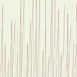
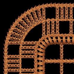
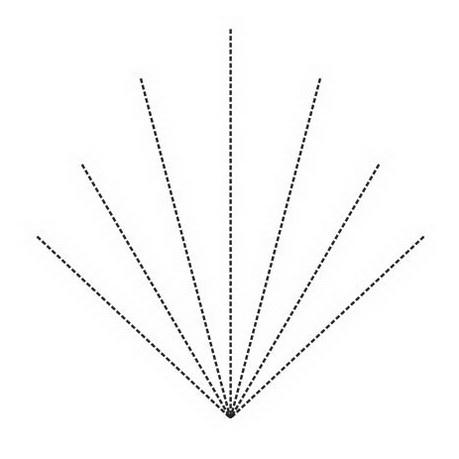
    To smooth the cap surface before the embroidery, you can use the next trick: place an underlay of a particular kind, shaped as the leaf veins, and of the same color as the cap (one of the radial underlays): 
    It is always worth considering a possibility of attaching an applique — all you need is to sew in onto the cap.  Everything seems to be clear. And yet, every time is like the first one when you're dealing with caps so that you need to use your head. And of course, take advice from much more competent people with more experience. 
    Speaking of which, how do you create such designs? 

    A bit more information on blending

    By Irina, in Machine embroidery materials and technology, , 0 comments, 2,761 views
    Original text by Marina Belova 
    A very long time ago I've read on Lindee Goodall's website that the colors in machine embroidery could be blended not only by way of adding tone to the main color but also the other way round. I made little of it then, having considered this technique just a slightly odd variation of a traditional one. 
    But when I created a pony free embroidery design not so long ago, I, by a fortunate coincidence or rather because I added the understitching manually, noticed that the method described by Lindee does indeed work: 

    After that I saw an embroidered logo at my work, executed in exactly the same fashion. And then it dawned upon me that a rare technique can rival this one in its simplicity and availability: You don't even have to bother about splitting the objects into segments, orienting your stitches and adding the understitching so that it won't show through the upper layer of low density, etc. The gist of this method is as follows: 
    Place the tonal layer under the main fill in the required place. Set the density at an ordinary value or 1 or 2 points lower. Remember that the stitch orientation in the main and tonal layers should be matching to a tee. 
    The density of the main layer is standard, 0.4 mm, for example.  No understitching in the main layer.  It is also very important for your editor to distribute the stitches in the layers in such a way that majority of them do not overlap, but fit in the free space between the stitches of the preceding layer. 
    Not every editor can give you the required precision in stitch allocation. But this is what makes it possible for the inner layer to peep through the densely laid stitches of the outer one, creating a very thin watered effect in case the colors are chosen appropriately. 

    An interesting method of using gradients to blend colors in machine embroidery

    By Irina, in Machine embroidery materials and technology, , 0 comments, 10,926 views
    Original text by Marina Belova 
    I always achieve a better tonal gradation in embroidery if it is made across the direction in which the stitches lie, but it is harder to achieve the same in the direction in which they lie. I have an old article called Creating a Basic Color Blend from the Printwear magazine written by Bonnie Nielsen, which I saved for the future a long time ago, that covers the basic principles of color blending in machine embroidery, among them the ones that I don't seem to get right. So I decided to give this article some time today, in order to find out if the method described in it was good for me, and if not, what was I doing wrong that I kept getting unsatisfactory results. 
    The color blending technique is based on simple principles and tools that any contemporary machine embroidery editor has — gradient fill (they are also called accordion) that can be applied to the tatami stitches. Therefore, even a novice can repeat the steps described below. 
    This method is not based on the mindless exploitation of the standard instruments of the embroidery design editor where you take two identical objects, paint them in different colors and then apply gradient fill to them and set two different density values, like the one pictured below: 

    This is the option that all software developers like to advertise, guaranteeing a superb tonal gradation to every user. But it doesn't always work.
    For example, if you try to blend two contrasting colors the result will be far from satisfactory. I think that those who have tried gradients know about this aspect. Even if your editor permits, like the Stitch Era does, blending 3 colors at a time instead of 2. 
    Bonnie's method is based on using the same tools described above, it's only that a user has to use his head and his hands as well. 
    First, you should not forget that the stitch orientation in the layers must correspond. 
    Second, to ensure the subtle gradient color change, you should choose at least 3 colors instead of 2. And they should be digitized in this way: 
    1. The lightest color does not fill the entire area, but only a part of it, with no gradient applied to it and the standard density, sufficient to cover the embroidery area throughout — 0.4 mm, for example: 

    2. Then the second color is digitized, an intermediate between the first and the second, it does not cover the entire area either, but the accordion effect is applied, and the appropriate density value is set; don't forget that the further is the distance between the rows of stitches, the less intense the color will be: 

    3. And the last step — we digitize the third color, which, like two previous ones, does not cover the entire embroidery area. Gradient is applied again, and the suitable density value is set: 

    This is how the overlapping layers look on the computer screen: 

    The already embroidered square: 

    So this method works. Everything seems to be very clear at the first glance, and you manipulate everything easily. But, as it turned out during the testing, choosing appropriate threads is not so important as having a possibility to adjust the distribution of density in this same accordion. Bear in mind that not only stitch length influences the intensity of the color but the density distribution as well. However, not all the editors have this option. For example, both of my 2 layers have a separate density distribution profile. This is a middle color profile: 

    And this is the last color profile: 

    All of these density distribution values are based on some number of test runs. And even a small discrepancy between the density values of the layers greatly influences the look of the layer with lower density. 
    All things considered, this is not the easiest way of color blending because it requires some effort and test runs. Though had I not read the article,
    I would never have arrived at a thought on how to apply this gradient to the fills.

    The difference between the editable and working embroidery formats

    By Irina, in Machine embroidery materials and technology, , 0 comments, 5,544 views
    Original text by Marina Belova 
    Today there are so many machine embroidery file formats that one may get lost in them. But it is not so important to know all of them as to understand the difference between the editable and the working files. 
    In my opinion, all the files should be divided into 2 groups: 
    Editable ones  Working ones  Editable files 
    These files have a lot of different names, both in Russian and in English, where they have originated from. 
    In English they are called by the following names:
    object file  condensed file  native file  These files contain information about all the geometric parameters of the objects and elements, stitch attributes (density, pull compensation value, color, the applied functions and so on). These characteristics can be easily altered, optimized and edited, the stitches being automatically recounted. 
    In order to open such files, you'll need an editor in which they were created. Or at least a converter, "native" to the same software. You cannot convert one "native" format into another. But you can save any machine embroidery file as editable. 
    Here are the most common file extensions for different editors: 
    *.PXF for Tajima DGML By Pulse  *.EMB for Wilcom  *.DSG for Embroidery Office and Stitch Era  *.MLS for WingsXP or WingsModular, and so on.  Every type of machine embroidery software has its own native format. 
    Working files 
    These files have their own names. 
    In English they are called by the following names: 
    sew file  stitch file  machine file  expanded file  Regardless of how one calls them, these files are ready for the embroidery: the machine recognizes them. Such a file contains only X and Y coordinates of every stitch, color change, trimming and other data in accordance with the file format. *.DST file format, unlike *.DSZ does not contain information about the colors. 
    Stitch format is not perfect either. It is hard to edit. It is not recommended to scale it more than 5—10% in either direction. This is because when increasing/reducing the stitch size, the stitches are not recounted, whereas the design becomes less dense and the stitches become longer or shorter. This may lead to the lesser quality of the embroidery. 
    The format can be compared with a bitmap image, consisting of colored blocks — pixels. When increasing, every pixel becomes bigger, when decreasing —smaller. This format can be universally recognized and converted. Absolutely every software starting with the converters and ending with editors can work with it. 
    The most common file extensions for various types of embroidery machines are: DST, DSZ, DSB, EXP, HUS, JEF, PES, SEW, VIP, VP3, PEC, ХХХ. 
    Somewhere in future there will be an article that contains the complete list of file formats in a table. 

    Adding texture to the embroidery using a thick metallic thread

    By Irina, in Machine embroidery materials and technology, , 0 comments, 4,030 views
    Original text by Marina Belova 
    Besides the standard metallic embroidery threads, which are exactly of the same thickness as the ordinary rayon or polyester threads (#40), manufacturers offer an enormous range of metallic threads of varying thickness and texture. There can be thinner #50 metallic threads for precise handling of the details. And also thick threads from #35 and up to #8. 
    These threads arouse interest because of their thickness they allow to achieve the three-dimensional effect and create texture. In my opinion, they will be splendid for machine embroidering sacred images — imitating metallic thread couching. Especially if you use a colored thread instead of a standard bobbin thread, and if you also loosen the tension so that the thread forms some loops on the front side. Who knows all the cases where these threads can be used! Beside artistic effects, the use of metallic threads allows reducing the stitch count in the fill patterns by means of lowering the density, which is quite important. 
    Madeira makes very thick threads of that kind, and they are marked FS. Rheingold offers practically the same color and size range, but for a lower price (they are manufactured at the same factory as Madeira threads). Amann, too, has a textured thread called Mety 30. Unfortunately, in order to buy threads of that kind you'll have to run off your feet — they are not easy to find in my country, even in Moscow. 
    How should one use them? The information available is sparse, as usual. But you don't need to invent anything, just to make sense of what the manufacturers write on the subject. And if you already used supertwist or thick acrylic (woolen) or cotton threads in your embroidery, there will be much fewer questions. 
    A thick thread of that kind is made of several twisted thin fibers. On the photo below you can see an ordinary metallic thread on the right, and on the left is Mety 30 made of 5 strands, each constructed of still thinner fibers: 

    Technically the embroidery process with these threads will look like this: 
    You'll need thicker needles, corresponding to the thickness of each thread. This is what Madeira recommends: 
    A #90/14 needle will be suitable for #35 and #30 metallic threads, a #100/16 needle for #20, #15 and #12 metallic threads, and a #110/16 needle — for #10 and #8 threads. 
    In order to insert such a «multi-layered» thread in the needle's eye, you'll need to make a flat knot. Otherwise, the task will prove extremely difficult. 
    You'll also need to loosen up the tension, but in such a way that the nasty "bird nests" do not appear. 
    Using a thin bobbin thread like ISA 180 is preferable. 
    Machine's speed should be reduced to 650—750 rpm. 
    Don't forget to choose the appropriate stabilizer. 
    As for creating the design, you'll need to expend some effort. 
    Pick a big design. Leave all details to be embroidered with the ordinary threads. 
    Set the density of the satin stitches, as well as tatami filling stitches, as follows: 
    #35 — 0.45 mm  #30 — 0.5 mm  #20 — 0.8 mm  #15 — 0.9 mm  #12 and thicker — 1 mm and more. When modifying a ready (machine embroidery) file you can try to upscale the design. Start with the 10% increase. But you'll have to perform many tests to evaluate the result. Therefore, in my opinion, it is easier to digitize the design for thick threads. At least in those parts where the textured thread will be used. 
    Stitch length is no less than 3—3.5 mm. This is true for running stitches as well as for satin stitches and filling stitches. 
    Designs filled with tiled patterns look particularly effective when embroidered with the threads of this kind. 
    The number and density of the understitching should be kept to a minimum. Especially regarding the use of the very thick threads — you simply won't need much understitching. It will give the extra thickness, which many embroidery machines, home ones in particular, hardly manage to stitch. 
    But how beautiful is the result! And besides, it does not require too much of an effort. 


    The basic ways of imitating fur and feathers manually in machine embroidery

    By Irina, in Machine embroidery materials and technology, , 4 comments, 10,463 views
    Original text by Marina Belova 
    How does one imitate fur and feathers in the embroidery editor so that they look believable? 
    Essentially, there are 2 ways of achieving the result that is required: 
    Create all the objects manually, employing traditional digitizing methods.  Use the automatic effects like Fur which allow to quickly and effectively (or so the manufacturers claim) imitate the results of the manual work. Not many editors have this option. It is present in Tajima DGML by Pulse v. 14 and in my Stitch Era Liberty Plus. I've never seen anything like it anywhere else. But as I haven't seen all the embroidery editors, it is highly possible that such a "quick button" can be found elsewhere.  I think that before applying the effects automatically one should turn attention to how it is done in a manual mode. In my opinion, before doing something on the computer, one should focus on hand embroidery first. 
    Below are 2 splendid examples of hand embroidery from the book called A-Z of Thread Painting: 


    And these are the graphical charts to accompany them, divided into sections where the stitch orientation is specified in accordance with the direction in which fur and feathers grow naturally: 


    Methods proposed by the authors are of the most traditional variety — short and long stitch combination with careful color matching: 

    Something like that can be done in a machine embroidery editor in the manual mode. The only other thing you'll need is to set the values of density and stitch length, and also to apply some more effects that will help blending the colors in your embroidery later (like a jagged edge) or specifying the direction in which the fur naturally grows — the curves along which the Tatami stitches will be bent. 
    I.e. during digitizing you need to create something like this: 

    The process of creating such objects is not difficult and can be done in any machine embroidery editor because you'll only need a standard set of tools: satin stitch columns, Tatami fills and running stitches. The process will be long and tedious. 
    But it pays because you control 100% of the settings: layers' density, stitch lengths (what is extremely important for quality color blending), edge shapes, the degree of evenness of the surface, sizes of the objects and stitch orientation in them. The same cannot be said about the automatic effects, which I will cover in my later articles. 
     

    Which hand embroidery techniques are the easiest to imitate in machine embroidery?

    By Irina, in Machine embroidery materials and technology, , 4 comments, 5,850 views
    Original text by Marina Belova 
    I'm going to gather all the computerized machine techniques imitating hand embroidery (and not just the embroidery) known to me, in one article.
    In my opinion, this subject is rather popular and the clients often ask to copy something they've seen earlier. 
    I had an idea of doing it because not so long ago I imitated a hand-embroidered chain stitch on the ordinary embroidery machine — not everyone has the chain stitch machine. The desired effect was achieved by simple steps — I only needed to apply a motif stitch from the standard Wilcom library and select a suitable size. Everyone was satisfied with the result — quick, cheap and look-looking. Now the actress of one of the theaters in Moscow wears the embroidered dress onstage. 
    It turns out that if I count all the hand embroidery imitation techniques I'm familiar with, there will be a large number, and many of them I've already covered in my articles. 
    in its variety of techniques on various kinds of equipment, including special devices. 
    Pulled thread embroidery (Dresden work
    3. Filet — the many ways of creating it with the use of easy repetitive motifs are repeatedly described on the Web. 
    — the same FSL (or gimp lace) that people like and that was created very long ago to imitate the hand-made lace.
    Messiano and Zundt are the most successful in the field of creating the lace of this kind: 

    But the simpler technique is also widely known — satin stitches embroidered over the Tatami full grid, even a novice can manage:

    5. Crochet, which can be imitated by one or three standard motif stitches found in the library of almost every embroidery editor:

    6. Tatting, which is, basically, a kind of FSL, but I'll single it out. Criswell makes machine embroidery designs in this technique and does so successfully.

    7. Various hand embroidery stitch imitations:
    1) Back stitch. You can either find in your embroidery editor's library or create it yourself and use as a motif stitch:

    2) Stem stitch. Once again, you'll pick one from the library or create your own.

    3) Tambour stitch (also called chain stitch) — there is a standard motif stitch perfect for imitation in practically any editor: a triangle. And if there isn't one, it's not hard to create it yourself.

    4) Various motif stitches, which are used everywhere. There are so many types that you cannot count them.
    5) Applique in all its varieties, the subject which I addressed many times.
    6) Methods of using woolen threads, and not only them, to create satin stitches, where the stitch goes back and forth several times. Not every editor has this option.
    7) Cording
    8) Sewing on sequins
    9) Long-and-short stitch
    10) Trapunto
    11) Thick thread or cord couching
    I think I can remember more.
    It seems that machine embroidery is not so one-dimensional and simplistic in its artistic expression as people often claim it to be. After all, if one cares to think about it, machine embroidery was created exactly for this purpose: to make the manual work simpler and cheaper, and therefore, it can achieve a lot, too.

    Double-sided embroidery: how to do it?

    By Irina, in Machine embroidery materials and technology, , 0 comments, 9,401 views
    Original text by Marina Belova 
    I think that sooner or later every embroiderer comes to a situation where the wrong side of the embroidery must look almost as good as the front side. I'm not talking about the wrong side without knots, bumps, tangled threads and other attributes of an ill-adjusted machine. What I'm talking about is a specific garment, where the wrong side cannot in any way be hidden, so it is very important how it looks like. This is true for such items as: 
    curtains, transparent organza-like fabrics, veiling or netting  pennants and flags  also comforters, towels, scarfs, and hand napkins.  Can be anything, really, one cannot count all of the possible options offhand. 
    The most common advice on how to make a double-sided embroidery that one hears is to use the upper thread and the bobbin thread of the same type. 
    And it is a sound advice in case your design only has one color. But one justifiably wonders — what am I supposed to do if my design contains more that one color; 6 or 8, for example? Such a trick can be pulled off in the case of a single-piece production, where you can have a sufficient number of bobbins with the threads of different colors. But I don't find it very convenient to stop the machine every time I need to change the color and replace the bobbin. And what can be done in the case of the mass production on multi-head machines? I've never once seen a multi-colored embroidery sample with more than one bobbin thread color. So is this advice only good for single items where it is time for such things? 
    I've often had to deal with a client's request to not only match the underthread and the upper thread colors when embroidering on transparent tulle but also to remove all the thread ends on the bar tacks! Frankly speaking, it has always puzzled me. I remember once me and my colleague,
    Catherine, manually hid the thread ends by inserting them into the needle's end and drawing them under the neighboring stitches — what an interesting job that was! Later I didn't bother to do anything like that, and in case we had such a request from a client, we just cut all the thread ends on the bar tacks, not caring about the fact that the embroidery would unstitch immediately after the first wash. 
    If you look at the wrong side of such garments made by the Turks or Germans or Italians, you'll see right away that there are no thread ends there: the wrong side is always neat. This indicates that they: 
    either adjust their machines so that the thread ends were short and, therefore, invisible from the start  or, they cut them off afterward like I used to do.  And of course, they digitize the design properly, planning the embroidery sequence in such a way that the number of trims and bar tacks was kept to a minimum. 
    Does anyone know how they manage to get such a neat wrong side? Would you please kindly share your experience with us? 
    And lastly, more complex items: pennants and flags. I've seen the pennants and everything there is more or less clear for me — the wrong side is simply covered with the piece of the same fabric without the embroidery and the decoration is added along the perimeter. But what about flags?
    Do they embroider two pieces of fabric, mirroring the design, and then sew two of them up and add the decoration along the perimeter? How do they do it? Would someone please be so kind to tell us? 
    There are more questions than there are answers in the machine embroidery, as usual. 


    Embroidery on fur

    By Irina, in Machine embroidery materials and technology, , 0 comments, 4,516 views
    Original text by Marina Belova 
    I've decided to try embroidering on fur. I got the design right the first time, without any technical intricacies or brain-twisters while creating. Satin columns on the snowflake did not sink much into the fur, the pile didn't show through the stitching, although I haven't used any toppings (like water-soluble film or a polyethylene bag). Chances are that I just got lucky and picked the fur very suitable for embroidery, with the thin pile 1—1,2 cm high. 

    It is commonly believed is that fur is not the easiest material to embroider and that you'll have to give it quite a lot of effort so as to create a high-quality design and embroider it. 
    It is advised to make preparations, similar to those you make before embroidering on any other pile or loop fabric: 
    If the fur cannot be hooped because hooping will damage the pile, you should stick it onto the stabilizer with temporary spray adhesive or onto the filmoplast. But you'll also need to place a stabilizer under the filmoplast for assurance. 
    If it can be hooped, you'd better hoop it together with the stabilizer. Before choosing the stabilizer type, you need to check if the fur is stretchy. If it does not stretch and the design is not big, you may use a tear-away stabilizer, and if the fur contains elastane or has a knitted base, better use a cutaway one. 
    Put thin water-soluble film (or a thin polyethylene bag) on top of it so that the pile doesn't pierce through the stitches. Better still is to hoop the film together with the fabric. You'll get a stabilizer—fur—water-soluble film hooped "sandwich" as the result. 
    You can use the threads of any thickness and structure. 
    The needle size should correspond with the thread thickness, and the sharp (R) needlepoint is preferable. 
    In case the pile is very high, here's what you can do: shorten it in places where the future embroidery will be located. Some people use scissors and some — an ordinary hair trimmer. 
    Digitizing a design for furs 
    It's better to choose bigger designs for the purpose. They don't contain small elements and details that can sink into the pile and become invisible.  Large fonts with thick letters without delicate hair strokes are preferable.  Satin columns should be less than 1.5—2 mm wide. When the stitch length reaches 7—8 mm, they should be compulsorily split.  Pull compensation should be no less than 10% of satin column width.  Filling stitches should be longer than usual (over 4 mm). It will reduce the number of needle penetrations and, subsequently, the possibility of the pile peeping out. Understitching: 
    Double run for thin satin columns  Edge run + double zig-zag for thick satin columns  Edge run + full grid at an angle different from that of the main layer — for the filled areas.  The benchmark density value for test designs should be 0.3—0.35 mm. A density like that usually results in a perfectly filled embroidery area. 
    If none of the aforementioned tips help and the embroidery keeps sinking in the pile, you can try this: put a low-dense full grid of the same color as the fur under your design: it will trample down the pile and make an excellent underlay. You will be able to embroider even small elements on it not fearing that they will "disappear". 
    These easy rules will aid you in taming this fabric even if you have never embroidered on it so far. 

    Satin borders for the manually trimmed chevrons. Which one is the best?

    By Irina, in Machine embroidery materials and technology, , 0 comments, 2,650 views
    Original text by Marina Belova 
    I continue to ponder over the chevron making techniques, comparing the ones produced in Canada and the ones I produce myself. Of course, as I don't own a serger, what I'm most interested in is a proper border in case I accidentally cut the satin stitches while manually trimming the fabric. 
    After all, I can only dream of a laser cutting machine. And besides I'm so far from it that I hardly imagine how the process of cutting the ready garments out of the fabric looks like, how high is the defect ratio and how much profit comes from having such a device. The moment the laser devices exhibition commences, I'll go there and boost my knowledge. For those technologies somehow went past me. I've often heard though that the defect ratio of the laser cutting machines is rather high (up to 50%). 
    So I will concentrate on an old available method of digitizing an edge of the chevron to be trimmed with scissors. 
    This is the how I make the borders for chevrons now: 

    This is an ordinary satin stitch border with an understitching inside. The underlay depends on the border width. 
    This is how Bonnie Nielsen suggests securing the edges, using 2 runs: 

    In this case, the border consists of 2 layers. The first layer is a narrow satin stitch border with the density 2 times lower and the width 2 times lesser than those of the finishing border: The second layer is a standard satin stitch finishing border. 
    And the third way of doing that is very much like Bonnie's, only here everything is vice versa. From all appearance, this is the one that was used for the Canadian samples: 

    Here the narrow border runs over the wide one and has no understitching (I've painted it brown to make it visible): And the stitch type used in it is not a satin stitch, but instead a zig-zag stitch, which is considered more reliable for holding various things in place — an applique fabric, for example. For those who don't know the difference between a satin stitch and a zig-zag, here's my article. 
    It appears to me that the third way is the most logical and right. The only trouble with it is that it increases the stitch count in the design indefinitely. Nevertheless, it will be definitely easier to cut the fabric with a double border because of the additional perforation. 
    Perhaps, somebody will share their own experience and tell what other ways of securing the finishing border for the chevrons are there, besides the ones mentioned in the article? 

  • Top Downloads

  • Recently Browsing   0 members

    • No registered users viewing this page.
×
×
  • Create New...