Jump to content

Articles

Our website articles

Original text by Marina Belova 
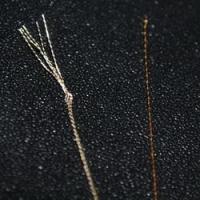
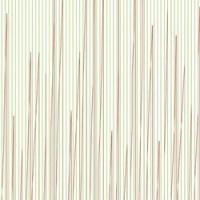
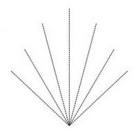
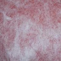
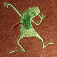
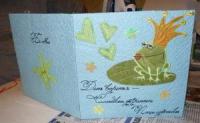
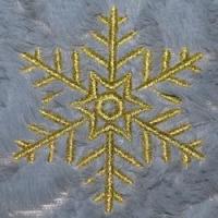
I've decided to try embroidering on fur. I got the design right the first time, without any technical intricacies or brain-twisters while creating. Satin columns on the snowflake did not sink much into the fur, the pile didn't show through the stitching, although I haven't used any toppings (like water-soluble film or a polyethylene bag). Chances are that I just got lucky and picked the fur very suitable for embroidery, with the thin pile 1—1,2 cm high. 

It is commonly believed is that fur is not the easiest material to embroider and that you'll have to give it quite a lot of effort so as to create a high-quality design and embroider it. 
It is advised to make preparations, similar to those you make before embroidering on any other pile or loop fabric: 
If the fur cannot be hooped because hooping will damage the pile, you should stick it onto the stabilizer with temporary spray adhesive or onto the filmoplast. But you'll also need to place a stabilizer under the filmoplast for assurance. 
If it can be hooped, you'd better hoop it together with the stabilizer. Before choosing the stabilizer type, you need to check if the fur is stretchy. If it does not stretch and the design is not big, you may use a tear-away stabilizer, and if the fur contains elastane or has a knitted base, better use a cutaway one. 
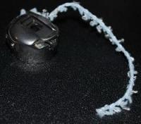
Put thin water-soluble film (or a thin polyethylene bag) on top of it so that the pile doesn't pierce through the stitches. Better still is to hoop the film together with the fabric. You'll get a stabilizer—fur—water-soluble film hooped "sandwich" as the result. 
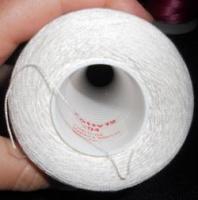
You can use the threads of any thickness and structure. 
The needle size should correspond with the thread thickness, and the sharp (R) needlepoint is preferable. 
In case the pile is very high, here's what you can do: shorten it in places where the future embroidery will be located. Some people use scissors and some — an ordinary hair trimmer. 
Digitizing a design for furs 
It's better to choose bigger designs for the purpose. They don't contain small elements and details that can sink into the pile and become invisible.  Large fonts with thick letters without delicate hair strokes are preferable.  Satin columns should be less than 1.5—2 mm wide. When the stitch length reaches 7—8 mm, they should be compulsorily split.  Pull compensation should be no less than 10% of satin column width.  Filling stitches should be longer than usual (over 4 mm). It will reduce the number of needle penetrations and, subsequently, the possibility of the pile peeping out. Understitching: 
Double run for thin satin columns  Edge run + double zig-zag for thick satin columns  Edge run + full grid at an angle different from that of the main layer — for the filled areas.  The benchmark density value for test designs should be 0.3—0.35 mm. A density like that usually results in a perfectly filled embroidery area. 
If none of the aforementioned tips help and the embroidery keeps sinking in the pile, you can try this: put a low-dense full grid of the same color as the fur under your design: it will trample down the pile and make an excellent underlay. You will be able to embroider even small elements on it not fearing that they will "disappear". 
These easy rules will aid you in taming this fabric even if you have never embroidered on it so far. 
Original text by Marina Belova 
I think that sooner or later every embroiderer comes to a situation where the wrong side of the embroidery must look almost as good as the front side. I'm not talking about the wrong side without knots, bumps, tangled threads and other attributes of an ill-adjusted machine. What I'm talking about is a specific garment, where the wrong side cannot in any way be hidden, so it is very important how it looks like. This is true for such items as: 
curtains, transparent organza-like fabrics, veiling or netting  pennants and flags  also comforters, towels, scarfs, and hand napkins.  Can be anything, really, one cannot count all of the possible options offhand. 
The most common advice on how to make a double-sided embroidery that one hears is to use the upper thread and the bobbin thread of the same type. 
And it is a sound advice in case your design only has one color. But one justifiably wonders — what am I supposed to do if my design contains more that one color; 6 or 8, for example? Such a trick can be pulled off in the case of a single-piece production, where you can have a sufficient number of bobbins with the threads of different colors. But I don't find it very convenient to stop the machine every time I need to change the color and replace the bobbin. And what can be done in the case of the mass production on multi-head machines? I've never once seen a multi-colored embroidery sample with more than one bobbin thread color. So is this advice only good for single items where it is time for such things? 
I've often had to deal with a client's request to not only match the underthread and the upper thread colors when embroidering on transparent tulle but also to remove all the thread ends on the bar tacks! Frankly speaking, it has always puzzled me. I remember once me and my colleague,
Catherine, manually hid the thread ends by inserting them into the needle's end and drawing them under the neighboring stitches — what an interesting job that was! Later I didn't bother to do anything like that, and in case we had such a request from a client, we just cut all the thread ends on the bar tacks, not caring about the fact that the embroidery would unstitch immediately after the first wash. 
If you look at the wrong side of such garments made by the Turks or Germans or Italians, you'll see right away that there are no thread ends there: the wrong side is always neat. This indicates that they: 
either adjust their machines so that the thread ends were short and, therefore, invisible from the start  or, they cut them off afterward like I used to do.  And of course, they digitize the design properly, planning the embroidery sequence in such a way that the number of trims and bar tacks was kept to a minimum. 
Does anyone know how they manage to get such a neat wrong side? Would you please kindly share your experience with us? 
And lastly, more complex items: pennants and flags. I've seen the pennants and everything there is more or less clear for me — the wrong side is simply covered with the piece of the same fabric without the embroidery and the decoration is added along the perimeter. But what about flags?
Do they embroider two pieces of fabric, mirroring the design, and then sew two of them up and add the decoration along the perimeter? How do they do it? Would someone please be so kind to tell us? 
There are more questions than there are answers in the machine embroidery, as usual. 

Original text by Marina Belova 
I'm going to gather all the computerized machine techniques imitating hand embroidery (and not just the embroidery) known to me, in one article.
In my opinion, this subject is rather popular and the clients often ask to copy something they've seen earlier. 
I had an idea of doing it because not so long ago I imitated a hand-embroidered chain stitch on the ordinary embroidery machine — not everyone has the chain stitch machine. The desired effect was achieved by simple steps — I only needed to apply a motif stitch from the standard Wilcom library and select a suitable size. Everyone was satisfied with the result — quick, cheap and look-looking. Now the actress of one of the theaters in Moscow wears the embroidered dress onstage. 
It turns out that if I count all the hand embroidery imitation techniques I'm familiar with, there will be a large number, and many of them I've already covered in my articles. 
in its variety of techniques on various kinds of equipment, including special devices. 
Pulled thread embroidery (Dresden work
3. Filet — the many ways of creating it with the use of easy repetitive motifs are repeatedly described on the Web. 
— the same FSL (or gimp lace) that people like and that was created very long ago to imitate the hand-made lace.
Messiano and Zundt are the most successful in the field of creating the lace of this kind: 

But the simpler technique is also widely known — satin stitches embroidered over the Tatami full grid, even a novice can manage:

5. Crochet, which can be imitated by one or three standard motif stitches found in the library of almost every embroidery editor:

6. Tatting, which is, basically, a kind of FSL, but I'll single it out. Criswell makes machine embroidery designs in this technique and does so successfully.

7. Various hand embroidery stitch imitations:
1) Back stitch. You can either find in your embroidery editor's library or create it yourself and use as a motif stitch:

2) Stem stitch. Once again, you'll pick one from the library or create your own.

3) Tambour stitch (also called chain stitch) — there is a standard motif stitch perfect for imitation in practically any editor: a triangle. And if there isn't one, it's not hard to create it yourself.

4) Various motif stitches, which are used everywhere. There are so many types that you cannot count them.
5) Applique in all its varieties, the subject which I addressed many times.
6) Methods of using woolen threads, and not only them, to create satin stitches, where the stitch goes back and forth several times. Not every editor has this option.
7) Cording
8) Sewing on sequins
9) Long-and-short stitch
10) Trapunto
11) Thick thread or cord couching
I think I can remember more.
It seems that machine embroidery is not so one-dimensional and simplistic in its artistic expression as people often claim it to be. After all, if one cares to think about it, machine embroidery was created exactly for this purpose: to make the manual work simpler and cheaper, and therefore, it can achieve a lot, too.
Original text by Marina Belova 
How does one imitate fur and feathers in the embroidery editor so that they look believable? 
Essentially, there are 2 ways of achieving the result that is required: 
Create all the objects manually, employing traditional digitizing methods.  Use the automatic effects like Fur which allow to quickly and effectively (or so the manufacturers claim) imitate the results of the manual work. Not many editors have this option. It is present in Tajima DGML by Pulse v. 14 and in my Stitch Era Liberty Plus. I've never seen anything like it anywhere else. But as I haven't seen all the embroidery editors, it is highly possible that such a "quick button" can be found elsewhere.  I think that before applying the effects automatically one should turn attention to how it is done in a manual mode. In my opinion, before doing something on the computer, one should focus on hand embroidery first. 
Below are 2 splendid examples of hand embroidery from the book called A-Z of Thread Painting: 


And these are the graphical charts to accompany them, divided into sections where the stitch orientation is specified in accordance with the direction in which fur and feathers grow naturally: 


Methods proposed by the authors are of the most traditional variety — short and long stitch combination with careful color matching: 

Something like that can be done in a machine embroidery editor in the manual mode. The only other thing you'll need is to set the values of density and stitch length, and also to apply some more effects that will help blending the colors in your embroidery later (like a jagged edge) or specifying the direction in which the fur naturally grows — the curves along which the Tatami stitches will be bent. 
I.e. during digitizing you need to create something like this: 

The process of creating such objects is not difficult and can be done in any machine embroidery editor because you'll only need a standard set of tools: satin stitch columns, Tatami fills and running stitches. The process will be long and tedious. 
But it pays because you control 100% of the settings: layers' density, stitch lengths (what is extremely important for quality color blending), edge shapes, the degree of evenness of the surface, sizes of the objects and stitch orientation in them. The same cannot be said about the automatic effects, which I will cover in my later articles. 
 
Original text by Marina Belova 
Besides the standard metallic embroidery threads, which are exactly of the same thickness as the ordinary rayon or polyester threads (#40), manufacturers offer an enormous range of metallic threads of varying thickness and texture. There can be thinner #50 metallic threads for precise handling of the details. And also thick threads from #35 and up to #8. 
These threads arouse interest because of their thickness they allow to achieve the three-dimensional effect and create texture. In my opinion, they will be splendid for machine embroidering sacred images — imitating metallic thread couching. Especially if you use a colored thread instead of a standard bobbin thread, and if you also loosen the tension so that the thread forms some loops on the front side. Who knows all the cases where these threads can be used! Beside artistic effects, the use of metallic threads allows reducing the stitch count in the fill patterns by means of lowering the density, which is quite important. 
Madeira makes very thick threads of that kind, and they are marked FS. Rheingold offers practically the same color and size range, but for a lower price (they are manufactured at the same factory as Madeira threads). Amann, too, has a textured thread called Mety 30. Unfortunately, in order to buy threads of that kind you'll have to run off your feet — they are not easy to find in my country, even in Moscow. 
How should one use them? The information available is sparse, as usual. But you don't need to invent anything, just to make sense of what the manufacturers write on the subject. And if you already used supertwist or thick acrylic (woolen) or cotton threads in your embroidery, there will be much fewer questions. 
A thick thread of that kind is made of several twisted thin fibers. On the photo below you can see an ordinary metallic thread on the right, and on the left is Mety 30 made of 5 strands, each constructed of still thinner fibers: 

Technically the embroidery process with these threads will look like this: 
You'll need thicker needles, corresponding to the thickness of each thread. This is what Madeira recommends: 
A #90/14 needle will be suitable for #35 and #30 metallic threads, a #100/16 needle for #20, #15 and #12 metallic threads, and a #110/16 needle — for #10 and #8 threads. 
In order to insert such a «multi-layered» thread in the needle's eye, you'll need to make a flat knot. Otherwise, the task will prove extremely difficult. 
You'll also need to loosen up the tension, but in such a way that the nasty "bird nests" do not appear. 
Using a thin bobbin thread like ISA 180 is preferable. 
Machine's speed should be reduced to 650—750 rpm. 
Don't forget to choose the appropriate stabilizer. 
As for creating the design, you'll need to expend some effort. 
Pick a big design. Leave all details to be embroidered with the ordinary threads. 
Set the density of the satin stitches, as well as tatami filling stitches, as follows: 
#35 — 0.45 mm  #30 — 0.5 mm  #20 — 0.8 mm  #15 — 0.9 mm  #12 and thicker — 1 mm and more. When modifying a ready (machine embroidery) file you can try to upscale the design. Start with the 10% increase. But you'll have to perform many tests to evaluate the result. Therefore, in my opinion, it is easier to digitize the design for thick threads. At least in those parts where the textured thread will be used. 
Stitch length is no less than 3—3.5 mm. This is true for running stitches as well as for satin stitches and filling stitches. 
Designs filled with tiled patterns look particularly effective when embroidered with the threads of this kind. 
The number and density of the understitching should be kept to a minimum. Especially regarding the use of the very thick threads — you simply won't need much understitching. It will give the extra thickness, which many embroidery machines, home ones in particular, hardly manage to stitch. 
But how beautiful is the result! And besides, it does not require too much of an effort. 

Original text by Marina Belova 
Today there are so many machine embroidery file formats that one may get lost in them. But it is not so important to know all of them as to understand the difference between the editable and the working files. 
In my opinion, all the files should be divided into 2 groups: 
Editable ones  Working ones  Editable files 
These files have a lot of different names, both in Russian and in English, where they have originated from. 
In English they are called by the following names:
object file  condensed file  native file  These files contain information about all the geometric parameters of the objects and elements, stitch attributes (density, pull compensation value, color, the applied functions and so on). These characteristics can be easily altered, optimized and edited, the stitches being automatically recounted. 
In order to open such files, you'll need an editor in which they were created. Or at least a converter, "native" to the same software. You cannot convert one "native" format into another. But you can save any machine embroidery file as editable. 
Here are the most common file extensions for different editors: 
*.PXF for Tajima DGML By Pulse  *.EMB for Wilcom  *.DSG for Embroidery Office and Stitch Era  *.MLS for WingsXP or WingsModular, and so on.  Every type of machine embroidery software has its own native format. 
Working files 
These files have their own names. 
In English they are called by the following names: 
sew file  stitch file  machine file  expanded file  Regardless of how one calls them, these files are ready for the embroidery: the machine recognizes them. Such a file contains only X and Y coordinates of every stitch, color change, trimming and other data in accordance with the file format. *.DST file format, unlike *.DSZ does not contain information about the colors. 
Stitch format is not perfect either. It is hard to edit. It is not recommended to scale it more than 5—10% in either direction. This is because when increasing/reducing the stitch size, the stitches are not recounted, whereas the design becomes less dense and the stitches become longer or shorter. This may lead to the lesser quality of the embroidery. 
The format can be compared with a bitmap image, consisting of colored blocks — pixels. When increasing, every pixel becomes bigger, when decreasing —smaller. This format can be universally recognized and converted. Absolutely every software starting with the converters and ending with editors can work with it. 
The most common file extensions for various types of embroidery machines are: DST, DSZ, DSB, EXP, HUS, JEF, PES, SEW, VIP, VP3, PEC, ХХХ. 
Somewhere in future there will be an article that contains the complete list of file formats in a table. 
Original text by Marina Belova 
I always achieve a better tonal gradation in embroidery if it is made across the direction in which the stitches lie, but it is harder to achieve the same in the direction in which they lie. I have an old article called Creating a Basic Color Blend from the Printwear magazine written by Bonnie Nielsen, which I saved for the future a long time ago, that covers the basic principles of color blending in machine embroidery, among them the ones that I don't seem to get right. So I decided to give this article some time today, in order to find out if the method described in it was good for me, and if not, what was I doing wrong that I kept getting unsatisfactory results. 
The color blending technique is based on simple principles and tools that any contemporary machine embroidery editor has — gradient fill (they are also called accordion) that can be applied to the tatami stitches. Therefore, even a novice can repeat the steps described below. 
This method is not based on the mindless exploitation of the standard instruments of the embroidery design editor where you take two identical objects, paint them in different colors and then apply gradient fill to them and set two different density values, like the one pictured below: 

This is the option that all software developers like to advertise, guaranteeing a superb tonal gradation to every user. But it doesn't always work.
For example, if you try to blend two contrasting colors the result will be far from satisfactory. I think that those who have tried gradients know about this aspect. Even if your editor permits, like the Stitch Era does, blending 3 colors at a time instead of 2. 
Bonnie's method is based on using the same tools described above, it's only that a user has to use his head and his hands as well. 
First, you should not forget that the stitch orientation in the layers must correspond. 
Second, to ensure the subtle gradient color change, you should choose at least 3 colors instead of 2. And they should be digitized in this way: 
1. The lightest color does not fill the entire area, but only a part of it, with no gradient applied to it and the standard density, sufficient to cover the embroidery area throughout — 0.4 mm, for example: 

2. Then the second color is digitized, an intermediate between the first and the second, it does not cover the entire area either, but the accordion effect is applied, and the appropriate density value is set; don't forget that the further is the distance between the rows of stitches, the less intense the color will be: 

3. And the last step — we digitize the third color, which, like two previous ones, does not cover the entire embroidery area. Gradient is applied again, and the suitable density value is set: 

This is how the overlapping layers look on the computer screen: 

The already embroidered square: 

So this method works. Everything seems to be very clear at the first glance, and you manipulate everything easily. But, as it turned out during the testing, choosing appropriate threads is not so important as having a possibility to adjust the distribution of density in this same accordion. Bear in mind that not only stitch length influences the intensity of the color but the density distribution as well. However, not all the editors have this option. For example, both of my 2 layers have a separate density distribution profile. This is a middle color profile: 

And this is the last color profile: 

All of these density distribution values are based on some number of test runs. And even a small discrepancy between the density values of the layers greatly influences the look of the layer with lower density. 
All things considered, this is not the easiest way of color blending because it requires some effort and test runs. Though had I not read the article,
I would never have arrived at a thought on how to apply this gradient to the fills.
Original text by Marina Belova 
A very long time ago I've read on Lindee Goodall's website that the colors in machine embroidery could be blended not only by way of adding tone to the main color but also the other way round. I made little of it then, having considered this technique just a slightly odd variation of a traditional one. 
But when I created a pony free embroidery design not so long ago, I, by a fortunate coincidence or rather because I added the understitching manually, noticed that the method described by Lindee does indeed work: 

After that I saw an embroidered logo at my work, executed in exactly the same fashion. And then it dawned upon me that a rare technique can rival this one in its simplicity and availability: You don't even have to bother about splitting the objects into segments, orienting your stitches and adding the understitching so that it won't show through the upper layer of low density, etc. The gist of this method is as follows: 
Place the tonal layer under the main fill in the required place. Set the density at an ordinary value or 1 or 2 points lower. Remember that the stitch orientation in the main and tonal layers should be matching to a tee. 
The density of the main layer is standard, 0.4 mm, for example.  No understitching in the main layer.  It is also very important for your editor to distribute the stitches in the layers in such a way that majority of them do not overlap, but fit in the free space between the stitches of the preceding layer. 
Not every editor can give you the required precision in stitch allocation. But this is what makes it possible for the inner layer to peep through the densely laid stitches of the outer one, creating a very thin watered effect in case the colors are chosen appropriately. 
Original text by Marina Belova 
There is an enormous load of information on how to digitize embroidery designs for caps. But for some unknown reason, every time I see a new design which has to be placed on the cap front, I begin to panic and wonder: which of the well-known rules will work for this particular case? And every time I feel like a novice, though, from the theoretical perspective, everything seems to be clear. 
So, I'll proceed to the theory of creating embroidery designs for caps. 
It's better to create simple and big designs. Extra details that can be spared should be removed.  The design is usually 2.25 inches (55 mm) high and 4.5 inches (112.5 mm) wide. To be sure which elements of the design will end up in the resulting embroidery, it is usually recommended to print the design at one-to-one scale and place it onto the fabric where the embroidery will be located. It will be instantly evident which of the details will be embroidered, and which ones won't.  The density of the embroidery can be increased a bit compared to the standard value for such fabrics (for example, 0.3—0.35 mm for twill). But it seems to me that the density value should be the one the designer prefers.  Remove the understitching from the object's edges (more than 0.7 mm).  The test sample minimum size is 6—7 mm.  Avoid intricate outlines (double runs of satin stitches, satin stitch + running stitch combinations and so on). Avoid the long jumps between the objects.  As the cap front in not a flat, but a rounded surface, there is a higher possibility of distorting the outline during the embroidery, and of failing to match the outlines or just to land in the allotted space when aligning the parts together. To avoid this, you need to follow simple instructions concerning the order in which the parts should be embroidered:  Big objects or the ones in the center are embroidered first.  Then come the color changes. For example, if you have a letter with an outline, it's better to embroider the outline right after the letter has been finished.  Embroidery should be planned from the center outwards and from the peak to the top of the cap. On the picture below you can see the classic example of the word written on the cap front. In this case, the embroidery sequence will be as follows: first the letters "ивка" embroidered from the central seam to the side and then "шыв":
It is important to avoid letters crossing the seam where possible, shifting the inscription to the side.  If you have to embroider a letter over a seam, after all, you can try to flatten it. The recommendation for such cases states that you should cover the seam with a zig-zag stitch added specifically for that reason. The thread color is usually chosen so that it matches the color of the fabric of which the cap was made: 
To smooth the cap surface before the embroidery, you can use the next trick: place an underlay of a particular kind, shaped as the leaf veins, and of the same color as the cap (one of the radial underlays): 
It is always worth considering a possibility of attaching an applique — all you need is to sew in onto the cap.  Everything seems to be clear. And yet, every time is like the first one when you're dealing with caps so that you need to use your head. And of course, take advice from much more competent people with more experience. 
Speaking of which, how do you create such designs? 
Original text by Marina Belova 
Sometimes even in machine embroidery, there is a place for enlightenment when a technique seen many times before elsewhere assumes its own meaning or begins to shine with the new colors. "The penny dropped!" they usually say. 
I'll take the roundabout approach to the subject. 7 or 8 ago a manager of one of the Chinese thread manufacturers was showing an embroidery sample where the key component in the creation of the design was the underthread instead of the upper thread. Accordingly, the front side of the embroidery was situated on the back side of the hoop. 
Even then the Chinese manufacturers had a small collection of bobbing threads of different colors and thickness specifically for that purpose. In those days, this information fell deaf on my ears. And after that, while thumbing through the books on the free-motion machine embroidery technique I often saw that instead of an ordinary underthread you could use virtually any thread, even the one that cannot be used as the upper thread because of its thickness or twist. It can be a mouline thread or special decorative sewing thread like Madeira Overlock #4 or the ordinary not so thick knitting thread or a thin ribbon. Anything that can be wound up on a bobbin and tucked in a bobbin case. These are the threads I have: 

Val Holmes encyclopedia of machine embroidery calls this embroidery technique a "Cable Stitch". A similar way of attaching a bobbin thread or a thin cord imitates a hand embroidery technique where a thread, a cord or a ribbon is couched. This is a godsend for those who need to sew down the cord, but whose machine is not equipped with a special device for it. 
This week I saw a photo of the embroidery with the ordinary knitting threads in the very same technique and was illuminated by it. I wanted to try it right away and see what would happen. 
The design can be made very easily: you just draw the trajectory with a running stitch or a hand stitch — depending on the idea or an image. In my opinion, the embroidery design should be created so that you won't have to return to the same place several times. I.e., the design should be drawn "in one stroke". The stitch length is set at about 2.5—3 mm. But, in my opinion, one should experiment with the length, for everything depends on upon what you embroider with. Below is my first test piece: 

I decided to do without bar tacks for fear of the knots and "bird nests". Stabilizer is not necessary for this kind of work if I understand correctly. As for the tension, the adjustment will take some time. 
First, you must loosen the tension on the bobbin case in accordance with the thread type. Too loose a tension, theoretically, will result in the loops on the wrong side, not unlike the one on the terry cloth. Tension adjustment changes the size of these loops. Suitable tension makes couching imitation possible. No, not imitation — for it is real embroidery couching.
Second, you should just as well adjust the upper thread tension in accordance with the desired effect. In case it is too loose, the upper thread will form loops on the bottom of the fabric, creating an additional embellishment. This means that the upper thread will contribute to the design creation. If the upper and the lower thread tension are balanced, as usual, the result will be a simple running stitch with the upper thread slightly pulled across the lower one. 
On the photo below you can see a bobbin with a knitted thread wound up on it. I wound it up manually. To my regret, only a small amount of thread can be placed onto the bobbin in this way: 

I insert the bobbin into the bobbin case, loosen up the tension:
 
Start the embroidery: 

It runs smoothly. Even the trimming works well: 

This is the wrong side of my fabric — the upper thread has formed some loops:
 
And this is after I've tightened up the upper thread tension so that is wasn't pulled through the fabric to the wrong side: 

Unfortunately, no matter how long I've been adjusting the wheel, I haven't managed to get the underthread loops on the bottom of the fabric.
And on the photo below you see the fabric embroidered with the Overlock #4 thread in the bobbin: it looks similar to the mouline thread — multi-layered and not twisted.

It turns out to be that easy. Just imagine, how many interesting designs you can create in this way!
Original text by Marina Belova 

What should one know to begin machine embroidering? You should have the following equipment: 
Embroidery machine Ready embroidery designs  Fabrics  Threads  Stabilizers  Time  And, the most important thing, the knowledge of how to use all that. It would also help to know what kinds of things can be done on an embroidery machine. 
The embroidery machine manual will tell you how to operate if you there is no one there demonstrate. You don't need to be afraid of the machine, just follow the manual as accurately as possible. 
There are tons of ready designs on the internet, which you can download. You can also find pretty designs in our shop. 
There would be no problems with buying the fabrics for your first attempts, either. The crucial thing is to distinguish between the various fabric types, to understand their specs, and how that can influence the embroidery. 
As for the embroidery consumables, things are a little tight where I live nowadays. Embroidery threads range is not big in the ordinary crafts shops, but it is possible to buy them nevertheless. The stabilizer is one of the most enigmatic of the consumable materials: you need to be able to distinguish between them, in order to choose a right kind of stabilizer for a right kind of fabric. Not only is it enigmatic, but you need to search for the particular one you need. 
And the last thing before you start the embroidery is hooping. It is no mystery either: the fabric should be drum-tight in the hoop. So that it is not distorted. But it is not so in every case. A bit of practice with different kinds of fabrics and everything will be fall in place. 
It would be useful to know the most common machine embroidery myths. 
Frankly speaking, having assembled a library that contains more than several tens of thousand ready design files, I've hardly embroidered 10 of them over the course of my whole career. And why? Because it is much more interesting to create the designs yourself. 
You'll only need 2 things to do that: 
Machine embroidery software. How to choose a proper one? You can read my article on the process of choosing machine embroidery editor.  Twice as much time for design creation and for testing.  Where do you start digitizing? General theory, I believe. I have some here, and I would suggest the following order: 
What is digitizing in machine embroidery?  Check list of a machine embroidery design creator  Tips for productivity in the design creation. Getting started  Image analysis before the digitizing takes place Design creation: tips for productivity. Operational standards in machine embroidery software  The difference between the editable and working embroidery formats  Types of objects to be digitized  Four main types of stitches Quality benchmarks. Object characteristics  Quality benchmarks. Choosing the stitch length  Quality benchmarks. Understanding density  Quality benchmarks. Secrets of pull compensation  Quality benchmarks. Push compensation  Quality benchmarks. How to use understitching Quality benchmarks. Controlling the stitch angle Quality benchmarks. Shortening stitches on the inner side of the contour  Quality benchmarks. Rendering corners  Quality benchmarks. Tie-offs  Connector stitches between the objects and inside them in the machine embroidery  Embroidery navigation  In my opinion, this information is sufficient to grasp what various tools in machine embroidery editors are for, and to start doing something on your own. The rest (such as the shape of the edges, varying density, the creation of fill patterns and motif stitches, etc.) can be saved for last when you digest all this information. 
After you get wise to it, you can proceed to master a machine embroidery editor and create your own simple designs. You can learn how one does that in my article "On the crossroads between knowledge and mastery". Unfortunately, I haven't yet found time to write a beginner's guide to machine embroidery software. Eventually, I'll come to that. 
And after that, when you figure out nuts and bolts of the machine embroidery editor, and it becomes your ally, you can try various techniques, to practice what you've learned. 
Of course, this is not the end of the machine embroidery. This is only the beginning. Just try it, and you'll know why. 
Original text by Marina Belova 
I've been drawn to the idea of saving lately. Nothing can help you to save money better than the absence of the thread breakage. Just try to estimate how much money you waste on dealing with a broken thread, then come back and retrace the embroidery. One should also remember that the place where the thread had broken stands out to the naked eye. 
In theory (and in practice), every design should not just be beautiful, but, with the good performance, able to be embroidered, too. I've read on Frank Gawronski's website recently that a machine embroidery design is considered good when the thread breaks less than once every 10—15 thousand stitches on the multi-head embroidery machine. And less than once every 60—100 thousand stitches on the single-head embroidery machine. 
Unfortunately, the facts that I've picked up in the course of my embroidery career, say the opposite. Often the consumables — needles and threads — were to blame. I remember that once when I was using a Chinese brand, the thread broke every 100—150 stitches, and when a German brand was used instead, the trouble vanished as it by magic. The embroidery looked fluffy without using any acrylic threads. Sometimes, an embroidery machine had its needle in the pie. And also the designs often are third-rate. 
The reasons for the thread breakage depend on all kinds of factors: 
The design  The embroidery sequence  Embroidery machine settings  Consumable materials (threads, needles, stabilizers and so on.)  Embroidery machine operating skills  I will not enlarge upon the embroidery process itself and also upon the consumable materials — those are the topics for two separate articles. I'd better bring your attention to the things you should check out in order to minimize the thread breakage. 
The design 
The embroidery sequence begins with the good design. Before digitizing it, you'll need to make the assessment in order to find possible problems. Such problems as too many details that result in multi-layered embroidery, which can lead to the thread breakage because of its thickness. Too small details: thin outlines, curved in too many places, etc. It is possible that some of them can be spared or simplified. 
Digitizing 
There are 3 main reasons why poor digitizing leads to the thread breakage: 
Wrong stitch length Automatic trimming in wrong places  Excess stitches squeezed into a too small embroidery area  Dealing with these reasons prevents about 75% of the thread breakage. 
Wrong stitch length 
As you know, almost any embroidery machine is capable of making stitches from 0.1 to 12.7 mm long. But in reality, it becomes clear that stitches under 1 mm and over 7 mm are the reason for additional thread breakage because of the curves and because the needle deviates from its axis. 
Therefore, you should check out the stitch lengths in a design before digitizing. Modern embroidery software offers all kinds of handy tools, such as removing stitches shorter that the stated value. Also, there is splitting long stitches into shorter ones. 
Carefully digitize automatic trims 
I won't reinvent the wheel if I mention that a trim requires a tie-off before and after the trimming. Though I've often heard that you can dispose of the one after — the understitching is there, anyway, and it should not be secured with lock stitches, for they are underneath. Moreover, I tried this once. Technically the absence of lock stitch on the object that follows is a common reason for the thread coming out of the needle. And this can count as breakage. 
Tie-offs protect the design from breaking loose. When the machine resumes the embroidery, in only has a short thread end to make the loop.
Therefore, you should place a lock stitch and resume the embroidery on a low speed in order to avoid thread coming out of needle at this moment. 
Nowadays the digitizer won't have any trouble inserting a tie-off. For virtually every editor has a logical value that automatically does that after color change and trims. This makes the job much easier. 
Lower the density 
The excessive stitch count in a small embroidery area will lead to the thread breakage because of the high density. It is necessary to lower the design's stitch count, simplify the details, decrease the number of layers and use motif stitches and patterns. I.e. reduce the number of stitches as much as possible. I've expanded on the subject here. 
Proper digitizing depends not so much on the software, but on the knowledge and skills of the design creator. For any embroidery editor is only the instrument for making the task quicker and easier. It cannot estimate whether the design is made right or wrong. Machine embroidery software does not know, what can be done and what is not recommended. It does not have an algorithm for such things. 
It has been said that everybody who can draw in a computer program can learn to digitize machine embroidery in no time. But based on the above, one can conclude that a digitizer should know the embroidery process inside out and also have a profound knowledge of the theory of machine embroidery. This is necessary for understanding what embroidery software options work well enough, and what would be better done manually. 
 
Original text by Marina Belova 
Nearly every machine embroidery software that proudly calls itself "Professional" has a very interesting option that allows users to dynamically change satin stitch density, depending on the stitch length. When the option is enabled, the software lowers the density (makes the space between the stitches wider) for the short stitches and increases it (makes the space between the stitches narrower) for the long stitches. This is necessary for sufficient covering of the fabric without distortion due to the excessive density and gaps due to the deficient density. 
This option in machine embroidery editors is called differently. I'll name just several. 
Auto-Spacing (Wilcom)  Variable Pitch (WingsXp)  Ramping (EPC win)  I'll only examine the first two. 
This thing is extremely handy. No trouble with dividing the objects into separate contours, in order to find suitable density for every one of them in accordance with the stitch length. This is not against any recommendations on how to choose a proper density. More in my article on density. 
I'll show you how changing the stitch density looks using this example: 

The upper satin column with uniform density throughout the length of the object, which is equal to 0.6 mm. 
In the lower satin column short stitches are sparse, but when moving to the right edge they become longer and more fit together more closely.
This is despite the fact that the basic density value is set at 0.6 mm for both objects. And the stitch count in these two object is different as the result. In the upper contour, where the density is consistent, there are 118 stitches, and in the lower one, where the density changes dynamically 132. 
What's interesting is the way the editors allow their users to influence the density dynamic pattern. Customarily, you can set the percentage change value, beginning at 0. But, frankly speaking, it does not offer much help in my case. What does it mean, 50 or 70 or 150? I don't get it.
What does it mean, more stitches if <100% and less if >100%? Any why the best result can be achieved at 75%, as it is stated in Wilcom manual?
The whole algorithm is not clear to me. 
Wilcom went even further and suggested the users to adjust the parameters to change the density, depending on the stitch length. You can insert your own density, stitch length and thread thickness values on the Auto Spacing panel, pictured below. 

At the same time, the crafty manufacturers did not provide any coherent recommendations on which values are right and which are wrong. Either that or I've missed it. In any case, users have to choose from the number of pre-defined parameters that can be found in the table sheet here. The basic density value here is 0.4 mm. And if I need to increase or reduce it, I cannot use this option. What am I to do in such cases? 
WingsXP does not allow the users to alter the algorithm by themselves. But the manufacturers don't make a mystery of how the density changes depending on the basic density value, which is set by the user when digitizing a design. 
The density dynamic change table sheet is taken out from the WingsXP manual and looks like this: 

What I like very much about WingsXP is that it is possible to calculate the density not only in accordance with the default 0.4 mm. And also the fact that I don't have to exert myself. You can use this table sheet to set density values manually in case you cannot use the automatic option.
WingsXP generates stitches rather good, and can be trusted. 
An undoubtedly useful option, in general, but, unfortunately, not every editor has it. 
Original text by Marina Belova 
Sole-colored Redwork designs are considered the simplest hand embroidery technique. It used to be made with a red thread on fair-colored — white or creamy — fabrics made of natural fibers (muslin, percale, linen and so on). The designs in only one color were used everywhere in the earlier days: on clothes, bedlinen, and table-cloths, also as room decorations. 
Even now you can see a lot of sole-colored designs in various online shops. Only in those days the designs intended for hand embroidery were rather simple and crude. This is the reason why they used to be the first step in embroidery education. Running stitches, chain stitches, and french knots were used. Below you can see the example of the classic sole-colored design of the 30s from the book called Antique French Textile for Designers by June K. Laval. 

Nowadays not only simple designs, embroidered just with running stitches, but also immensely complex graphic designs that contain other stitch types as well, are common in machine embroidery. For example, this piece embroidered with black threads, won a prize this year from the Stitches magazine: 

Thence, not all sole-colored designs are dull, for they have something in them that justifies the focused attention. 
The creation process is not at all difficult for this is just everyday embroidery. You simply hoop the fabric and embroider. There can be even simple designs, where a stabilizer is not needed, for they are embroidered with running stitches only. But if a design is big and full of stitches of various types (like the one pictured above), a stabilizer will be necessary. 
Digitizing 
I will only review the simple and most common type of sole-colored designs — the one made with the running stitches. 
Digitizing recommendations are as follows: 
Prior to the embroidery, the image should be simplified as much as possible. Small details should be either removed or combined with the others or upscaled a bit. The lines should be smoothed out.  The design should be digitized with a double or triple running stitch in accordance with the size of the elements. A single running stitch can be used for very small details.  I've seen an insistent recommendation to digitize such design with bean stitches. This type of stitches lowers the possibility of looping and misplacing lines on repeats, especially when embroidering on the fabric with polyester batting.  But in my opinion, a triple running stitch looks rather crude, and if a line fails to follow the steps of the previous one to a tee, it makes the work more lively and artless. And on top of that, when digitizing with a triple running stitch or bean stitch, one should plan the embroidery sequence with the utmost care, which does not help to save time. But, every man to his tastes.  Stitch length 2—2.5 mm. No less than 1 mm for small designs and details.  Try no to use the dynamic stitch length in order to follow the trajectory as close as possible.  The design should be digitized so that it is embroidered all in one go. It's better to avoid trimming. Therefore, it is necessary to carefully plan the embroidery sequence.  I point out that the process of digitizing this particular embroidery is the same in all editors, professional and amateur alike. 
I picked a simple vintage image from the Briggs’ Patent and digitized it with only one color. 

But digitizing took 30 minutes of my time. I created it manually, with the only 1 running stitch, with the stitch length equal to 2.3 mm, without trims — in a "single stroke" technique, that is. Every line was made by two simple running stitches. The stitch count is 1593. The image size is 74.8x72.2 mm. This is how it looks on the screen. 

And this is how it looks already embroidered on the blue fabric with black threads, in a large 120x30 frame (which is not at all how it is intended).
That's why the look is so lively and not sterile. 

A very quick and economic embroidery technique. 
P.S. The best free manual on how to digitize designs like that was created by Brad Martin, and can be found in Floriani Club on Youtube. In case you are interested, google Floriani Club — Making Lineart from a backdrop. 
Original text by Marina Belova 
Myth #1 
Machine embroidery is very easy. Just pick up the fabric and threads, hoop, then load the file, press one or two buttons — and that's it. 
It's a common misperception. In reality, a high-quality machine embroidery results from these things: 
Knowledge  Practice and, consequently, experience and skills  Attention to details  Myth #2 
You need to know how to sew in order to embroider, 
In all the years of doing embroidery, I didn't need perfect sewing skills once. Only one sewing skill, in my opinion, will come handy — to add some more fabric, if the piece you have is too small to hoop. And for that, you'll only need to stitch a more or less straight running stitch on your sewing machine. 
Myth #3 
You don't need to test new files, better to save your money and consumables. 
Testing is what allows you to see and correct mistakes in a design, choose your stabilizer, tune up your equipment before starting the embroidery on an item. This is exactly this process that will determine how successful your result is going to be. In order to know more read this article. 
Myth #4 
You can do a test piece on any kind of fabric to save money, with any kind of needle and on any kind of stabilizer — i.e. breaking all machine embroidery rules. 
I fell for this one many times. The special aspects of the embroidery will be different in case you use some other fabric, some other threads, and consumables. On top of that, the design will be created with the special aspects of other materials in mind. And embroidery, in this case, will be full of surprises. 
Myth #5 
Any design could be embroidered on any kind of fabric. 
There are no perfect designs that are good for all fabrics. But the creation of the design is only the small part of achieving a high-quality result in machine embroidery. The main part is technique. 
Myth #6 
If the contours shift during the embroidery, if gaps or other defects are present, this results from having a bad design. 
As they say in the East: you need two hands to make a clap. Mistakes made during the embroidery, as well as the mistakes made during the creation of the design, can be the reason for the defects. Click here to know what is it that causes a particular defect. 
Myth #7 
If during the embroidery the thread and needle break often, if other troubles with the equipment are present, this indicates a bad design. 
Though incorrect digitizing or the use of low-quality consumable materials may be the reason for the defects, the technical condition of your embroidery machine should not be overlooked. More about defects in machine embroidery here. 
Myth #8 
You can substitute specially designed consumables with cheaper materials to save money. For example, use building spunbond instead of a regular stabilizer or plastic bags instead of water-soluble film. Also, replace high-quality threads with the cheaper ones. 
Machine embroidery stabilizers are considered the main part of a successful result. Cheap materials can fail to provide substantial support to the fabric, and this will lead to using a bigger amount of them. You can read about my own attempts to find the substitutes affordable to everyone in the articles: 
Seeking for 3D Puff replacement Seeking for 3D Puff replacement again Seeking for 3D Puff replacement-2 Seeking for stabilizer replacement The same can be said about the threads. Cheap ones often break during the embroidery, which stretches the production time to the limit. I already wrote how much the thread breaks cost. 
Myth #9 
Try to follow general recommendations of how to choose the right kind of stabilizer for a particular fabric. 
If those recommendations were always relevant, regardless of the fabric type, the design, the machine specs, it would be too easy. For the one giving those recommendations knows nothing about your current situation. Always test everything. 
Myth #10 
The fabric should be stretched drum-tight in the hoop. 
If you stretch the fabric in the hoop too much, then after the embroidery it will try to return to its original shape — that will result in creases, which cannot be removed no matter what. This rule does not apply to those garments that will be worn in a stretched state. Read more on basic rules of hooping. 
Myth #11 
You should tighten the screw after hooping in order to pull the fabric more. 
If you do that, you can damage the fibers. 
Myth #12 
Machine embroidery non-editable files can be scaled by as many percents as you want. 
You can make the designs in the non-editable files 5—10% bigger or smaller, but not beyond that. It is commonly believed that such small scaling percentage won't damage the quality of the design considerably. The one thing would need to be checked: whether the stitches did not become shorter than 1 mm and not longer than 10—12 mm. Marginal length values can cause problems during the embroidery: thread breakage, needle breakage, etc. 
Myth #13 
All threads are interchangeable. 
I came across the fact that the threads were not indeed interchangeable when it became clear to me that it was impossible to substitute #40 rayon with #40 polyester — the result would be unexpected. To say nothing about changing the thread brand without doing some tests first, even if the thread thickness remains the same. Amann #40 rayon thread may be used as an example. It is much thinner than other manufacturer's analogs.
Click here to see how I embroidered the same design with the threads of different brands. 
Myth #14. The most important one, in my opinion. 
You can learn how to embroider, digitize impeccable design by only using recommendations, books, and other educational resources. 
Without endless testing, reworking, without failures that give us food for reflection, theory, and someone’s recommendations remain recommendations that allegedly work. Machine embroidery is practice. You should not take anybody's word. But check every little detail yourself instead. Even the words of great authorities on the subject. 
 
Original text by Marina Belova 
I'll continue my recent article about motif fills and how to manage them. Today I'll inquire into the main principles for the creation of the standard flat fills. 
A standard flat texture is a number of simple running stitches grouped together in two or more layers. The needle penetrations are evenly spaced and every stitch has its fixed length (excluding the end of the stitch line before the edge of the object). Usually, Offset or Tilt is used to slightly shift each row of needle penetrations against the next one, which gives the texture a smooth look. 

The rules of creating these kinds of textures are very much alike in all sorts of embroidery editors. The key difference of this particular software is the ease of handling, as I've already mentioned. 
Let's see how does one create a decorative fill (standard fill, manual pattern) in the Stitch Era Liberty editor. Here you can see the result right away, which is a great advantage. 

Like in any other embroidery software, you have access to the following parameters: 
Stitch length in mm (Length)  Number of lines that form a group and a pattern of needle penetrations (Lines)  Shifting of the neighboring rows of needle penetrations. As a general rule, this is a percentage of the stitch length (Line Offset)  Usually, the creating of the flat texture ends here. But this editor has 3 more parameters which you can tweak if you like. 
Stitch Offset, which places the stitch above the specified position (Random equivalent). If the value is set to 50, you'll get the following texture for the object above: 
Line Offset, which shifts the lines and groups against each other (Random equivalent). It's not quite clear for me, what it is used for. I set it at 50, leaving the other parameters as they were, and got this: 
Tilt — another way of shifting the lines and groups of lines against each other. I set it at 7, left the other parameters as they were, and got this: 
After you have achieved the desired result, you need to save the newly created pattern under the new name, and then select it right away through the library. 
Here is an illustrative example. I created a classic flat texture which is present in any machine embroidery editor (I did not have it, but I do now). To do so I created a basis for it — 3 lines with 1/3 stitch offset. The rest of the settings were left as they were: 

This is how it looks when applied to the real object: 

Therefore, you need to have a clear view of the pattern you want to create. 
Original text by Marina Belova 
I'll continue my new series of articles on motif fills and standard fills. Today I'll inquire into the main principles for the creation of the decorative fills. 
Program split texture is a texture where all the needle penetrations follow the specified pattern. During the embroidery slight shading is added to the place where the needle penetrates the fabric, thus adding volume to the filled area. The examples of the program split textures below: 

I will divide decorative fills into 2 groups: 
Simple pattern, which is made by the long smooth satin stitches (the 3 samples on the left).  Composite pattern, which is a combination of the standard flat fill and the raised flat pattern on top of that (the 2 samples on the right).  The rules of creating these kinds of textures are very much alike in all sorts of embroidery editors. The key difference of this particular software is the ease of handling, as I already mentioned. 
Let's see how one creates a decorative fill in Stitch Era Liberty. Here you can see the result right away. 
To create a simple pattern, select Creative Pattern in the pattern editing window. An empty white square appears in which you'll need to draw your future pattern with the help of Tools (on the right): 

I decided to copy the braided pattern, which is inaccessible to me in the free version. Or, at least, something that resembles it. 

I draw according to the grid like we used to do in Paint a long time ago. Every cell painted black is a future needle penetration. The size of the square (rectangle) is of a vital importance (Height and Width, on the top right). 10 points are equal to 1 mm if I'm not mistaken. Hence, the "80x80" on top of the photo means that the size of the pattern will be 8x8 mm. You'll need to calculate the distance between the penetrations in accordance with the grid in order to avoid too short or too long stitches. 
This is what I drew: 

Everything that you do inside the square field will instantaneously appear on the background. This is how it looks: 

All that is left is to save it to the library under the new name, for the future use. This is the braided pattern I got in the end, having applied the newly created pattern to an object: 

You should remember that the pattern can contain stitches of varying length. Especially where the lines of needle penetrations cross each other. This can cause problems when using a metallic thread. Therefore, you should pay close attention to the stitch length, with short stitches in particular. If there is no possibility of removing short stitches automatically, it's necessary to get rid of them manually. You can see on the picture below that the editor had erased the excessive needle penetrations in my pattern: stitches less that 1mm long were automatically removed by consolidating 2 stitches into 1. 

Not every embroidery editor has the option for the simple creation of a composite pattern that consists of Tatami stitches and satin stitches. 
I haven't found a convenient way of doing this with the flat fill in Tajima. I only noted that all needle penetrations must be drawn manually, which is not very convenient, is it? 
In Wilcom we create a simple as well as a composite pattern in 2 steps (both are the parts of the same process): 
Create a vector image of no particular shape. I did this: 
Select the newly created object, click on Special in the menu and choose Make program split. Save it under the different name. 
Now this new object is already a part of the library, and you can use it, adjusting the outer look of the pattern (simple or composite) with the help of Program split -> Combination split. 

In Stitch Era Liberty the process of creating a decorative pattern is a lot more interesting than in Wilcom, and there are 2 steps in it: 
Creating a raised pattern (satin stitches).  Combining this pattern with a flat background texture of your choosing. 
To create a raised part of the pattern (print, mask), choose Pattern Masks in the pattern editing window. Again, using the grid, draw the white mask (your future pattern) in the black square that appears with the help of Tools. The whole white area will be covered with satin stitches. But first, you need to choose the size of the image (Height and Width), just like you did with the simple pattern — to understand how long the stitches will be. I drew this figure in the square (see the picture below), and immediately saw how it will look with my texture: 

Then I saved my mask to the library under the new name. After that, I go to Combined Patterns and begin to put the flat fill from the library and the newly drawn mask together. First, I add a flat background texture (it may look the way you like). Mine is the simplest, but you can select any one from the library. 

Now I add another mask — the one I've just created (or the one that is already there): 

In the end, you can play with the settings a little. Shift the masks slightly and widen the space between the satin stitch columns and rows, using Offset and Spacing on the right: 

The composite pattern is now ready. I save it for the future use: 

Here's how this same mask looks with another texture: 
 

Original text by Marina Belova 
Color blending adds realism to the design, which is often desirable when embroidering flowers and animals; logos also come with gradients.
Everyone can use the color blending technique, and it does not matter, which machine embroidery software you employ. 

There are several ways of making realistic-looking blends: 
Use the software capabilities, applying the automatic gradient effect to the object.  Show the color tones and gradations, using a simple running stitch and standard fill. The latter can be only achieved manually and, in my opinion, requires exceptional digitizing skills.  Creating tonal gradations by mixing fill stitch or satin stitch layers of varying density and thread color.  Automatic gradients 
Modern embroidery software offers its users an automatic gradient fill for blending colors and creating the effect of the smooth transition from one color to the other. This effect is present in many editors, but only for the fills. Let's see what possibilities this method can offer, using a standalone machine embroidery editor called Stitch Era Universal. You can download it here. 
I chose a sole-colored object of a simple shape and filled it with the ordinary unidirectional Tatami. 

3 types of automatic Gradient fills that use 1—3 colors can be applied: 

In case you use only 1 color, it will look something like this: The result depends on the type of gradient used. This is what I got: 

In the panel on the picture below you can see how much the density value will increase or decrease after this effect has been applied. And not only see: you can create your own gradient type with your own density values right there: 

This is what I got with 2 colors: 

After I chose a 2-color gradient and the way it should look, the editor automatically generated 2 objects of different colors and with different types of gradient applied to them. The stitches were packed tightly in one of them, and sparse in another. You can see and adjust it, using the panel pictured below: 

When I applied a 3-color gradient to the same object, I got this: 

In this case, the editor automatically generated 3 objects of different colors with different types of the gradient. You can see and adjust the density distribution, using the panel pictured below: 

As you can see on the chart, the 3rd color has consistent density, and the first 2 change their density in different directions: the stitches are closely spaced in the 1st, and sparse in the 2nd, and vice versa. 
This editor gives you a room to play with gradients, for it allows to make adjustments. And this is extremely helpful when you create color blending effects in machine embroidery. 
The same settings can be applied to satins. 
The color transfer with the help of the running stitch and a standard fill 
This method is based on the use of a filling pattern, which creates the background that is emphasized by the running stitches on the front. 
The filling pattern may be unidirectional or curved along 1 or 2 lines. On the top of the pattern, you draw a running stitch by hand, in order to create dancing shadows. You set the stitch density, the stitch direction — it should match the one in the lowest level — and the stitch length. The running stitch may follow a number of trajectories. 
In order emphasize the contour of the objects, you need to place the running stitches so that they would follow the shape of the outline. 

The stitches of that type do not intermingle with the stitches in the lower level and therefore create the contour effect. 
To achieve the color blending effect with the help of this method you need to position the running stitches in the same direction as the stitches in the lower level. You should get something like this: 

All outer colors are "painted" by the running stitch against the background layer. Only the stitch length varies in order to achieve the "sinking" stitches effect. 
I've seen John Deer applying this technique in masterly fashion — not only for the fills but for the satins, too. I particularly liked the way he created color blends using nothing but running stitch. 
Technically, this method can be recreated in a simple mode. Instead of drawing everything manually, you can replace them with satin stitches or fills, having set the proper density, stitch direction and stitch length. 
Mixing colors by playing with density values 
This is the most complex of the traditional color blending techniques, where the tonal gradation is achieved by intermixing the layers of different colors. Applicable both to the fills and the satins. 
In this case, you create several contours and place them on top of each other. You'll need to pay attention to the density of each layer so that not to get the embroidery that sticks out. 
Color blending: general recommendations. 
When gradually reducing stitch density, keep in mind that the density value of the next layer should be a multiple of the layer number: 0.4 mm for the 1st, 0.8 mm for the 2nd, 1.2 mm for the 3d, and so on. 
While digitizing, you should also remember that the shadow layers, despite being of low density, also cause push and pull effect. 
Feathering is good for smooth tonal gradation. 
The use of the threads of different brands and structure, but of the same color helps a great deal (this one is true for other color blending methods). 
In order to achieve the "moving stitches" effect along the outline, you can try to split the shading layer into narrow satin columns and overlap them, changing the stitch direction only slightly in every one of them, creating the illusion of movement along a curve. 
Be careful to avoid placing stitches along the specified line, because setting the trajectory automatically rarely achieves a good result. It is often better to use simple running stitches, added manually. 
You can achieve the realistic look in any embroidery editor that has a basic set of tools. One thing is the necessity to control the density, stitch length, and texture. The knowledge of how to place the stitches manually is 90% of success. You should not forget that a satisfactory result can hardly be achieved by breaking the general rules of using the color wheel. 
Original text by Marina Belova 
Proper stabilization of the fabric during the embroidery in order to prevent the distortion remains one of the most acute problems. Even in my not so long embroidery career, numerous garments were ruined simply because of disinclination or, more often, inability to use the stabilizers (or interfacing materials). It goes without saying that, unfortunately, I don't always use them even now. 
The rules of choosing a stabilizer (or interfacing) are very simple and quite logical. It only takes to comprehend them once in order to use a suitable kind of stabilizer in any particular case in future. 
In my opinion, all stabilizers should be divided into two main categories: 
Backings  Toppings  Below I'll only list the types of stabilizers commonly used. 
Backings 
Backings are special materials, usually non-woven, which are placed under the fabric. They serve to support and stabilize the fabric when it's being embroidered, prevent creasing, distortion, stretch and pull, both during the embroidery and after washing or dry-cleaning. 
There are several types of backings: 
Tear-away  Cut-away  Adhesive  Soluble  Fusible  Tear-away stabilizers 
This type of stabilizers is good for most fabrics made of natural fibers and gives only a temporary support. Main recommendations: this type of backing is easily removed and can be successfully used with the items where the wrong side can be seen (towels, plaids, scarfs and so on). It is also widely used with non-transparent fabrics of fair colors, with thick and densely woven fabrics made of natural fibers — like denim. Not recommended for knits. 
Tear-away stabilizers are usually made of paper. And their thickness may vary. 
Cut-away stabilizers 
Cut-away backings are used when it is necessary to hold a highly stretchy fabric in place during the embroidery and stabilize it properly. They are necessary to embroider a design with a lot of stitches, in order to avoid gathering of the fabric, preventing the appear of bulges or concavities even after several washes. 
A cut-away stabilizer is always thicker than a tear-away one. Usually, this is a non-woven fabric made of long fibers on the basis of polyester or rayon. The distribution of the fibers in the backing is also of huge importance. 
If the fibers are mainly single-oriented, it stretches in tears in this one direction. Therefore, to stabilize the fabric properly you need to use 2 layers of backing, positioning them perpendicularly. Such backings are of varying density. 
If the fibers in the non-woven material run in multiple directions, it has an uneven grainy structure with knots here and there. This unevenness can make the fabric less stable. But this kind of material is good for the embroidery nevertheless and is used often because it's cheap. This kind of stabilizer can also be of varying density. 
Bonding short fibers (polyester, rayon, cellulose) together by solvent treatment, you'll get a non-woven fabric of high quality, which is soft like a tear-away stabilizer, has a smooth surface and does not stretch in any direction. This stabilizer can be of varying density and just 1 layer of it is sufficient. It is considered most optimal for stabilizing because it does not add extra volume to the embroidery and is invisible through the fabric. 
Recommendations: to add stability to this kind of backing you can spray it with temporary spray adhesive. 
Among the cut-away stabilizers spunbond stands out — thin, very soft material that resembles a waffle. There are stabilizers produced in the USA that are called Poly Mesh or No Show Mesh. This kind of backing is good because it does not stretch at all, providing support all the time and is not visible through the fabric. It comes in various colors and densities. This kind of stabilizer is good for embroidery on knitwear. 
Adhesive stabilizers 
They allow the item to be stuck onto them, thus stabilizing the fabric. There are several types of them: 
Ordinary stabilizer with glue on one side. The item is stuck onto such backing with an iron.  Adhesive paper with glue on one side that is covered with a protective layer. This paper is necessary when embroidering tricky fabrics: velvet, cashmere, leather, which are not recommended for hooping. And also for the items that are hard to hoop: collars, cuffs, small details.  The paper is placed in the hoop with the sticky side up, then the protective layer is removed and the item is placed on top. Afterward, you simply tear the paper away from the item. 
Solvent stabilizers 
Solvent stabilizers include a water-soluble stabilizer that is very much like fabric and water-soluble film of varying density. They are used for stabilizing the embroidery when it is necessary to remove the backing for good so that it was not at all visible. For example, organza, transparent fabrics, FSL and also cutwork. Read more on using this kind of stabilizer here. 
Fusible stabilizers 
They are used when it is necessary to stabilize the fabric, which cannot be made wet, but the backing leftovers need to be removed. They can be successfully used for embroidering FSL, as well as water-soluble film. They are usually removed with a very hot iron (no less than 120°) or with the pressing machine through the ordinary paper. Under no circumstances should steam be used with fusible stabilizers. 
Toppings 
Toppings are special materials that are placed on top of the fabric. 
They are necessary to prevent the stitches from sinking into the pile, loops, fur and other such materials, also in loosely-woven fabrics like knits.
Gelatin-based toppings are used most often because they can be easily solved in water. We call them wash-away toppings or water soluble toppings (film). 
There are two main kinds of water-soluble toppings: thin and thick (dense) ones. The thin film is used practically with everything, and thick ones only with high piles. 
The other type of toppings are fusible toppings (we call them heat-away, fusible or heat-soluble). They are used in cases when the fabric cannot be washed, and therefore, the water-soluble film cannot be used. They are usually removed with a very hot iron (no less than 120°) or with the pressing machine through the ordinary paper. Under any circumstances don't use steam with fusible stabilizers. 
Main rules of using the stabilizers
The thicker is the fabric, the heavier the backing should be, and vice versa, the thinner the fabric, the less dense the backing. 
The more stitches are in the design, the denser the design itself should be, and the thicker the backing should be for stabilizing the fabric. 
When embroidering with metallic threads you should avoid synthetic backings and try to use the ones made of natural fibers (cotton or rayon), like Madeira E-ZEE Cotton Soft. This is necessary because stabilizers made of natural fibers are softer, they create less friction to the thread and needles, so the needle does not overheat and the thread breaks less often. 
How does one decide which stabilizer to use? Every time you need to answer these questions: the stability of the fabric, the density of the design, stitch lengths, embroidery speed, thread type. All of these parameters determine what your choice will be. Also, you can read my article on matching the fabric with the stabilizer. 
In the course of time, I singled out the stabilizers that I use the most. I've covered them at length in this blog. 
I think that felt is one of the most common fabrics for doing machine embroidery samples. It is also used for chevrons, appliques, and in any case, it is extremely popular nowadays. It is a non-woven material that resembles valenki by its outer look. Felt can be made of a variety of fibers, natural (wool) as well as synthetic (polyester). The thickness and color of this material also vary greatly, which is very handy.
I first came across this material quite a long a time ago and only then noticed that the embroidery looked different from that on any other kinds of fabric — all the elements became narrower. But that was when I didn't use any stabilizer, so the such a result was hardly surprising.
In reality, if you follow a production process and embroider on a stabilized fabric, felt is one of the easiest materials. You can embroider on it with no difficulty at all, and design creation for felt is also easy (it is used for samples for a reason).
You can embroider almost anything on felt — big and small details alike will look good on it. Like with any other fabric, digitizing a design for felt and embroidering on it has its undemanding rules:
For the ordinary designs, use a middle-weighttear-away stabilizer. For large objects with lots of stitches, a middle-weight cut-away will be just right. You can additionally sprinkle it with a temporary spray adhesive. You'll need #75 needles, with sharp needlepoint. But if you're going to embroider small details with thin threads, you'd better change your needle for the one matching the thread (#65). When embroidering with thick threads, you should likewise choose a thick needle. But the needlepoint stays sharp in all cases. Density values can remain standard, enough for sufficient coverage (0.4-0.45 mm). Understitching is traditional and unpretentious. Pull compensation is up to 10%. Felt is a very easy embroidery material. The only thing I don't like about it much — it's quite thick and therefore hard to hoop. But the quality of the embroidery saves it all.

Original text by Marina Belova 
Machine embroidery on paper is rapidly becoming more and more popular these days. This may be various postcards, gift-wrappings, labels, bookmarks, sachet, pictures and so on. Anything really. Any scrapbook can be your source of inspiration. 
A year ago I became excited by the idea of embroidering on paper and decided to give it a try. This is my embroidered postcard: 

I didn't find embroidery on paper all that supernatural. All you need to do is to follow several simple rules. It must be said, that the embroidery on any other kind of material has its own rules that should be followed. 
The main rules of embroidery on paper are: 
1. Get the paper of a particular kind. I've read many articles written by professionals in the field, and they recommend to use hand-made paper. Such paper is made of long fibers and is thus similar to a cut-away stabilizer in structure. The properties of such paper, such as density, texture, color, structure, etc, may vary. You can buy it at any place that offers scrapbooking essentials. 
Nevertheless, in my opinion, you do indeed need the paper composed of long fibers as a basis for your embroidery, but use almost any kinds of paper for small details. 
2. Any threads are good. 
3. The only limiting factor will be thickness because the needles thicker than 75/11 will make too big holes. 
4. Because paper cannot be hooped (or permanent crease marks will appear), you'll need a stabilizer (of a cut-away, tear-away or water-soluble variety), onto which your paper will be stuck. 
You can use an ordinary temporary spray adhesive or even a simple glue pencil like I do. You can also use various adhesive tape if you like. The choice depends on the situation. 
5. The designs for embroidery on paper should be very simple. They should be carefully chosen or created specifically for that reason. 
Such can be designs of a very low density or containing just outlines (made with running stitches). If satin stitches and fills are present, use a dense cut-away stabilizer. 
Stitch length should be no less than 2 mm. 
In other words, you can use running stitches, motif stitches, appliques, low-density fills without an underlay, low-density zig-zag stitches and satins. 
6. When embroidering an applique, it's better to use templates. 
This is all, in a nutshell. 
The rest is for trying and experimenting. 
Original text by Marina Belova 
I've had very thick cotton embroidery threads (Gunold Cotty 12) for some time, but I still don't understand where they can be used, and what can be embroidered with them. For they appear rather crude to the eye. Perhaps, some of you have used them before and will be so kind to share their experience? Share your thoughts, please! 

The purpose of these threads, as I see it, is to get a result that looks very much like it was embroidered by hand. But how to do that? Even the manufacturer's brochures don't shed much light on that question but give only the most general recommendations on how to work with these threads and what is their purpose. 
The recommendations are as follows: 
#90/14 SES or, in case you have a more dense and heavy fabric, #100/14 SES needle. It's better to use a special needle — like the one for metallic threads — instead of a standard one because it has the bigger eye (DBx7ST by Sсhmetz).  The bobbin thread is a standard one.  Not much for a start. 
The color chart is not so big — just 52 colors; apparently, it's due to the difficulties with the coloring of the natural fibers. But, in any case, it's not so little. 
I can add what is on the tip of my tongue when I'm looking on this thread: 
Its higher fluffiness will require the more frequent cleaning of the machine.  I'll need to play with the tension regulator to increase the tension.  Reduce the machine embroidery speed  Don't forget to choose the appropriate stabilizer  Chances are that the design digitizing will be rather like the one with acrylic (woolen) threads, and the general recommendations are as follows:  Redwork designs are splendid.  You can try motifs which have longer stitches.  Basic density value is 0.8—1 mm.  Remove all stitches shorter than 1.5—2 mm.  Increase the stitch length to 3—8 mm at least.  No or minimal understitching. The density of the underlay is low, the stitches are long.  No designs with lots of layers.  You can upscale an existing design, digitized with an ordinary #40 thread, for 20% without a stitch recount.  Well, I need to work with what scarce information I have and experiment. 
This is what I got after embroidering the first sample of the design: 

Tension regulation proved to be quite a task: I needed to screw the handles until they were tight. Despite that measure, the thread continued to loop. It is most likely that this happened because of a standard needle which I use for #110 acrylic threads. This is how the wrong side of the embroidery looks like: 

And these are the conclusions I arrived at: it's better not to use these threads in a double or a triple run — it will look too crude. One run is enough, for the thread is rather thick. And if you still want to make the stitch thicker, bean stitch or backstitch is the best solution. 
Optimal satin stitch lengths are 3—7 mm. Shorter stitches (1.5—3 mm) are good, too, but they are a bit too short. I liked the stitch density set at 0.8—0.85: it gives a good coverage and there is no slacking. I used very little understitching, except edge run in the fills. 
Automatic tie-offs work good, thought I manually increased the stitch length in them. The trimmer cut this thread every other time, and, judging from the sound it made, not without difficulty. Therefore, one should reduce the number of trims in the design or leave the jump stitches. 
After the first sample, I tried to embroider the flower with satin and running stitches only. This is what I got: 

As you can see in the photo, the long (over 8 mm) stitches begin to slacken and the background shows through. From all appearances, I'll have to give up the fixed density value and choose density according to the stitch length. For this sample, I decided to change my needle for a #90 one, which helped me to get rid of the loops. The stitch count here is only 2000, which is a very small number for a 110x110 mm design. 
Having embroidered the flower, I remembered that I had the home-produced pure silk threads stashed somewhere: 

I checked the direction of their twist, and they turned out to be left twist threads. I compared them to the cotton threads regarding their thickness.
They turned out to be very much alike, though the silk ones were slightly thinner. Or, they seemed to be thinner because of the lack of the fluff, 
so I decided to embroider the same flower with them, in case it would turn out good. Then I could use this kind of thread for various projects. 

But they were a disappointment. Despite the enhanced strength, promised by the manufacturer, the thread kept breaking, especially on the stitches shorter than 3 mm (the cotton thread didn't break at all). Also, silk proved to be very tricky when it came to tension regulation. If I adjusted the tension according to the particular stitch length, the thread would loop on longer stitches, and the bobbin thread would show on the right side on shorter stitches. So, I agonized over it for a while and let it all hang out — perhaps, I'm not yet ready for these threads. This is my best attempt so far: 

Such are these enigmatic thick threads. It seems likely that this kind of threads is only good for decoration of the details.
Original text by Marina Belova 
The most interesting aspect of machine embroidery is that one design can look different after being embroidered on different fabrics. And the reason for this are different fabric properties, which have a great influence over the end result. Digitizing and the embroidery process are essential, too. 
All fabric for machine embroidery may be divided into 3 groups; I'll cover their properties in separate articles: 
Woven fabrics  Knitted fabrics (various kinds of knitwear)  Non-woven materials (leather, felt, paper, wood, etc.)  Each of these groups can be split into subgroups and types. It is generally accepted that woven fabrics are much easier to embroider than knits. In my opinion, it is nothing more than an embroidery myth. Benchmark parameters for all kinds of fabrics have existed for a long time, as well as for the needles and stabilizers and other stuff. When working with this or that kind of fabric they should be used as a starting point. And if you have some experience and power of observation, you can conquer them all. 
You don't even need to go far to obtain this information — nearly any machine embroidery editor has templates with preset values of density, compensation, types of underlay and so on. For example, this is the template for embroidery on terry cloth in Stitch Era: 

Sometimes the embroidery software will even offer you recommendations on the choice of stabilizer like I was in Drawings. 
But I'll repeat just once more: take no instructions for granted but go and try for yourself instead. 
Original text by Marina Belova 
We all use fabric or some other material as a base for our machine embroidery. Machine embroidery is possible on a huge variety woven and non-woven fabrics and also knitwear. The machine embroidery design construction in many ways depends on the properties of the fabric that is going to be used as a base. 
Today I decided to delve into the properties of the woven materials. I'd singled out 3 groups of properties that have the great influence over the embroidery: 
Main properties of the woven materials concerning with structure: 
Density which is determined by the number of the warp and weft yarns in 10 cm of the fabric. There are tightly woven, loosely woven and open fabrics. 
The interweaving of the yarns has an impact on the durability of the fabric, its texture, elasticity, thickness, coarseness, proneness to fraying and shrinkage. 
Main (simple) types of weave 
Plain weave. Front and back side look identical. The fabric is highly durable.  Twill. Diagonal lines are distinctly visible on the fabric, running out from below left to upper right or upper left to below right. The first one is more common. Though such fabrics have a smoother surface, they are less durable than plain weave fabrics. They are distinctive for their softness and elasticity, their ability to arrange in folds and their stretchiness, especially diagonally.  Satin — has a smoother and evener surface than twill, is shinier, softer and more elastic and also ravel-prone.  Huck-a-back  Ribbed — has longitudinal or crosscutting ribs on the fabric.  Basket weave — has square-shaped ribs of the fabric.  Three-dimensional weave — a picture where warp or weft threads is raised.  Complex weave — made by 3 and more threads.  Jacquard is made by 3 and more threads.  Geometrical properties 
Thickness — distance between the protruding parts of yarns on the right and wrong sides. Depends on the thread thickness, their curvature, type of weave, density and finishing. Plain weave fabrics are the thickest, twill and huck-a-back a bit thicker and complex weave cloths are the thickest. The choice and expenditure of threads, also the choice of needles and stabilizers depends on the fabric thickness.  Surface density is weight per 1 m2 of the fabric.  Mechanical properties show how the fabric reacts to the forces imposed upon it. 
Tensile deformation  Flexural deformation  Technical properties, which characterize various stages of embroidery production. 
Proneness to slip — depends on the surface: on the yarns and weave.  Cutting resistance.  Fraying ability — the ability of threads to slip and drop out of raw edges. Depends on the types of threads, their weave, density, and finishing.  Shrinkage — ability of the cloth to decrease in size under the influence of heating and water.  The ability of extrusion while washing and pressing — the ability of the fabrics to take a shape and retain it in wear. Depends on the fiber composition and fabric structure.  Yarn slippage — shifting of the yarns against each other under the influence of outer forces, which damage the structure and look of the fabric. Low-density fabrics are marked by it. These are silk cloth, organza and so on.  Proneness to needle cutting is what causes the damage to the fibers by a needle. It depends on fabric structure and type of finish, density, the right choice of needles and threads. Plain weave is easier for the needle to cut through, therefore, these fabrics are damaged more often than the ones with twill or satin weave.  Compressibility — the ability of the fabric to become thinner when being compressed. It characterizes thread expenditure and seam structure. Thick loosely spun fabrics like drape cloth and baize are compressible, the seams lie deep and are not visible. Coarse fabrics are almost non-compressible, the seams protrude from the surface, are visible to the eye, and these fabrics require more threads. 
All these particularities of woven cloth make their mark on the digitizing process — every one of them has its own underlay properties, push and pull compensation, density values and so on. Therefore, there are no settings that are good for all types of fabric simultaneously, and you need to make alterations every time. Besides, the properties of the fabric influence the embroidery process: the (im)possibility of hooping, the hooping method, the choice of stabilizers, etc. 


Original text by Marina Belova 
Knitwear (french: tricotage) is among the most frequently used fabrics for machine embroidery. 
Knits are textiles made by knitting yarns or threads. When comparing woven and knitted fabrics, you can see that the intertwinement of the threads in a knitted fabric is distinct from that of the woven material. As this is what determines the whole process of design creation and embroidery the follows, they will be very different for knits. 
Knitted fabric consists of loops that intertwine both lengthwise and crosswise. It is usually more stretchy along the rows of loops than across, but there are knitwear varieties that stretch in both directions. Type of interlocking is defined by the shape, position, and size of the loops, and also by the connection between them. No fabric can rival knitwear in stretchiness and shape retention. Though, there is a kind of knit fabric that stretches little, like a woven fabric. 
Knit structure depends on the fiber type, yarn thickness and structure, type of knit, loop length, knit density, and finishing. 
There are 3 main groups of knit: 
Plain knit — the simplest weave that is made by identical loops. They are very stretchy.  Plain knits differ from each other by the way of forming the fabric that defines the knitwear properties. 
Derivative knits structure contains several identical basic knits interlocked.  Fancy knits that are based on plain and derivative knits by changing their structure in order to achieve textured, open-knit or colored patterns.  Knits: main properties 
1. Geometrical 
Density  Loop length  Thickness — determines the volume. Knitwear thickness is between 0.4 to 5 mm. It is influenced by the thickness of the thread that comprises it, their interweaving and density.  Mass (weight per 1 m2) depends on the loop length, density and thread thickness. Mass range is quite wide — from 30 to 600 g/m2.  2. Mechanical 
Breaking resistance — the degree of tensile strength  Stretchiness — the ability of the loops to change their shape under the influence of outer forces.  Depending on stretchiness, all knitwear fabrics are divided into 3 groups: 
the ones that can stretch breadthwise up to 40%  between 40 and 100%  over 100%  Resilience — the ability of the fabric to return to the original shape after being distorted. This is very important when hooping.  Proneness to unraveling — how easily will the fabric unravel if one of the loops is damaged.  Creasing property — the ability of the fabric to crease when folded.  Needle penetration resistance is of extreme importance during the embroidery. The needle separates the yarns in the loops and runs through the fibers. If the knitted fabric is dense and slow-moving, and the needle is thick or sharp, it may damage the fibers that lie in its way. As a result, the loops will slip.  shrinkage while washing and pressing  wear resistance  3. Physical properties
moisture retaining property thermal conductivity If you look into the catalogs issued by the clothing manufacturers, with the clothes intended for transferring pictures or patterns onto them, you can see that there is a huge variety of knits. They all differ in structure, quality, density. There hardly is a universal way of embroidering on all of them. 
Before starting the embroidery on knitwear the most crucial thing is to find out which kind you're dealing with, to identify its structure and in what direction it stretches. This will help to choose a proper stabilizer, hoop the garment and create or find a suitable design to embroider on it. 

Recently Browsing 0

  • No registered users viewing this page.