Jump to content

Articles

Our website articles

Original text by Marina Belova 
Oh, this horrifying aspect of machine embroidery — Density! How many mysteries, conjectures, and speculations exist around it. When I first encountered it, I wondered: What density value is enough? Will 0.55 mm be too much or too little? On what one or another density value depends? 
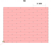
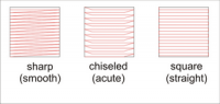
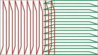
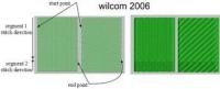
What is stitch density? The last question is asked by many machine embroidery beginners. Density (sometimes also called spacing) is the distance between 2 neighboring rows of stitches. 

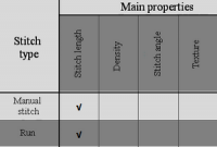
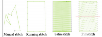
Only 2 kinds of stitch objects have this property: satins and fills (see the table in my article called Quality benchmarks. Stitch object properties). 
In different machine embroidery editors, the density units may vary. The most common way of measuring density I've seen was in mm. 0.4 mm, for example. The other way of estimating density is to count the number of stitches per 1 mm or 1 inch (SPI) or to count the number of needle penetrations (points, units) per 1/10 mm. 
Some embroidery editors allow you to choose the density measurement units out of a list. For example, Tajima DGML by Pulse has 3 density measurement units: mm, SPI and point per mm. Every user can adjust it in the software as he/she pleases. 
One should be fully aware that changing density measurement units will have an impact on many things: 
density


density value in the software


distance between the stitches


number of stitches


time spent on the embroidery


productivity


The most common question is this: what density value is considered optimal? To which all embroiderers answer in different ways. But the answer that is closest to the truth is this: "It depends…"
A lot of factors have an impact on the choice of density value: 
1. The type of a material to be embroidered, which defines its characteristics. 
thickness  texture  density  numerous other characteristics  2. color of the fabric 
3. the future embroidery design 
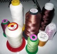
4. threads 
their thickness  type  color  5. tension regulation on the embroidery machine 
6. what kinds of stitches will be used in the embroidery 
stitch type  stitch length  7. kinds of stitches in the underlay 
number of stitches their type  8. Embroidery effects that are to be achieved 
dense filling  light filling  color-blending  9. personal tastes 
What are the reference points for choosing density values? 
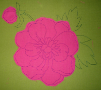
The most important thing is to get a good coverage. 
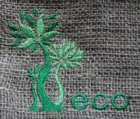
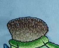
For example, logo and chevrons require a density value that covers the fabric completely. That is, it should not show between the stitches. 
The most common recommendation on densities are as follows: 
don't change the density value when substituting a #40 polyester thread for #40 rayon. In my opinion, this can be disputed.  lower density when substituting #40 threads with the ones of bigger number (#30 rayon or polyester with acrylic threads or the threads that glow in the dark).  darker threads require lower density values for covering the light-colored fabrics than light-colored threads for the dark fabrics. More about it here.  long stitches give better coverage than short ones  metallic and other threads of special kinds work better with reduced density and longer stitches  satin stitches require varying density in accordance with the stitch length Read more about it in this article.  if the design is distorted after the embroidery, you can try to lower the density value by 10%. Try again and see the result. Keep trying until you get a result that satisfies you.  You can learn the recommended density values from various kinds of brochures issued by the thread manufacturers. 
Madeira, for example, suggests several tips for digitizers on how to find the right density value and needle thickness, so that they have a starting point in creating the embroidery design: 

The consequences of the excessive density in a design are usually the following: 
design distortion  coarse embroidery  thread breakage  perforation on edges  higher cost: production consumes more of your time and resources  In one word, there are no ready answers when it comes to density — everything should be tested. Read here about an interesting method of finding the right density value for various kinds of threads. 
Original text by Marina Belova 
What is understitching (or, as it's also called, underlay or strengthening layer)? This is the most important element of the design — the embroidery basis, its "skeleton". Being embroidered first, before the outer layer of stitches, understitching creates the foundation. In order to make this basis for the future embroidery strong enough and the end result a good-quality one, you need to choose the right type of underlay. 
Two main goals of understitching are: 
To stabilize the fabric by attaching it to the stabilizer  To give a support and make a platform for the outer layer of decorative stitches  Additional advantages of using an underlay: 
It helps to reduce the stitch count  Prevents the upper layer of stitches from sinking into the fabric, trample ribbing and pile  Participates in reducing the push and pull deformation  There are 3 types of stitches that can be used to form the underlay: 
Running stitch  Zig-zag stitch  Fill (Tatami)  These types of stitches combine to make the 6 possible types of underlay. They can be created manually or applied automatically in the embroidery software. 
The main types of underlay 

Center Run (Perpendicular, Center Walk). This is a simple running stitch that goes right in the middle of a satin column that is usually no more than 2 mm wide. You can combine it with the Edge Run when a satin column is wider than 2 mm, and it is necessary to lift the upper layer of stitches up a bit.  Edge Run (Contour, Edge walk). This type of underlay consists of a running stitch tracing the object outline. It is essential for creating a neat even border of the embroidery (its profile). Edge Run is the most frequently used type of underlay.  Zig-Zag (Parallel). This type of understitching is made by a zig-zag stitch that goes through the entire object once. It is mostly used for lifting the stitches over the fabric and trampling pile or ribbing. It is recommended for the objects no less than 2,5 mm wide.  Double Zig-Zag. This type of underlay is also made by zig-zag stitch. But in runs through the entire object twice.  Tatami (Lattice, Mesh). This type of understitching is based on the standard fill. But is has a very limited density. Usually, the stitches here go at an angle of 45 or 90° in relation to the upper stitch layer. It is used for stabilizing big size embroidery areas in order to reduce the pull.  Double Tatami (Full Lattice). This type of underlay is likewise based on the standard fill, but it makes a full lattice — the stitches are placed at an angle of 90° in relation to each other. It is used to stabilize big size embroidery areas on highly stretchy fabrics in order to reduce the pull. Often used in highly contrasting embroidery. 
All main types of understitching can be combined with each other if the embroidery design requires. Usually, the embroidery software either offers the choice of underlay types and their combinations or allows the users to set the values manually. 
Tajima DGML by Pulse, for example, allows to combine up to 4 types of underlay at the same time, and it also has lots of options for every one of them. 

The underlay stitch length depends on the kinds of fabric used. For example, the ordinary stitch length value is 2.5 mm. For slippery fabrics like satin, you can set it less than 1.5 mm. 
When is the understitching not necessary? 
You don't need an underlay for non-woven materials: leather, vinyl or paper. Also, when embroidering the designs like redwork or quilt the understitching is not needed. 
This is important! Understitching doesn't replace the stabilizer. In order to achieve a good result, the understitching and stabilizers should work together. 
One point is worth noting: An underlay created by hand often adds a much less amount of stitches to the design because of the well-planned sequence. But it requires spending more on digitizing and also experience. Automatic underlays are highly adjustable and scalable compared to the manually created ones. 
Original text by Marina Belova 
You can have anything regarding threads now: there is a huge variety of colors, fibers, thicknesses in machine embroidery. There are even threads that have special properties. They were created specifically to help you achieve all kinds of effects. 

You can divide them into different groups, depending on, say, fibers: 
Rayon (Viscose) — an artificial thread  Polyester — a synthetic polymeric ester thread  Metallic thread  Threads with metallic polyester coating. Usually, they have a polyester or nylon thread inside.  Twisted thick threads  Flat tin threads  Cotton threads  Threads with special characteristics or outer look:  Twist — a thread that is made of 2 or more colored fibers, twisted together.  Acrylic (woolen) thread — a thick spun polyester thread  Threads that glow in the dark  Threads that change their color under in the sunlight Non-flammable threads  Multicolored threads — the ones that are of several colors simultaneously.  Below I'll list the properties of the most popular kinds of threads. 
Rayon thread properties: 
Soft  Shiny surface  A great variety of shades and colors (multicolored threads included)  No loops during the embroidery  Easier to handle that polyester  A great thickness range: from 12 to 60  More sparing of the equipment, than polyester threads  Washable  May be dry-cleaned as well  Polyester thread properties: 
An ordinary polyester thread has a brighter luster than a rayon one. But there is also a lusterless polyester called Frosted Matt from Madeira.  More durable than rayon thread  Can be whitewashed or subjected to other chemicals  More elastic than a rayon thread. Therefore loops during the embroidery are possible.  Polyester thread is cheaper than rayon  Polyester distorts the embroidery more than rayon  Metallic thread properties: 
Shiny surface  Can have a textured surface  Less flexible than polyester or rayon  Not suitable for all kinds of fabrics  May twist when coming off the spool  Great thickness range: from 15 to 50  Cannot be whitewashed  Cotton thread properties: 
Lusterless surface  Small color range  Washable  Cannot be whitewashed  Great thickness range: from 30 to 120  Clutters the shuttle because it's not as glossy as a synthetic or a man-made thread.  Beside their structure, all kinds of threads have their own weight. #40 thread is considered standard. The greater the number is, the thinner will be the thread and vice versa. You can read more about it in my article on the embroidery threads labels. 
This is important: the threads of the same number but made of different fibers may have a different look. For example, a #40 polyester thread looks thinner than a rayon one of the same number. Cotton threads look even thicker than #40 rayon. Also, the thread thickness and weight may vary depending on the manufacturer, though they will be marked the in the same way. One needs to remember that thread thickness and type influence such stitch object property as density. You can see the general recommendations on working with the threads in the table in my article called Quality benchmarks. Understanding density. Also, you can find the table on the fabric/needle/thread ratio in my article on machine embroidery needles (coming soon). 
Not so long ago I read in my embroidery machine user guide that it's best to use a left twist thread in machine embroidery. Here is a way of finding out the direction in which your thread is twisted: 
1. Take your thread with both hands 
2. Twist the thread with your right hand toward you; your left hand should remain unmoved. 
3. See what happens with the thread. If it slackens, it is a right twist (or S-twist) thread. If it becomes tight, it is a left twist (or Z-twist) thread. 
I've never checked the thread twist. Moreover, I've never even thought that the direction of the twist was important, too. But if even a Chinese manufacturer mentions it in the user guide, then, perhaps, I should. 
Choosing the thread type is up to the embroiderer. Every embroiderer should try all types of thread and decide which ones work better for them. But, in any case, you should buy the high-quality threads. Because the cheap threads break often. This ruins the outer look of the embroidery and stretches production time (up to +50% of the time, according to my experience). 
Embroidery threads storage
It is better to store the threads in a cool and dark place with 40-60% humidity and about 20°C. Read what else you need for the threads storage here. 
P.S. Speaking from my experience, I will assert that there are practically no interchangeable threads nowadays. You cannot replace a standard #40 rayon thread with a polyester thread of the same number and vice versa without changing the design settings, even if they are of the same brand. These threads lie on the fabric in different ways, and the embroidery looks different. Therefore, they need to be approached individually when digitizing a design, especially if the embroidery is rich in contrast. 
Some people think that the embroidery threads should be oiled. I'll supply an article on the subject in the nearest future. 
Original text by Marina Belova 
Tie-offs are a secondary property of the object. But they are important nonetheless. 
Tie-offs are made of several short stitches (usually 1—1.5 mm, and never over 2 mm) that prevent the embroidery from loosing up. 
Reasons for inserting a tie-off: 
In the beginning of the embroidery  In the end of the embroidery  Before trimming  Before/after a jump  Before/after thread color change  It is better not to use tie-off without a reason, for they may lead to "bird nesting" on the wrong side of the embroidery. 
Ways of inserting a tie-off: 
Manually  Automatically  Manually inserted tie-offs 
Only a small number of digitizers insert their tie-offs by hand. Usually, they are pretty much satisfied with what the software could offer. 
Manual tie-offs are used often in cases when an automatic tie-off at the end of the object becomes too apparent to the eye or distorts the outline. Small letters with narrow outlines, for example. In this case a tie-off is digitized manually in such a way that it becomes lost between stitches. 
Types of automatically inserted tie-offs 
There are different types of automatically inserted tie-offs. A line and a butterfly are considered the most common. There are several ways of inserting them. 

Often the embroidery software offers a whole row of options, out of which you can choose the one you need. For example, in the Stitch Era Universal you can choose a tie-off out of 5 suggested ones: 

In Tajima DGML by Pulse 12 there are only 2 types of tie-offs. And Compucon has 12! 

Additionally, some embroidery editors it is possible to modify the chosen variant. Usually, you can change the stitch length and the number of stitches. 
Original text by Marina Belova 
All types of stitches have a bunch of adjustable properties. Control over these properties allows a digitizer to minimize the risk of defects and to produce a garment up to all quality standards. 
There are 2 types of stitch object properties: 
Main  Secondary  Main stitch object properties include: 
Stitch length  Density  Stitch angle  Texture  Stitch shortening  Edge shape (stitch profile)  Secondary stitch object properties are: 
Pull compensation  Push compensation  Understitching Tie-offs  Not all of these can be applied automatically to any stitch type. Some stitch types have a narrower range of properties, some a wider one (see the table below).

All object properties can be changed by a user in the Properties panel. Is is usually called 'Properties', but in some embroidery editors there may be variations. For example, in Stitch Era Universal such a panel is called Object inspector. It looks like this: 

Every parameter in the object characteristics panel is set to a default value. These default values differ from one embroidery editor to another.
They are only the starting points for design digitizing. One should be aware of the fact that these values are not reference standards. All the parameters suggested by the software manufacturer should be revised and adapted for every particular situation and every particular design. The most important factors for the changes are your personal tastes, your embroidery machine peculiarities and the input parameters of the future design: fabrics, threads, etc. 
I'm going to describe all stitch object properties in separate articles. Stay with us! 
Original text by Marina Belova 
For all types of stitches the stitch length is a distance between the needle penetrations. 
Running stitch length:

Satin stitch length: 

Fill stitch length: 

The stitch length determines how high the stitch will be over the fabric — this is called loft. The loft value allow the digitizer to achieve various visual effects: more or less luster of the embroidery. 

Factors that influence the loft value: 
thread thickness and thread type  stitch length  thread tension on the machine  In reality the stitch length is often limited by its minimum and maximum values. We do so from technological considerations and the embroidery wearability: 
in order to prevent the 'birds nests' (where the knot of tangled threads appears on the wrong side side of the embroidery)  to avoid the "bullet proof vest effect" (where the embroidery is extremely dense and coarse)  to minimize the thread breakage  also long stitches may become slack and get caught  General recommendations on the minimal value: don't make them less than 1mm. It is because the two most frequently used threads in machine embroidery are the rayon or #40 polyester. They are about 0.3 mm in diameter. The most common type of needle is #80. 

You can see the scale on the photo: the green stitch is 1 mm long, 2 red circles represent needle penetrations; in many fabrics the holes will "close down" (as the fabric will try to return to its original state) once the needle is out. In case the fibers in the fabric are loose, it's possible that there won't be any of them between these two penetrations at all. And so there will be no fully-fledged stitch, but a small loop instead. 
It is completely another story with tightly woven fabrics with a lot of interweaving fibers. Every needle penetration result in shifting of the fibers, and if the stitch is very short, they shift even more, so the fabric becomes largely distorted around the hole. Creases and scrimps are evident. 
1 mm stitch length may be too short when: 
you use metallic or other tricky threads  you use thicker than #80 needle  you embroider on a loosely-knit or loosely-woven fabric  you embroider on a thick or a tightly-woven fabric  on leather  on vinyl  Despite all the peculiarities of the short stitches they have their own advantages: 
they speed up the machine and increase your productivity output  they are good for rendering details to make them visible  But one should not forget the disadvantages: 
a short stitch is a #1 reason for the thread breakage  General recommendations on the maximum value: 
5-7 mm for wearable items  over 7 mm for pictures and other things where the stitches cannot be accidentally caught in something  The pros of the long stitches: 
longer stitches give better coverage  simultaneously, the stitch count is lower, and the fabric is softer  thread consumption is lower  lesser fabric distortion  Cons: 
loops are more likely  lower embroidery speed, because the Pantograf goes a longer distance  long stitches may be caught in something while in wear, while washing or ironing, and the embroidery will be distorted at the very best, and even torn in extreme cases.  Despite their apparent simplicity, these rules form the basis for creation of the high-quality embroidery. 
Original text by Marina Belova 
Compensation (or Comp) is a stitch object property around which a great number of myths, mysteries, and puzzles have emerged. Let's try and figure out what it is. 
Compensation: generalities 
Compensation is a deliberate distortion of the shape of the objects in an embroidery design at a digitizing stage. This distortion serves to prevent the appearance of various defects during the embroidery: gaps between the object outlines and shape deformation (circles becoming ovals and squares turning rectangular). 
There are 2 main types of shape deformation: 
Pull — decrease of the object thickness in the stitch direction.  Push — object elongation in the stitch direction.  
Outline distortion is a result of the upper and the lower threads interacting with the fabric when changing the stitch direction during the embroidery. 
In this article, we'll cover pull compensation only. 
Pull compensation
There are 3 ways of adding compensation to the object: 
distort the shape manually by digitizing an object wider than it is in the original design  adjust the respective parameter in the embroidery software  combine the previous two options  I want to point out that to do the first one you need to have a vast experience and a trained eye. 
Many western sources state that the option #3 is the most effective. They think that compensation should mostly correct shape distortion during digitizing. Adding some automatic compensation will allow adapting the design for various kinds of fabric. 
A second way where compensation is added automatically is much easier and much more obvious. 

There are 2 methods of adjusting the automatic compensation value: 
absolute (fixed) value in millimeters  on a percentage-of-stitch length basis  Some embroidery editors have additional options for compensation: 
you can choose to compensate only one side of the design  you can compensate in one direction only (X or Y — Tajima DGML by Pulse has such an option)  What determines the compensation value and how can it be adjusted? 
type of fabric: the thinner and softer is the fabric, the more compensation it requires compared to the thick, densely-woven fabric  upper and lower threads tension regulation on your machine  the size of the embroidery area. The thicker is the element, the more compensation it needs the density of the embroidery. The higher is the density, the higher is the compensation value 
And the last thing that everybody is interested in: what are the benchmark pull compensation values? 
Ways of adding pull compensation: 
set it at the value of 0.1—0.4 mm. I've heard that 0.4 mm value is good for standard situations.  adjust compensation on a percentage basis for sharp and straight corners to make them more clearly defined  when joining two objects make them overlap no less than 1 mm by hand or with the help of the compensation adjustment option.  too much compensation may damage the outer look of your embroidery and even lead to distortions  Of course, these parameters are only nominal and can be used as a starting point for design creation. Compensation is not a science, therefore, you cannot tell which value is the most optimal. You can always find the right value by doing test samples. You can read here why you should test every design. 
In the following article, I will continue on the subject and will describe push compensation. 
Original text by Marina Belova 
Following my previous article called Quality benchmarks. Secrets of pull compensation, I'll remind you that in machine embroidery there exists a kind distortion called push. It means that the object stretches in the stitch direction. Thread thickness and density value are what causes shapes to distort. 

There is a lot of reservation surrounding the whole concept. I suggest that we make it clear once and for all. 
Push compensation is a deliberate distortion of the object shape in an embroidery design while digitizing. It serves to avoid various embroidery defects, for example, shape distortion (circles becoming ovals and squares turning rectangular). 
Push compensation (Half-pitch compensation) 
There are 2 ways of adding compensation to the object: 
manually change its shape by removing several stitches from the ends of the object  adjust the respective parameter in the embroidery software  I'll better tell straight off that the possibility of regulating the compensation automatically is not present in every embroidery editor. And if it is there, the following methods of adjusting the automatic compensation are suggested: 
remove the required amount of stitches from the ends of the object  or shorten it by a certain amount of millimeters  Tajima DGML by Pulse can automatically control the push comp properties, but for satin stitches only. At least, in v.12 of the mentioned software.

Perhaps, the newer versions have a greater range of possibilities. 
Also, Compucon works with this type of compensation. But you can only control compensation for fills in it. 
As for WingsXP, it suggests moving the stitches aside from the open edges by the thread thickness value divided by half. A parameter called Half-pitch compensation exists specifically for that purpose. It only has two modes: Yes and No. 

And the best bit comes at last. The question that everybody is interested the most: what are the benchmark push compensation values? 
These are the push compensation values that I've encountered: 
for satin letters more than 1.5 cm high — remove 1-2 stitch from the open edges 
for fills — remove 2—4 rows of stitches  for open edges — remove the more stitches out of them, the higher is the density value  thicker threads need more push compensation than thinner ones  I'll repeat once again, that the aforementioned values are nominal and can only be used as a starting point for digitizing a new design. Compensation is not a science, therefore, you cannot tell which value is the most optimal.
Original text by Marina Belova 
In these days all embroidery software embroidery offers the users a possibility of choosing their own type of corner or automatically create a new one in one click. But let's divert our attention from this very handy option and see what corner shapes exist in machine embroidery, and what determines your choice of them in a different situation. This, in my opinion, is necessary in order to start controlling the automatic process at least to some degree, and to manually fix anything that you don't like. 
So, there are the following angle shapes in machine embroidery: 
Capped corner  Mitered corner  Hand-sewing corner (or butt corner)  Tucked corner  Simple corner (rotating corner, also called main or regular corner)  Before we plunge into the depth and begin to sort out why there are so many of them, let's recall some knowledge that we took out of our geometry lessons at school. 
The measurement unit for an angle is a degree. 
Sharp angle is an angle that is less than 90°.  Straight angle is 90° even.  Blunt angle is the one that is more than 90°.  The factors that influence the corner shape and kinds of stitches used for decoration: 
Angularity  The width of the columns that form a corner.  If you look at the picture below, it will become clear why you should use different kinds of corners for the columns of different width. 

Corner size is defined by the point on its inner side to the point on its outer side. The size depends greatly on the column width and rotation angle, which determines the type of corner that can be used. 
Had we not used automatic angles in embroidery editors, we would digitize them by hand in this way: 
Capped corner 
Good for sharp angles between 0 and 60° and narrow columns, so that the stitch length isn't too high when they cross each other in the cap. I.e., the width of the columns that form a corner should not be over 2—3.5 mm. 

Mitered corner 
This method is used for sharp and blunt angles alike, from 60 to 130°. Column width value can be quite high — 5—7 mm. In order to avoid gaps at the joint place, you need for the columns to overlap. A slightly different stitch angle in columns that form a corner is preferred. Just how much overlapping there will be, is determined by fabric type: the stretchier is the fabric, the more overlapping there will be. 

This is important: You should use this corner type in small letters and designs with care — overlapping stitches result in higher density. 
Hand-sewing (butt) corner 
Used only for straight corners (90°). It is good for columns of any width that form an angle. Can be digitized as 2 outlines, connected butt-to-butt.

Very easy, but attentive digitizing is a must in order to avoid gaps between the outlines. 
There is also this variety of a butt corner: 

The turning looks like it was embroidered manually. Embroidery software manufacturers recommend it for appliques. 
Tucked corner 
This corner is very similar to mitered corner and consists of 2 oncoming columns overlapping each other. The columns should be wide enough (over 4 mm) and be identical. Stitch angle in neighboring columns is not much different, unlike in a mitered corner. Therefore the joint place is almost invisible. 

Simple corner 
Simple corner is very good for any angle ranging from sharp to blunt, but can be used only with narrow columns or the stitches may become too long. This corner is digitized as a single outline. Most of the stitches are gathered on the inner side, and on the outer side they are the most sparse. Therefore, it is necessary to remember to make the stitches on the inner side shorter in order to avoid holes in the fabric, monitor the stitch length and the stitch angles in the corner area. 

Signs of a poor quality corner embroidery 
the angle is not equal to the straight sector. The difference is most obvious in the wide columns.  a lot of thread breakage in the corners  the fabric is perforated on the inner side of the corner  embroidery speed is visibly lower at corners or trimmer keeps turning on when the stitches are too long  embroidery is puffier at corners, they become rounded and lose their shape  corners are not smooth because of distortion 
Original text by Marina Belova 
In the latest article by a famous digitizer and blogger Erich Campbell in Printwear magazine, I saw an explanation of the way of using underlay I'd encountered before. This was not the ordinary understitching applied automatically in your embroidery editor but manually digitized many-pronged stars for completely stitched designs like emblems or lines under openwork designs. 
A many-pronged star looks something like this: 

This type of underlay is used for very tricky and highly stretchy fabric like knitwear. It is placed under designs that are stitched all-over as in the picture above. This type of underlay is stitched at the very beginning, before the other underlays because it's main purpose is to make the fabric even and attach it to the stabilizer. The main thing when digitizing this type of underlay is to maintain the direction of the embroidery from center outward in order to avoid puckering. 
But how does one deal with an openwork design that has openings between the stitched areas? A definite answer to this question does not exist, because its type is defined by the design itself. 
This is what Erich Campbell suggested when making a Celtic flourish: 

And this is Bonnie Landsberger's answer given in the Stitches magazine long ago: 

I think I should take note of these recommendations. What is really important, this method allows you to edit designs created by other people even in the most primitive embroidery software. You'll only need to add a couple of stitches. 
Of course, this can work only if you use a stabilizer for your openwork embroidery. Without it will undoubtedly shift. 
Original text by Marina Belova 
Terry cloth is a fabric with loops. Every one of these loops is some kind of sponge that is aimed at soaking up water. Terry cloth made of 100% cotton is the most common. But it may be composed of other fibers: bamboo, cotton, linen, etc. 
Lots of much-in-demand garments are made of terry cloth, and all kinds of embroidery are used as decoration. Therefore, I decided to write about the basics of embroidery on this fabric. 
Terry cloth can differ in: 
weight  density  composition  stability  loop height  loop twist loop on just one side of the fabric or both  All of these properties make their impact on digitizing for loop fabrics. 

From the technical standpoint there is nothing difficult in embroidery on terry cloth. You hoop the fabric together with the stabilizer (I use thin tear-away one; although I've read somewhere that you can use a thin water-soluble film instead: put it on top so that the loops don't show between the stitches or better hoop it), and then embroider. 
80/12 needle with a sharp needlepoint is usually recommended for thick terry cloth, and 75/11 ballpoint needle for thin and stretchy kinds. You can use any kind of threads. As for me, I prefer rayon – it is softer than polyester. 
Digitizing a design for a loop fabric 
The design digitizing process is not much different from the usual one, but there are some recommendations that you should follow. 
It's better to choose bigger designs for embroidery on terry cloth. The object should not contain small and delicate elements, for after the embroidery the loops will raise and cover them completely, making the embroidery look worse. Therefore, it is better to use bold letters. Satins should not be wider than 8 mm and narrower than 1.5–2 mm. 
When the stitches are over 8 mm it is necessary to compulsorily split them or apply short filling stitches to this object. This is due to the fact that garments made of terry cloth are washed rather often, and long stitches will eventually slacken or get caught in something — in both cases, it will damage the outer look of your embroidery. 
It is recommended to increase the satin width by 10% or just add 20–30% pull compensation. 
Understitching: 
Double run for thin satins  Double run + double zigzag with short stitches that will keep the loops trampled for thick ones  Double run + full lattice at an angle different than the one in the main layer — for the filling.  Density: 
I set density at no more than 0.45 mm for terry cloth. Though I've often heard that you should increase your density by 20% compared to the usual one. My experience shows that this will only lead to distortion — there will be waves on the embroidery surface. 
You may consider using applique not only because this will allow you to reduce the stitch count and save on water soluble stabilizer, but also because it is easier to embroider small details on applique than on terry cloth. 
But I didn't like the process of cutting out the applique with terry cloth still in the hoop — too much risk to catch a loop with your scissors and cut it open. Better to make an applique out of a ready template. 
Digitizing for terry cloth is not really difficult. There is nothing in it that one cannot learn.
Original text by Marina Belova 
The fringe effect is a special machine embroidery technique, simple yet effective, that allows to look at the design from a new angle and add some volume to the embroidery thanks to the free thread ends. 
Below is the example: 

Technically the process of creating fringe effect is simple and includes 3 steps: 
First, we embroider the entire design in exactly the same way as always.  Second, we unhoop our item and cut the stitches on the wrong side to create the fringe.  Third, we fluff the threads up.  This technique works splendidly for whiskers and tails, hair and fur, flowers, etc. Anything your fantasy can conjure. 
Digitizing 
The digitizing process for creating of the fringe effect is so simple that even a beginner can cope. It's sufficient to know how one creates a wide satin column in the embroidery software. 
So, we create a standard but a very wide satin column. You can set the width at the maximum value for the longest stitches your machine can embroider. The longer is the stitch, the longer the fringe will be. You can have a short fringe, of course. In my opinion, the stitch length should not be less than 5–7 mm, otherwise, it will be difficult to cut the threads on the wrong side. It's better to increase satin stitch density by 15–20%; it will improve the outer look.  No understitching whatsoever.  One side the column should be fixed to prevent unraveling. This can be done with the help of thin satin column. Set the stitch length in this column at about 1–1.5 mm.  You can apply this effect to the ready designs, too. Just create the satins in the way described above and place them on top of the embroidery sequence. Thus, the fringe will be embroidered before other elements. 
Recommendations 
Adjust your embroidery machine so that it does not trim long stitches. 
Ways of cutting the underthread: 
If you want loops, cut the underthread only.  If you want no loops, cut the upper thread on the wrong side near the edge.  Very easy, as you can see. 
Original text by Marina Belova 
Satin and filling stitches have a property defining the edge type (object profile). 
There are at least 3 basic edge types: As it usually happens, every type has more than one name, depending on the embroidery editor: 

Smooth (sharp) edge, where one stitch is parallel to the guideline (transverse) and the other is at an angle.  Acute (chiseled) edge is good when you want parallel stitches, except the first and the last ones.  Straight (square) edge is typical for low-density (min 2 mm) fills with a wide distance between the stitches. It makes a straight border.  There is one more type for satins: 
Zig-zag edge where two neighboring stitches are laid at an angle to the guideline (transverse).  See the difference between Smooth and Zig-zag edges on the picture below:
 
Apart from these basic edge shapes, the advanced modern software offers the users the possibility of customization. 
It's hard to see the sense in changing the edge type and predict the results right away. Why did the software developers include so many separate shapes? I haven't yet found a comprehensible explanation neither in software manuals nor in professional literature. All I see is a plain statement: it is so and deal with it. 
Therefore, I decided to conduct a little experiment of my own, to find out how to control this parameter and whether there is any sense in it. I digitized a small design containing 4 satin columns with different edges and 3 square fills. The density of all the objects except the one with the square edge was set at 0.4 mm. 
This is how it looked in the editor: 

And this is the result:

Conclusions: Zig-zag edge for satins provides the best coverage, and I like the outline more. Acute (chiseled) edge is the best for the fills as it makes the best outline. I suppose if I combine satins with fills, the effect will be the same. Straight (square) edge looks skewed, and the outline is uneven. High (7 mm) stitch length is to blame, I guess. But it works splendidly for the fills: the outline is even. 
Perhaps, someone has experience in this area and is willing to share it with us? Or tell us why change the settings at all? 
Original text by Marina Belova 
Today I'll tell you another method of adding volume to your embroidery with the help of special material like 3D Foam, 3D Puff, Bodybuilder from Madeira, etc. Some of the manufacturers call it EVA (ethylene vinyl acetate) Foam, and some – PE (Polyethylene) Foam. The composition may vary, but the purpose of the product remains the same. 
The most common embroidery designs with foam are inscriptions on caps and bags. Though I've seen puffy embroidery on T-shirts as well. You can use 3D Puff not just for the letters but also under an appliqué. 
Foam comes in the variety of colors (usually all colors of the rainbow). But black and white remain the most common; anyway, I have not yet seen any other colors in Russia. As a rule, people try to choose puffy of the same color as the thread. The thickness, too, may vary – from 3 to 8 mm.
The most common is 3 mm foam. 
Embroidering with puffy is fairly simple: 
First, you embroider all the elements if they are present in your design. After that machine makes a stop.  You put the puffy in the right place.  Embroider; the needle should penetrate it along the edges.  Remove the extra puffy.  Recommendations: 
Before hooping 3D Puff, you can slightly spray it with temporary spray adhesive, just to secure it in place.  Choose your needles according to the fabric type. Ballpoint is the best for perforating 3D Puff. The needle size should be slightly bigger than the usual one for this type of thread.  Upper and lower thread tensions should be loosened up so that the threads would go around the puffy without trampling it.  Reduce the machine embroidery speed.  Rayon or polyester threads are preferable. A firm "no" to metallic threads. I've also read that #30 threads help to lower the stitch count in the design.  Plain-surfaced and tear-resistant fabrics are good for the basis of your embroidery. Better to do without thin and unstable fabrics. For example, chiffon and silk.  If there are still some traces of your 3D Puff left, try to singe it with a lighter.  Digitizing a design with puffy 
The most efficient stitch type for 3D Puff is, of course, satin stitch. Pick the design with satin columns at least 5 mm wide. I've also read that you should put fill under puffy, for example, the one with long motif stitches. But I've tried this, so I cannot say whether it works good or bad.  Our first underlay is made of running stitches about 1 mm long along the perimeter. 
Digitize "caps" for the open edges to perforate around the Puff on all sides. You can leave the inner side of the cap uneven in order not to penetrate the puffy. 
You can also use pinching instead. Pinching involves choosing such angles that stitches at the corners are very small: they don't perforate puffy and don't require capping. 
Your second underlay will consist of double zigzags with the density of 1.5–2 mm. 
Digitize your outer satins. 
Increase pull compensation by 5–15% of the column width. Increase push compensation by slicing at least 1 mm from the open edges.  Your standard fill density should be increased by 40–100%. For example, if your standard fill density is 0.4 mm, you'll need to make it 0.2–0.3 mm for the outer layer.  No shortening at the corners.  Now you've learned all digitizing tips. 
There are two ways of removing the puffy: 
after having stitched the underlay  after completion of the embroidery  I cannot comment on this one. It's the matter of preference. I tear the puffy away after the embroidery is completed. 
You can see samples in my article Testing solid 3D Puff. See also how I tested various supplementary materials in order to find a substitution for 3D Puff — one, two, three. 
Other articles on 3D embroidery — one, two. 
Original text by Marina Belova 
So, I've got to the Russian national material — burlap. Though I've already written about loosely woven fabrics, this may be considered a super-loosely woven one. There are only 4 or 5 strands per cm in burlap, and their variable thickness adds to the brain twister of design creation. But this is also what makes it interesting. 
I have laid my eyes on a brand new vegetable sack, which I'm planning to use it in my experiment. I only have one attempt, so I hope everything will be fine. 

Actually, the embroidery technique for the burlap is very similar to the one for other loosely woven fabrics; the only difference is that burlap surface has more texture. Therefore, much of the listed below is pretty obvious: 
Hoop the fabric and the backing – a semi-transparent cut-away spunbond or a piece of organza so that it wouldn't show between the yarns. If you aren't keen on saving up on the stabilizer, you can use a thick water soluble film. For my fabric, I would also add a temporary spray adhesive, just in case. Thin water soluble film goes on top to make the surface smoother.  You can use the threads of any thickness and structure.  Loosen the upper thread tension.  Use the most ordinary needles matching the threads and the fabric in thickness. Sharp needlepoint is preferable.  You also need to lower the speed a bit so that the loosely woven yarns aren't pulled.  To create a machine embroidery file, I: 
Picked a rather simple design to avoid excess stitches.  Paid particular attention to the strengthening layer: an additional basting stitch at the very beginning of the embroidery would attach the fabric to the stabilizer. It outlined my future design, the basting stitch being of the same color as my burlap so that in case something went wrong it wouldn't be visible.  I manually drew a lattice under the entire design. It would be of a matching color as well, provided that there was one in my collection.  I made a complex edge run and zigzag underlay for wide satins. For narrow satins only edge run was used. A very open lattice at 90 + edge run was put under the fills.  I set the density at 0.43–0.45 mm (my usual value).  Increased pull compensation up to 0.5-0.6 mm on each side and also deliberately changed the shape of the outline to make it wider (I mentioned this in my article on pull compensation).  I reduced satin stitch length to 3–4.5 mm in order to avoid the excess distortion.  With these settings I proceeded to the embroidery and got this: 

I can't say that the result is outstanding: it needs correction. Mainly, the underlays – I should have given them more strength, like the ones for the FSL where the purity of the outline does not depend on the texture of the surface. But to do that I need to buy more burlap and try again. This sack is already full of potatoes. In my own opinion, the design for such a coarse fabric should on the big side, because small objects look ridiculous on this texture. One should not be afraid of using large elements in a case like this. 
The first problem I encountered during the embroidery was the difficulty of hooping because this is not just cloth, but a garment. Special devices for such occasions once again popped in my mind. 
Also, it is inconvenient to embroider such things on my home embroidery machine. In these circumstances, one fully understands the advantages of the "free arm embroidery" in the tubular hoops on commercial embroidery machines. In my case, it's the back side of the sack, but someone else struggles with the back of a T-shirt or a hoody. A free arm is usually kept under the rest of the working gear and does not interfere with your embroidery process. You don't have to rack your brain over positioning the garment properly so that is does not get stitched or loose in the hoop. 
Original text by Marina Belova 
It occurred to me that I never did anything like that, so why not? Here's a cat made in the minimalistic style typical of all French designs, which are the subject of my respect and admiration. There is also a bit of quilt in it (a decorative strip across its chest), also made right in the hoop. 
The idea for the design came from the open sources online. The design may be used for non-commercial purpose only. You may also publish it on the Web with the reference to my website. 
The design is in a *.dst format. To convert the file into other machine embroidery formats you'll need a converter. You can read more about it here. 
Soft kitty (download) 

The design size: 8.7х12.2 cm Stitch count: 1411  Number of colors: 1 or 2. Number of colors depends on whether you want to change threads. I used two threads, a black one for the nose and eyes and a beige one for everything else.  The embroidery sequence goes like that: 
Hoop a stabilizer (tear-away): 

Stitch the first outline directly on the stabilizer: 

Put the first front piece right side up, aligning it with the horizontal line: 

Cover it with another piece of fabric with its wrong side up to make a narrow strip on cat's belly. Align the edge with the outline: 

Start the machine and stitch the strip that joins these two pieces together: 

Turn the fabric back to flatten the seam: 

Stitch one more basting stitch over it. You'll need it to know where to put the next piece of fabric for cat's lower part: 

You may trim this piece of leave it for later: 

On top of it place the lower part piece with its wrong side up, aligning the edge of the fabric with the basting stitch: 

Stitch it: 

Turn it back to flatten the seam. Stitch the whole thing along the perimeter to secure all three pieces on stabilizer: 

Embroider the eyes and the nose (black in my case): 

Cover it all with yet another piece of fabric with its wrong side up. This time, we'll make cat's back side: 

Stitch the cat perimeter-wise: 

Unhoop it, remove the stabilizer, cut it out along the perimeter (don't forget seam allowance!): 

Turn it the right way round: 

Fill it and stitch the opening: 

That is all. Nothing overly difficult. 
P.S. You can download other free designs from our online shop. 
Original text by Marina Belova 
Nowadays any self-respecting online shop with machine embroidery designs has In-the-Hoop projects to offer. Also, projects where even a zipper is stitched right on the embroidery machine, simple as they are from a sewer's standpoint, have become commonplace. In other words, you won't need to do any sewing at all. 
I've long set my eyes on such items and finally decided to make something like that myself. After all, why buy a design if I can create one with my own hands? Moreover, step by step master-classes that cover the creating process in details are ten a penny on the Web. Just pick the one you like and go! 
For starters, I decided to give the easiest of such projects a try. On the photo below you can see the result of my first attempt – a coin purse: 

This is how it looks from within: 

It turned out that it is rather simple to make an item like that, zipper and all, entirely on the embroidery machine, from a digitizer's standpoint as well as an embroiderer's standpoint. There were mistakes, of course, and today I'll write about them, too. But mistakes are what ignites the thinking process and causes progress, aren't they? 
I'll cover the creation process in details. I picked an ordinary blind zipper. I didn't risk to use an ordinary zipper, for I didn't know how the machine would behave. A blind zipper is thinner, after all. Before creating the design, I measured its width. It was necessary for the basting stitches: 

Then I digitized a very simple design, just 14 outlines, and 2900 stitches. Below is preview of the machine embroidery file: 

After that, I selected fabrics for the front side of my coin purse, and also the filler. For the front side, I chose an ordinary cotton print and cut 3 identical squares out of it. I used thin fleece trimmings for a filler, because they were the only suitable thing I had, thinking that they could add some volume. I cut out 2 squares, and then cut one of them in half. 

After all these simple manipulations, I went to my machine. I hooped a tear-away stabilizer: 

Loaded my design and hit the start button. First, I embroidered a guideline. I did that to outline my future embroidery and to mark the place where the zipper would be. 

Now it was time to stitch it. I placed my zipper face up and secured it with a painter's tape: 

Started the machine again and stitched my zipper to the fabric. I used a running stitch for that: 

After that I picked up one of the cotton squares, put it on the table wrong side up and covered with a strip of fleece: 

Then I folded the cotton piece like a book. The strip of fleece ended up inside: 

I repeated my actions with the remaining cotton and fleece cuttings. All the preparations for my future coin purse were finished. I took the first "book", positioned it with its fold along my zipper and secured it with sticky tape: 

Same with the second "book": 

I started the machine again and stitched both of them along the zipper, then outlines my future coin purse with a zig-zag stitch: 

I should have half-unzipped it at this stage. But I forgot about it – like many other first timers, I believe. 
Only when almost everything was ready did I remember about it, so I had to partly unstitch the whole thing in order to go back and do it. In the end, I got it right: 

Now I needed to make a "layer cake" for the back side of my coin purse. When I started to arrange the pieces of fabric, I saw that I had forgotten to prepare the backing. Again, I had to make a detour in order to cut out one more square. 


Then I assembled the following "layer cake" right in the hoop (layer after layer): Cotton print, with its front side to the already embroidered piece: 

Fleece (for the filling) on top of it and also the backing with the right side up: 

I started my machine and stitched all these layers perimeter-wise. I used the 3d stitch for this. And also E-stitch for the edges to prevent fraying:
 
This is the wrong side of my coin purse: 

I unhooped the item and removed the stabilizer: 

Then trimmed along the perimeter: 


Mind you, trimming so many layers of fabric didn't come easy! At last, I turned my purse the right way round. 
Everything is now ready. 
Summary: 
a coin purse is very easy to make, just pay attention so that not to forget anything.  An embroidery machine and a zipper go along fine.  I've also noticed that the diagonal positioning is not the best: it distorts the item, and zipper crawls out of seams.  It would also be a good thing to add a loop beside the zipper, which would not be difficult.  A bar tack on the zipper should be strengthened, my usual 3 runs are not enough.  And if you divide the whole process into 2 stages, you can also embroider the back side of the purse. 
Original text by Marina Belova 
Today I read the latest blog of Erich Campbell called "How do I learn embroidery digitizing?", in which he writes about his own learning path in machine embroidery digitizing and gives recommendations. This blog once again raises the familiar question: how exactly does one learn digitizing? My own hardships instantly sprang to mind: where I live, a digitizer's education consists of memorizing all the buttons in the software, omitting much more important things. And the crucial thing, in my opinion, is to grasp what all these buttons are used for, i.e. the technical aspects of the embroidery. Until you don't fully understand what is the purpose of every option in the software, you won't be able to digitize properly. 

So, after reading the article, I realized that I neglected one more aspect of the utmost importance, which comes even before the technical one – that is, the understanding of how to transform an image into stitched objects. This understanding is based not on digitizer's violent imagination, but on some knowledge. Sure, I wrote about the image analysis before digitizing, but to me, it seems like a drop in the ocean of what one needs to know and be able to do. It is insufficient to know what stitch type is better for an object of a particular shape and size. You also need to work with colors and reproduce textures. You never know what you may need to do one day. 
I personally haven't yet fully grasped how to convert certain elements into stitches so that to achieve a fine-looking result, and many shapes still puzzle me. I wish someone would teach me how to digitize from an artist's standpoint... I believe that not only artists can digitize pictures. Though many people claim the opposite. 
Eventually, Erich suggests a formula that should be followed when learning how to digitize. It's not really a formula but rather three interrelated questions that should be answered either by you or your teacher: 
How one learns to convert an image into a stitch object?  How to control stitches?  How does one learn to use a machine embroidery editor, whichever one you may choose?  Erich suggests only one answer to all three questions. It is called "observation". You should observe what you get while transferring an image from your computer into a hoop. 
Original text by Marina Belova 
All machine embroidery designs are made with only 4 basic types of stitches. All other stitches that can be created in various embroidery editors are just the offsprings of these basic types. Even the most complex design is a combination of these 4 basic types. 
The main types of stitches are: 
Manual stitch  Running stitch (also called Walking stitch)  Satin stitch (also Column stitch)  Tatami (Fill, Seeding stitch, and so on) 
I'll describe each of these types in a few words. 
First: Manual stitch 
This is the most basic stitch type in embroidery. Every separate stitch is created manually, without using the automatics. 
Manual stitch can be used instead of the auto-generated running stitch when it's not possible to create the desired effect with the help of the editor. 
Second: Running stitch 
Running stitch is considered the simplest and most creative stitch at the same time. Why is that? Because a digitizer, not the software, controls every stitch that is laid on the fabric. 
Running stitch has a small number of properties: 
1. Stitch length (one should avoid short stitches) 

2. Number of runs (how many times every stitch is repeated) For example: 
Single running stitch  Double running stitch  Triple running stitch  Motif stitch (follows an established pattern)  There are several effects that can be applied to the running stitch. Their variety depends on your embroidery software. For example: 
Variable stitch length for better registration 
Stitch offset (or Swing) 
Shifting rows of needle penetrations with several repeats 
There is a large number of occasions on which the running stitch can be used: 
Design details  Decoration (motifs)  Contours (the most complex outlines)  Manual understitching  The Outline Designs  Redwork Quilt  Jump stitches between the objects  Preliminary stitches (basting stitches, guidelines)  But the greatest advantage of this type is that it makes the least impact on the fabric of all four. 
Compare 2 basic stitch types here. 
Third: Satin stitch 
Satin is the type of stitch that is most widely used. It consists of stitches that can change their angle after every penetration. There can be more than one stitch angle in the object embroidered with satins. 
When creating satin stitch objects you should pay attention to: 
Stitch length (it's necessary to avoid too long or too short stitches)  Stitch angle  Stitch density
Pull compensation  Push compensation Stitch shortening  Edge shape There are tons of effects that can be applied to satins. Their variety depends on your embroidery software. For example: 
Satin stitch with consistent width (Satin border, Satin column, Serial satin) 
Tatami Patterns 
Decorative fills 
Feathering (jagged edge) 
Variable density 
Radial fill 
Satin stitches are used for creating the following objects: 
Small lettering  Contours  Column of varying geometry  FSL (lace that does not use the fabric as a basis)  Satin is also used for creating dancing shadows as its surface reflects the sunshine 
Satin distorts fabrics. 
Fourth: Fill 
Fill consists of rows of running stitches that form patterns in accordance with needle penetration parameters. An object made with these stitches usually has only one stitch angle. 

There is a handful of parameters that should be controlled when using this type of stitches to create objects: 
Stitch length (it's necessary to avoid too long or too short stitches)  Stitch angle  Density 
Pull compensation  Push compensation  Edge shape (sharp, square/straight, chiseled/acute)  What other effects than can be applied to the fills? Their variety depends on your embroidery software. For example:  Decorative fills  Motif fills (can be programmed)  Waving effect – bending the fill along one or two curves 
Spiral fill 
Gradient fill 
Textures 
Feathering 
Fills are used for large embroidery areas. 
They distort fabrics the most. 
P.S.: Some other stitch typologies 
Having written this article I encountered Helen Hart Momsen's, a famous digitizer's, article called The Building Blocks Of Embroidery in the Printwear magazine. Helen thinks that there are only two stitch types: running stitches and satin stitches. Manual stitch, according to her, is a running stitch where the position and length of every individual stitch are determined by a digitizer and not the software. She also doesn't think that filling stitches should be singled out as fills are simply clusters of running stitches. 
Traditionally, there are only three stitch types: 
Running stitch  Satin stitch  Fill 
Original text by Marina Belova 
Quality and defects in machine embroidery go hand-in-hand. You cannot speak of one and not the other. 
Shape deformation and other defects are the most common problem for an embroidery digitizer and embroiderer. The "what you see (on your computer screen) is what you get" does not work in machine embroidery". Instead of an excellent design, you may get something completely different. 
I've often had to face the fact that different embroiderers have different quality benchmarks. Some embroiderers might tolerate a mistake that would be unthinkable for their colleagues. But despite their differences, quality benchmarks in machine embroidery are the same for everyone, so everyone must be familiar with them. 
One can catalog all possible embroidery defects for ages. I'll mention some of my own: 
the outlines are not where they should be 
the contours are misplaced 
the shapes are distorted: round objects become ovals and squares turn into rectangulars  stitches sink in the pile 
gaps between the stitches where the object with different stitch direction meet 
the underlay shows  the stitches overlap visibly  There may multiple reasons for the defects: 
Technical 
the fabric too tight/loose in the hoop without regard to its type and properties  wrong hoop size  tension regulation is not proper  wrong type and/or size of needle  wrong stabilizer Learn how to match the fabric and the stabilizer here.  embroidery speed is too high  fabric properties not taken into consideration  threads properties not taken into consideration  Project-related 
high density of the design  too much or too little push/pull compensation  stitch length varying greatly in one contour  incorrect embroidery sequence  a large number of short stitches  incorrect underlay type  The easiest way to solve these problems is to add one more layer of stabilizer. The other way is to understand the reasons behind the embroidery defects. Then to start foreseeing the possible defects at the digitizing stage. 
There are several tips for digitizers to prevent the appearance of defects while creating machine embroidery file. 
Overlap the contours to avoid gaps between them. I've written about it in my article called Overlapping of the neighboring objects. 
Correct the stitch angles for the objects where stitches run in opposite directions and insert a "patch". 
In order to find the reason for the gaps and learn how to get rid of them turn the design for 90° and embroider. If the gap is still present, it is a digitizing mistake. 
If the fabric is correctly hooped but still pulled or the embroidery is distorted, check out the density of the design and the type of understitching.
Correction formula for the excessive density: add density to the underlay and remove it from the upper layer. 
If the density and the underlay are consistent with the design requirements, hooping may be the problem. If the fabric in the hoop is too tight, it will pucker around the edges of the design. And if it is too loose, there will be humps on embroidery surface. 
So you'd better not to follow the established guidelines but find the reason of every particular problem in order to avoid the same mistake in future. 
The most important advice is: practice makes perfect. 
Original text by Marina Belova 
Even now I consider digitizing letters one of the most complex subjects in machine embroidery, of which I cannot tell much. I have more questions than answers because this embroidery technique requires accuracy and precision so that people could read the letters afterward. But there are some rules of digitizing characters over 5 mm high that I use in my work, and I'll gladly share them with you. 
1. It is not important in what direction you'll stitch: from right to left or from left to right. 
2. Letters over 5 mm high can be embroidered directly on the fabric, but smaller ones require a fill put under them. 
3. No character stroke should be less than 1 mm wide. Adherence to this rule often leads to changing the size or width of the letter or even the font itself. 
4. The letters extend over the baseline even more than they do in print. This is caused by push and pull compensation. I.e. you'll need to trim several stitches off the open edges of the letters and also increase the width of the columns. Letters that have openings in them, for example, "a", "o", "e", should be increased by 3–4% in size. This holds for both upper and lower-case letters. The result of your digitizing should look something like this: 

I first learned about the extension of the letters about two years ago, and it was like a revelation to me. 
5. Don't forget to measure the letter voids. They should be no less than 1 mm in diameter. If they are smaller, you'll need to increase them in size, otherwise, they will remain stitched and the letter will not be recognized. 
6. Stitch type requirements are much more strict than in ordinary machine embroidery: 
Any element less 1 mm wide is made with running stitches (manual, single/double/triple run or bean). The optimal stitch length for the outlines is 2.5–3 mm.  The elements 1–7 mm wide are embroidered with satins.  The elements 7–10 mm wide are embroidered with split satins.  Also, all elements more than 3 mm wide can be digitized with filling stitches. At the same time stitch length can be increased up to 4–4.5 mm in large areas.  7. An underlay of a corresponding type should be used. Main recommendations are as follows: 
Center run under columns 1–2 mm wide with stitch length equal to 1.5–2.2mm; variable stitch length is also possible.  Edge run under columns 2–3 mm wide, with stitch length equal to 1.5–1.8 mm.  If columns are more 3 mm wide, put zigzag + edge run under them.  8. You may consider these underlays, which, in my opinion, can only be applied to the simplest fonts like Arial: 
When letters are under 7 mm high, use center run with stitch length equal to 1.5–2.2mm, variable stitch length is also possible.  For letters 7–12 mm high – zigzag or double zigzag.  For letters 12–20 mm high – zigzag + edge run or zigzag + edge run.  Full lattice at 90 degrees or at 45 and 135 degrees under fills.  Of course, these recommendations do not say anything about the fabric that will be used for the embroidery. You should take the fabric properties into consideration. 
8. Density: 
For narrow (under 3 mm) segments of the letters, stitch density should be lowered by circa 0.4 mm.  For the columns between 3 and 5 mm use standard 0.4 mm density.  For the columns over 5 mm, the density should be increased.  Light-colored threads, when used for the fills, require higher stitch density than dark ones.  In order not to change density manually, thus dividing one outline into numerous segments, you can use variable density options if it is present if your embroidery software.  You should remember that the excess density results in embroidery deformation.  9. Trimming: to be or not to be? Perhaps, the hardest question of all: 
It's better to use jump stitches between the two nearest points wherever possible.  If the distance between the two letters is 1–1.5 mm, trimming is not necessary.  But when this distance is more than 2 mm, you should consider making a trim.  Don't make a straight line of jump stitches, it will be visible to the eye. Better to use connector stitches on different levels.  10. Needles and threads: 
#40 embroidery threads for the designs of normal size. The thinner the needle, the better – 70/10 or at least 75/11 is the best. #60 threads for small letters and elements of the design; 65/9 is the matching needle.  Here are the questions that I don't yet have the answers to: 
Should the serifs and crosslines in digitized letters overlap as if they were written by hand I've seen this assertion more than once and found it debatable.  How to digitize corners properly?  How to digitize serifs properly?  How to outline letters in a right way? You can also read about digitizing low letters here. 
Original text by Marina Belova 
Appliqué in machine embroidery (from Latin word "applicare" – to join, to attach) is a technique that involves cutting out pieces of fabric and attaching them to a background with a thread, using various types of stitches. 
Appliqué is one of oldest decorations that goes back at least 2500 years. Appliqué samples excavated in Egypt are dated by 980 BC. It is commonly believed that this technique came to Europe from Asia via the Silk Road. 
So far I've counted 10 types of appliqué in machine embroidery: 
Patched appliqué. Attaching details consisting of one or several layers onto the fabric using various types of stitches and supplementary materials (cord, ribbon, etc.). This type of appliqué creates the raised effect. 
There are different ways of cutting out a patched appliqué: 
Removing the excess fabric directly in the hoop, by hand or with a laser cutter  Cutting your future appliqué by a template in advance:  Depending on the edge, there are several kinds of appliqué: 
Distressed/raw edge appliqué where the edges do not have any finish and the yarns stick out. 
Traditional appliqué, where the edge has a border made of various stitches. 
Reverse appliqué One or more layers of appliqué fabric are placed underneath the main fabric that will be used as a background. A design is embroidered and the main (background) fabric is removed layer by layer in specified places. The reverse appliqué remains flat, but creates an illusion of distance. 
The excess fabric is cut directly in the hoop, by hand or with a laser cutter 
3D appliqué is a ready free-standing appliqué that is stitched to the garment in one place and has flaps (petals of a flower, wings of a butterfly and so on). 
Double-sided appliqué – the appliqué fabric is placed on both front and back sides of the main fabric.  Stained glass/Celtic appliqué – pieces of fabrics are joined butt-to-butt and the joint place is covered with a satin border. You get something resembling a mosaic panel.  Placing an appliqué under low-density fills 
If you lower the fill density by 30–40%, you can create a shading by placing fabric of a different color underneath. For example, a blue appliqué covered with a yellow fill will result in a green tincture. 
To save on stitch count you can reduce the fill density if you place an appliqué of the same color underneath. 
Padded appliqué uses puffy, polyester batting and other materials of this kind.  Kiss-cut appliqué. This type of appliqué is based on several layers of fabric of a particular variety (100% Poly Twill or Tackle Twill of different colors). The fabrics are laser-cut by templates. The edges don't need finishing, because they do not fray; all you have to do is to stitch your appliqué to the garment with a border. The advantage of using this kind of fabric is 40% less production time. This method is frequently used for embroidering sportswear. 
Quilt appliqué is a popular technique that involves stitching together pieces of different fabrics to form a pattern.  Purposes of appliqué in machine embroidery 
Lower the stitch count to fill large areas (more than 10000 stitches per segment).  To create a decoration using a piece of other fabric.  Camouflage the defects of the fabric.  Make the embroidery softer – with an appliqué, your garment will be less coarse than if you cover the same area with the embroidery.  Choosing a fabric for appliqué  Heavy fabrics that do not fray, are preferable.  The appliqué fabric should behave similarly to the main one when pressed and washed.  It should also have the same level of shrinkage.  General recommendations on fabrics 
Polyester fabrics are durable and can be washed frequently.  Fabrics with prints may tarnish and tear after repeated washing.  Cotton has low shrinkage rate, which is important for the future washing. Cotton is the best fabric for an appliqué.  Twill is one of the most popular appliqué fabrics in commercial machine embroidery.  Jersey is a good material, which is often used for sportswear, T-shirts, because it does not fray.  Felt behaves good, too. But washing and wearing can cause the appearance of pills on the fabric surface.  Chamois and velvet are used fairly often. They require careful digitizing, embroidery and wear.  Mylar is a thin transparent film that helps to achieve the shine. It is very popular decorative finish nowadays.  Tips: All fabrics used in appliqué need decating. If the fabric can be washed, better do so. Fabrics that stretch and fray, if you use them for creating an appliqué, can be fused. 
I'm planning to write a separate article about every type of appliqué. 
You can often see a machine embroidery defect where an outline pulls in the stitches of the bottom layer and the fabric becomes visible.
Or there is a gap between the objects where the stitches run in the same direction.

Or a gap between the design and the outline made with running stitches.

Avoiding these may seem a hard task. But in reality, it is not so. Means have been invented long ago, beginning with choosing the right kind of stabilizer and hooping method, and concluding with foreseeing the possible damage at the digitizing stage and taking measures to avoid it.
I'll skip the hooping methods and the choice of the stabilizer. Let's highlight the simple digitizing recommendations.
If you have the neighboring objects where stitches run in the same direction, a digitizer should apply pull compensation. It is necessary for the needle not to make multiple penetrations at the joining places that result in huge holes. If the fabric is also not stable enough, you may get a huge gap like the one in the second photo. Compensation settings depend on the type of fabric to be embroidered, the density of the machine embroidery design, stitch length, and other parameters. But the usual advice is to overlap the objects at least by 1–2 mm.
When the objects adjoin and the stitches in them run parallel, you should split the objects in order to avoid bulging. This means creating a distance between the objects no less than 2 rows of stitches. This gap will be closed during the embroidery due to push deformation of both objects in the stitch direction.
If two objects where stitches run in opposite directions adjoin, you may have to tackle this problem: too much pull compensation may result in the ridge at the place where the two objects overlap.
There may be several possible outcomes: if a green object is embroidered last, the stitches on its edge will become interlinked with the ones in the lower red layer and pulled to the side, separate from the fill. The longer are filling stitches, the more probably they will be pulled under the upper layer, leaving the gap and revealing the fabric. In order to avoid that, you'll need to add an underlay at the place where two objects join.
Low-density satin with a jagged edge will be sufficient. Thus, even if the stitches will end up under the upper layer, you'll see not the fabric, but the underlay.
If the direction of the stitches in the upper, red layer, is perpendicular to the one in the green layer, no deformation will occur. The stitches in the red layer work as a bridge in this case. Therefore, no preventive measures should be taken.
Running stitch outline is believed to be the most difficult in machine embroidery – it allows of no mistakes. In case a mistake takes place, the outline immediately goes off the track. There are only 2 ways of avoiding a gap between the outline and the design: the first is to spare the outline altogether, and the second is to overlap the fill and the running stitch outline.
That's why I mentioned that digitizing should begin with the image analysis. You can see the potential problems at this stage and avoid them while digitizing.
Original text by Marina Belova 
Flat or decorative fills parameters are usually applied to the complex shapes with limbs and openings if they are big enough to be embroidered with satins. 
At the first glance this seems the easiest object to digitize: first, you outline it, then mark the beginning and the end and specify only one stitch direction. Machine embroidery software does the rest. 
But here's a trouble: you cannot just put the beginning and the end of the complex shape whenever it is logical and rational with regard to the embroidery sequence, i.e. in the shortest possible way from one object to another. Overlooking this point may result in a highly unpleasant defect – gaps between the segments of one big object. It is even more possible when embroidering segments that have opposite stitch directions on tricky stretchy fabrics. 
The reasons for the gaps can be explained. During the sewing, the fabric stretches no matter what. It also begins to shift (you can see waves) in the direction of the embroidery. When the embroidery finish point is located in the middle of an element, and if stitches in segments lie in opposite directions, there will be a piece of unstitched fabric between them at the joining place. 
All contemporary machine embroidery editors have an adjustable option called Overlap. It is used specifically for the gap prevention. 
It is a value that defines the amount of overlap. Overlap is usually measured in the number of stitches (satins) or rows (fills) that will cover the assumed gap. 
On the picture below you can see how to overlap segments in a rather simple object: 

The algorithm depends on the stitch direction as well as start and end points. 
As you can see, not only a complex but also a very simple outline can be split into segments. The number of segments will depend on the stitch angle as well as start and finish points defined by a digitizer. 
Seems so easy: just set a value and that's it. Not so fast. Imagine a situation where you need to overlap not the stitches in a satin column but the ones in a flat or decorative fill. In this, a digitizer will need to find out how segments are overlapped in a particular editor so that the additional rows of stitches are in harmony with the texture of the fill. 
Almost all popular editors give different patterns of needle penetrations even if there is only 1 row. It usually conflicts with the texture of the fill. 
So as not to sound precarious, I'll give you an example: In each of the 4 embroidery editors, I drew 2 squares. Every square had its own texture. I set start and finish points for every object not at the ends, but about 1/4 from the edges. I chose horizontal stitch direction for every square. The objects overlapped for 1 row of stitches. 
Wilcom in a standard mode does not show how the needle penetrations shift in the segments or in the additional line of stitches between them. But switch to the realistic mode and it will be a completely different matter: 

The way segments of one object overlap in Wilcom 
It is similar in Tajima. There is a shift in the rows of needle penetrations, and the overlapping line looks odd: 

The way segments of one object overlap in Tajima 
In WingsXP the texture in segments remained very similar, but the overlapping line seems out of place. 

The way segments of one object overlap in WingsXP 
In Stitch Era needle penetrations in the additional row create a texture closest to the specified. 

The way segments of one object overlap in Stitch Era 
I didn't compare the other editors. It is clear that the calculation algorithms in different editors are also different. And consequently, the result will look different, too. 
But the bottom line is that you should minimize the number of segments in one object: 
You should select your start and finish points so that they are located on opposing sides. Which ones will that be, depends on the stitch direction. Hence, you should adjust the stitch direction value to achieve the best result.  For example: 

Create one object with different start/finish points and stitch direction, one objects with a different number of segments.  Reduce the number of overlaps to 1 per object where possible.  If the overlap is present, it should be at least 1–2 rows wide.  In case the start and finish points should be located in particular places, you can try to manually split a complex shape into segments with one stitch direction. 
Original text by Marina Belova 
I'll repeat what I said before. Patched applique involves attaching details consisting of one or several layers onto the fabric with the help of various types of stitches and supplementary materials. This type of applique creates the raised effect. 
Technically the process of creating applique is simple and includes 3 steps: 
Embroidering an outline that will show where to place the applique fabric. Then the machine makes a stop and the hoop comes out for positioning of the fabric sprayed with temporary spray adhesive.  Applique fabric is usually stitched with running stitches or zig-zags to hold it in place. After that, the machine makes another stop and the hoop comes out for cutting the fabric directly in it.  Embroider the finishing border to cover the edges.  There are borders to suit any taste. 
Satin  Fill  Low-density zig-zag stitch that is used by everyone in the industry, because it firmly secures the fabric whilst having low density  Running stitch for raw edge appliques or for the fabrics that do no fray (jersey, felt)  E-stitch  Motif stitch  Various combinations of the stitches mentioned above  There are different methods of digitizing an applique: 
Automatic digitizing in an editor. The range of options depends on the embroidery software used. I will overlook this question for now.  Digitizing by hand. If a digitizer chooses this method, he'll manually draw every outline.  Digitizing by hand 
Create an outline that will show where to place the fabric. It is usually digitized with a running stitch.  Insert a stop so that the hoop will come out for fabric positioning. Every type of machines has its own way of adding commands.  Create an outline that stitches the applique fabric to the base one.  Insert a stop so that the hoop will come out for trimming. Every type of machines has its own way of adding commands.  Create the finishing satin columns.  The width of the satin border should be at least than 3–4 mm. You can try a satin border 2 mm wide, but the embroidery will hardly be a high-quality one. Short stitches cannot firmly secure fabric in place. Besides, it is rather difficult to trim extra fabric in such a way that the remaining pieces will not show from under the thin outline.  Zig-zag stitch and E-stitch usually have very low density. On the average, a finishing zig-zag should overlap an applique by 70% and the base fabric by 30%.  Zig-zag, E-stitch, and motif finishing borders are frequently used for sportswear: lettering, numbers and other big elements. 
100% polyester twill can be stitched with opened stitches because of its wear-resistance. It's better to use twill with a patched interfacing like a web on the wrong side. This will allow lowering the density of the finishing zig-zag even more because the fabric edge is stabilized with the web.
When using zig-zag for finishing of the edge of an applique, you save about 75% of stitches. E-stitch and motif stitches are often used for non-woven applique materials like felt or non-fraying polyester fleece. 
Master-classes on simple and reverse applique coming soon. Stay with us!

Recently Browsing 0

  • No registered users viewing this page.