Jump to content
  • Articles

    Our website articles

    Mastering knitwear piqué

    By Irina, in Machine embroidery materials and technology, , 0 comments, 3,451 views
    Original text by Marina Belova 
    I've long wanted to focus on knitwear, and finally, I got around to it. The first thing I saw was piqué. I've heard numerous horror stories about this fabric and even embroidered some pretty awful designs on it, and now it's time to straighten it all out. 
    The key difference of piqué from an ordinary T-shirt is that it doesn't have a smooth surface. The texture of pique resembles honeycombs or a waffle. The fact that this type of knitwear is more vapory is what distinguishes it from the others and requires a special treatment. 
    My own (unsuccessful) attempt at the embroidery on this fabric proved that the most important task of a digitizer is to avoid puckering so that the embroidery is soft and pleasant in wear. 
    Embroidery on piqué – recommendations: 
    Use light ball point (SES) needles. The needle size should not be over #75; #70 is optimal. The rule is simple: a thinner needle will damage the fabric less.  It's better to use #40 or #60 soft threads, for example, rayon or cotton, for small details. You can use polyester as well, but it is generally regarded as being tricky.  Piqué should be hooped. Together with a stabilizer.  The hoop should be as small as possible for a particular design.  Stabilizers. On this subject, opinions vary greatly. Tradition says to use 2 layers of a cut-away middle-weight stabilizer under the dark knitwear, with strands running in different directions. Under the light knitwear, use one layer of spunbond (a non-show mesh) because the cut-away will show through, and besides, it is not pleasant in wear. Additionally, you may use a temporary spray adhesive.  Piqué may be covered with a water-soluble film. I think it would come in handy for small letters and small elements of the design so that they don't sink into the fabric.  When creating a design, it's better to avoid large areas, filled with stitches. Large details better to be replaced with appliques.  Standard density values are 0.4–0.45 mm. But openwork designs are considered best of all for piqué.  You should avoid long stitches in the design. 3–4 mm is an optimal stitch length.  Pull compensation should be no less than 0.4 mm.  Understitching – single and double zig-zags. They may be combined with the edge run. A full grid should be put under the fills (in case the filled areas are present in the design, after all). Underlay should be moved further away from the edges than on an ordinary fabric.  The embroidery should be sequenced from the center outwards.  Try to plan your embroidery sequence in such a way that complex objects are embroidered in one direction in order to avoid gaps.  Segment overlap: no less than 2 rows in the fills and no less than 2 stitches in the satins.  Frankly speaking, you'll never understand how a particular design should be embroidered until you actually embroider no matter how profound is your knowledge of theory. That's what all of the above is: a basic theory of embroidery on piqué, nothing more. I began fiddling with piqué with the basic settings that I use for simple fabrics, positioned my design on one layer of tear-away sprinkled with a temporary spray adhesive for additional stability and only then hooped the whole thing and hit the start button. I used this stabilizer because I didn't have any non-show mesh for knitwear and I was trying to use what was available. 
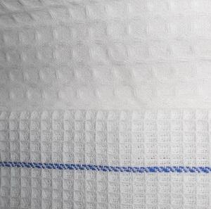
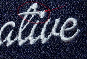
    The result was highly unsatisfactory – there were gaps between the neighboring outlines and there was also distortion. The fabric lost its shape while still in the hoop, which means that the stabilizer was ineffective: 

    This how the fabric looked after unhooping: 

    To get the whole thing right, I modified my design by increasing pull compensation both manually and automatically and also deliberately distorted the outlines in the direction I needed. Additionally, I put an underlay under the entire design, matching my fabric in color, that was meant to hold the design in place: After that, I placed my design on 2 layers of tear-away stabilizer and hit the start button. This is what I got: 


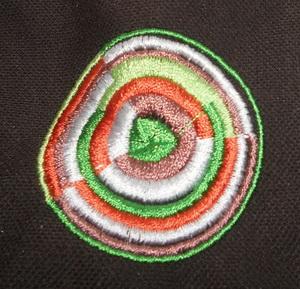
    The distortion was still there but it had been visibly reduced, which meant that I was going in the right direction. The only thing left was to get rid of such defects as the gaps between the stitches in the white area and in the green core. Having solved that problem, I stuck my piqué on a middle-weight cut-away adhesive stabilizer and embroidered my third piece. This one came out best: practically no puckering. 

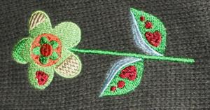
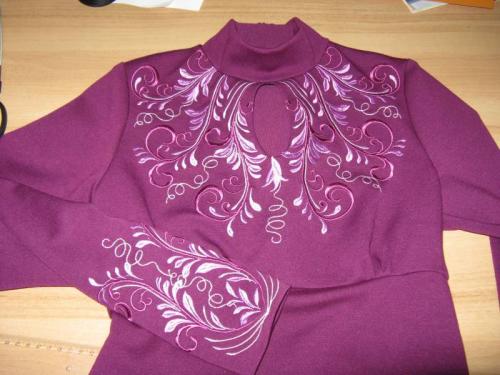
    The resulting embroidery was rather dense. It appears that one can embroider a dense design on piqué if one chooses a right kind of stabilizer and modifies the design after doing some tests. In digitizing, guesswork will get you nowhere; you need to see the embroidered design to get a high-quality result. After having conquered this design, digitizing a twig from my article on contrasting colors for embroidery on piqué was kid's stuff: 

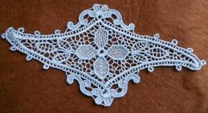
    It was an openwork design and the result was very soft and nice to the touch, which is a big advantage for a T-shirt. Even an openwork design didn't get puckered. 

    Objects to digitize in machine embroidery

    By Irina, in Machine embroidery materials and technology, , 0 comments, 3,039 views
    Original text by Marina Belova 
    It sometimes seems so strange to me when I hear questions the answers to which lie on the very surface. But then I realize that some newcomers might not be familiar it. 
    For instance, it always surprised me that every machine embroidery course teaches you to draw from scratch, explaining what exactly do you draw and how. Not everybody learns how to use graphics editing software before embarking upon creation of the machine embroidery designs. 
    So I won't discuss in a great detail precisely how and in what way the objects are created because it depends on the embroidery editor. Today I'll simply tell you what objects a user can draw. There only two types of such objects: 
    1. A line. A line can be open or closed. 

    The basic types of stitches that can be applied to the line: 
    Running stitch  Satin column  Cross stitch  E-stitch  Motif stitch (macros)  Manual stitch  An area. An area is usually a closed object of a varying shape. Why usually? Because some editors permit filling the areas within the open outlines. 

    The basic types of stitches that can be applied to the area: 
    Satin  Fill  Contour fill  Spiral fill  Radial fill  Applique  Cross fill  To know more about stitch types, click here. 
    What stitch type to choose for any object in particular, depends on its size, shape, outlines, its intended purposes, the desired decorative effect, and, of course, a digitizer's experience. All of this should be taken into account before digitizing has even started. 

    Mastering the waffle cloth

    By Irina, in Machine embroidery materials and technology, , 0 comments, 4,215 views
    Original text by Marina Belova 
    Several days ago I bought waffle weave towels and came up with the idea of attaching the embroidered eyelets to them (you can download the design here). Observing the textured surface I like so much, a question popped up in my head: are there any special rules for embroidery on this fabric? 
    It's not that I've never before embroidered on this cloth. I actually had more than once. It's that I've never thought what one could do to with it to get the embroidery of a high quality. It turned out that waffle cloth is not at all scary, on the contrary, it's rather stable. That is, if you don't count the cheap and loosely-woven waffle cloth that has a very low density and needs to be approached from a different angle as a consequence. Read more about loosely woven fabrics here. 

    The technique is actually simple and not really different from a standard procedure: 
    Hoop the fabric together with a backing (a middle-weight tear-away stabilizer will be just fine) and a water-soluble film on top. If you're trying to cut down expenses, I'm sure that you can do without the topping or simply put on top of the design a piece of a corresponding size. A tear-away stabilizer can be additionally secured with a temporary spray adhesive.  You can use threads of any thickness and structure.  Choose the needles with SES points, their thickness matching the thread thickness.  Digitizing a machine embroidery design for the waffle cloth 
    The process of creating a design or choosing a ready one for this fabric will be defined by its texture: 
    Avoid light-weighted designs executed in running stitches or containing a low-dense fill. (Though, in my opinion, this is a moot point.)  Do not embroider small letters directly on the fabric but on an underlay.  Standard density values are best: 0.4–0.45 mm will be sufficient to thoroughly cover the fabric. Density could be reduced due to the use of understitching.  Use stitches under 7 mm long, as usual. Anything longer than that should be split. For the fills, I'd recommend using stitches no longer than 4–4.5 mm. At any rate, the designs I'd embroidered looked better that way.  When working with a textured fabric, the most important thing is not to forget the underlay that will even the surface and maintain the edges.  Under thin satins – an edge run.  Under the satins from 2.5 to 7 mm – a zig-zag + an edge run.  Under the fills – a grid at 90° or a full grid at 45° and 135°, 3 mm stitch length + an edge run.  Compensation should be kept at a standard level of 0.4 mm.  It is beyond dispute that the fabrics differ in texture, density, and stability. For that reason, all of the above figures should only be regarded as a benchmark that may and should be modified for every particular design. 
    P.S. Some interesting information from Deborah Jones concerning waffle cloth. She strongly encourages to wash the towels prior to the embroidery. The reason for this is a very high level of shrinkage (about 10%). In her video, she proves that washing before the embroidery is necessary for the light-weight designs like redwork but not so crucial for the ordinary dense ones.

    The difference between the manual and running stitches

    By Irina, in Machine embroidery materials and technology, , 0 comments, 2,897 views
    Original text by Marina Belova 
    I've long been asking myself: why does every machine embroidery editor list a manual stitch among its types? When, where and how one should use it? In theory, this knowledge is the bedrock of machine embroidery design digitizing, but I, for some reason, am only familiar with the most general concepts. 
    Come to think of it, if this type of stitch is omnipresent and not one manufacturer has discarded it, then there must be a reason for keeping it.
    Then why are the clear instructions are so hard to find? 
    A manual stitch is at first sight very similar to a running stitch. Where it differs it that when you digitize it, every click of a mouse creates a reference point, which is also a puncture point. There will be no other puncture points except these ones. Therefore, a digitizer gets complete control over the number of stitches. At the same time, when you digitize a running stitch, the software generates additional puncture points between the reference points. The number of these puncture points will depend on the set stitch length value and several other parameters like chord gap length, stitch length variations, etc., and on the software itself. 
    In the picture below you can see a circle digitized in manual stitches: 

    No matter how I try, I cannot create a circle in 5 clicks. But I can create a perfect circle in 5 clicks using a running stitch with 3 mm stitch length and controlling the reference point type: 

     
    What purposes does the manual stitch serve in machine embroidery? 
    You can use it to handle tie-offs manually, at the beginning of an object as well at its end.  You can draw create a strengthening layer under the small letters.  Or even digitize the very same letters with it.  You can render the details that don't come out good in the automatic mode.  Judging by these scarce findings, a manual stitch is the domain of the professionals. In order to successfully apply it, you need to have a hawk's eye and a vast experience, for you have to have a clear understanding of where exactly do you need a puncture point and why. After all, the editor does very little to participate in digitizing: every stitch is drawn by hand and does not automatically comply when you change the design size or aspect ratio. 
    And for what purposes do you use this type of stitches? I myself do not use it at all. 

    Working with thick knitwear

    By Irina, in Machine embroidery materials and technology, , 0 comments, 2,668 views
    Original text by Marina Belova 
    I found an old sweater and decided to practice digitizing and embroidery on thick and textured knits. It's out of season now, of course, but you use your old garments to explore new techniques. 
    Basically, one look at this fabric makes clear what you'll have to face: 
    A textured, very uneven embroidery surface.  Puckering.  Difficulty in matching the outlines and objects to each other.  Sinking of the stitches and small elements.  The pliability of the fabric should not be damaged. This "bullet-proof vest" is the result of my first attempt: 

    To make up for the extra density, nothing was displaced. 
    When you've defined your goal, it becomes apparent exactly what you'll need to do during digitizing and embroidery. 
    Here's the embroidery technique: 
    Everyone I read recommends to hoop thick knits instead of gluing them. But the hooping process should be slightly different from the usual, and you need to be very careful so as not to screw the hoop too tight, otherwise the hoop marks will appear.  Knits should be hooped only slightly, the rings of the hoop should not fit tight, they should not be fixed.  Hoop the knitwear together with the stabilizer. As the custom goes, a heavy-weight tear-away stabilizer or a spunbond (non-show mesh) is suggested for knits. But you can use an organza of a matching color if the knitwear has many openings and there is a possibility that the stabilizer will show through. You can additionally sprinkle it with a temporary spray adhesive.  In order to prevent hoop burn, you should either wrap the hoop as I showed here or use cigarette paper/soft thin cloth between the fabric and the outer ring of the hoop.  Only after that, you can tighten the screw.  Put a water-soluble on top and, preferably, hoop it.  Embroider the design.  Loosen the hoop screw and take your item out.  Whether you need to stretch the knitwear, depends on the circumstances. If it will be stretched in wear, you need to stretch it in the hoop as well, and if not, leave it as it is.  The choice of a point type is defined by the thickness of the knitwear but in any case, a point should be rounded, ranging from the light ball point to the heavy ball point type. Use #70/10 – 75/11 needle (for #40 threads).  Soft threads (rayon, cotton) are preferable. Digitizing a design from scratch or modifying an existing one is very similar to digitizing for loop fabrics and is based on the following principles: 
    For thick knitwear, choose designs of the openwork variety that don't contain big objects, and on a more loosely knit one, heavier designs may come out good.  Sequence your embroidery from the center outwards.  The objects should not contain the elements that are too thin. Satins should not be wider than 7–8 mm and narrower than 1.8 mm. Simple, bold letters without hair-strokes are preferable.  When the stitches are over 8 mm it is necessary to compulsorily split them or apply short filling stitches to this object.  Consider increasing pull compensation up to 20–30% of the stitch length.  Better to manually digitize your underlays and not use the automatic option:  Put an edge run under the satins.  Put an edge run + double zig-zags under thick satin columns.  Put an edge run + a full grid at a different stitch angle from the one in the main layer under the fills.  Density should be set at 0.35–0.45 mm.  To prevent the stitches in the small letters from sinking into the fabric, you may put a low-dense fill under them (analogous to a full grid).  You should increase the amount of overlap between the segments to 2 or 3 rows at least in order to avoid gaps between the stitches. You also need to make certain that the fills are embroidered in one direction. Read more about it here.  In my opinion, one should not cut down on color changes, for it is better to finish one object before embarking on another instead of embroidering all the objects of the first color, then all the objects of the second color, and so on, like I did and got my dark green outlines displaced as a result: 

    But for the first time, the embroidery looks quite decent. 
    I came to a conclusion that you can do anything after a few test pieces, and all of the mistakes I made could be corrected without difficulty. 

    Adding volume to the embroidery Method #1

    By Irina, in Machine embroidery materials and technology, , 0 comments, 2,353 views
    Original text by Marina Belova 
    Today I'll tell about the way of adding volume to the embroidery with the help of several layers of understitching, which is considered one of the oldest in machine embroidery. 
    This method is good because it requires less skill and precision while digitizing a design and besides, you won't need any consumables apart from the threads. However, it demands a great deal of effort and, consequently, time. But it is worth it because you get a soft, clean and pleasant in wear embroidery as the result. On top of that, it doesn't involve any additional manipulations after the embroidery is completed. 
    To achieve that effect, one can simply digitize a design in any machine embroidery editor of any level. Only the satins are used: 
    First, you draw the main outline (the outer one). The outline's recommended width is no less than 6 mm. 
    Inside the outline, at a distance from it, at least 1 or 2 more are drawn. The offset is necessary for the fabric not to be perforated along the outline. You get the following picture: 
    Each layer is filled with 3 layers of stitches. 
    Under them, go 2 layers of underlay, the stitch direction in them perpendicular to each other – these are made of double zig-zags with large stitches. You can create them automatically (if the editor has such an option) or draw by hand. Having done that, you cover the whole thing with a finishing layer of satins at a standard density, the stitches in it being perpendicular to the outline, and along the perimeter, you add the edge run. You should get something like this in each layer: 
    All layers together will look something akin to this, if you discount the fact that they will be of the same color: 
    Now you're done with digitizing for the additional volume. 
    A design with so many layers has a high stitch count, and the production time increases sufficiently as the result. On the other hand, the embroidery process is easy: you hit the start button and the embroidery proceeds on its own. 
    There are some tips for successfully using this technique: 
    The stitch density in the inner layers depends on the desired height of the embroidery.  On thin fabrics, the number of layers is better to be kept to a minimum.  If you use #40 threads, you'll need 6–9 layers of stitches (a "nest" of 2 or 3 outlines with 3 layers in each).  In case of using metallic threads on the outside, you needn't necessarily use them in the lower layers as well. You can replace them with another kind of threads matching in color.  For the inner layers, thicker threads (#25, #30, etc.) can be used. This will give you an opportunity to save on stitch count.  Loosen the upper thread tension.  Lower the machine's speed a little.  You can see some examples of this technique in my articles on cording (one, two) and making a bag for presents. Another method, similar to this one but with some key differences, can be found here. 

    Stretch velvet

    By Irina, in Machine embroidery materials and technology, , 0 comments, 3,272 views
    Original text by Marina Belova 
    Long ago, maybe 5 years back in time, it was a sheer torture for me to embroider on stretch velvet. I vividly remember how I shed bloody tears every time when I was trying to hoop this wonder of a fabric. Especially in view of the fact that with this tricky fabric, stabilizers could not be used except for the water-soluble film topping. As a result, you could stretch it a great deal so as to make it tight in the hoop. And it is just about as stretchy as knitwear. In essence, it is knitwear – if you turn this velvet the wrong side up, you'll see the loops knit together: 

    And after the embroidery was completed, both the fabric and the embroidery puckered. What a mess.&
    Only now, after having started to experiment with stabilizer and different kinds of fabrics, it dawned upon me that such materials should be glued directly to the stabilizer. Even the thinnest tear-away one will give you a wonderful result. Also, you can't think of this fabric as velvet when digitizing for it. 
    In other words, it appears that:
    Stretch velvet should be glued to the stabilizer so as not to overstretch it in the hoop. There can be several ways of attaching it to the stabilizer: 
    Sticking it to the hooped Filmoplast. Don't forget that Filmoplast in and of itself is a very bad stabilizer, it is really an additional measure, and you'll need to place a layer of stabilizer under the thing. A tear-away, for instance.  Stick a piece of a fusible adhesive stabilizer to the velvet and hoop them together. But you should test it first to see whether it doesn't leave the hoop marks.  Hoop the denser tear-away stabilizer and glue the velvet to it with a temporary spray adhesive.  Additionally, you can fix it with a running stitch along the perimeter of the embroidery so as to prevent the velvet from detachment.  The embroidery threads vary greatly in composition and thickness.  You should use the most ordinary SES needles. Their thickness should correspond the thread thickness.  The digitizing recommendations will at the same time be similar to the ones for the knitwear and those for the ordinary velvet.;A cocktail of sorts:
    A design that has areas not filled with stitches is preferable. This will help to maintain the pliability of both the fabric and the embroidery.  Avoid small details, especially the ones embroidered with the running stitches – they will sink into the pile and you'll have to retrieve the film from under them.  Avoid big areas filled with lots of stitches – there is no stability in gluing the velvet to the paper, it will begin to detach, and the embroidery will be distorted as the consequence. This means that you'll need to substitute these fills for something less demanding like an applique or motifs comprised of satins instead of running stitches: The underlay should be of the most ordinary kind, in respect to the size of the elements and stitch lengths. Zig-zags are the most like candidate for the satins, and a grid or a full grid for the fills. The density of the finishing fills should be reduced to a minimum, with 0.45 mm as a starting point. Play with density and stitch length setting so that pile doesn't show through the stitches. Stitch length in the underlay should be increased to 3–5 mm. Pull compensation value should be increased compared to the standard one.  Such are the most basic concepts that will perhaps help someone to make a successful embroidery on the knitted velvet.

    A few words about free-standing embroidery

    By Irina, in Machine embroidery materials and technology, , 2 comments, 4,846 views
    Original text by Marina Belova 
    A jigsaw puzzle called "machine embroidery" is gradually building in my mind. Now I've reached the highly interesting free-standing embroidery piece. Free-standing embroidery is not always lace – that much has stuck in my head. 
    There are several kinds of free-standing embroidery: 
    Free-standing lace, beloved of all, embroidered on a water-soluble or a heat-away stabilizer.  Ready-made pieces embroidered on transparent fabrics.  Ready-made pieces embroidered on non-transparent fabrics.  I would also put into a separate category the so-called in-the-hoop pieces that are embroidered and sewn completely in the hoop and the ready item can be rather complex as a result. These are, to all intents and purposes, free-standing embroidery. 
    The key feature that distinguishes them from other embroidery projects no matter how they were made is that these are the end products. Not only two-dimensional laces, various pendants, and decorations but also manifold 3D items, such as baskets, vases, bells, flowers, trees, etc., fall into this category. To put it shortly, anything you can think of. 
    In our first case, the FSL embroidery should be sequenced in a particular way – all the elements in the design should have a shared underlay so it will not disintegrate after the stabilizer has been removed. What you can use as a backing: 
    For the big projects with a large number of stitches – a water-soluble stabilizer.  Dense water soluble film  Heat-away film  Heat-away fabric, like Gunold Thermogaze, for instance.  Here you can read about my attempts of creating FSL on three of those materials. In the photo below is an FSL lozenge that I digitized myself the other day. It took me a great deal of time and effort but in the end gave me an insight into how this kind of lace is created. But I see that I still have a lot to work on: 

    Everything here needs polishing, and besides, I should adjust the thread tension on my machine. The embroidery looks splendid before removing the stabilizer and after it – like in the photo above. 
    Synthetic fabrics that can be successfully singed (one layer of polyester organza, for instance) are commonly used for the free-standing embroidery on a semi-transparent base. A satin border should run along the perimeter that will hold the embroidery in place and prevent it from slipping but you may try and do without it. Just pay attention to the stitch direction near the edges of the embroidery – the stitches should be perpendicular or almost perpendicular to the edge. After the embroidery is completed, organza or other material is trimmed along the perimeter of the design and the leftovers are burned in a variety of ways. On organza, you can embroider designs completely filled with stitches and do openwork as well. There are plenty of examples, beginning with the simplest 3D flowers that are supposed to be used as brooches. 
    The free-standing designs of the third type are created on dense non-transparent fabrics. You can choose any one that you like but felt is by far the most popular. Such items are embroidered and then cut out of the fabric perimeter-wise. I'll name, perhaps the most popular free-standing embroidery of that kind – various chevrons (emblems). But there is also a wide range of decorations, such as flowers and butterflies that are sewn on or glued to something. 
    As for the in-the-hoop projects, I've expanded on the topic more than once. So many things can be created all in the embroidery hoop! There is no limit to the imagination: decorations, bags, all kinds of accessories, etc. Not only fabrics but also ribbons, zippers, and other things can be used. Free-standing designs are digitized in a special way and the whole creation process is often a big adventure. 
    That's pretty much all that can be covered in such a short article on a broad subject. 

    How to hide a tie-off at the end of the satin object?

    By Irina, in Machine embroidery materials and technology, , 0 comments, 2,262 views
    Original text by Marina Belova 
    A few days ago I needed to embroider an abstract logo for a close-up. Naturally, the embroidery had to be of a sufficient quality so that I wouldn't be too ashamed of how the stitches looked when highly magnified. 
    Here's what I noticed when scrutinizing the resulting look of my logo: the tie-offs visibly stood out in almost all of the satins. You may even say they detach themselves from the object and continue on their own life, distorting the object's edges and damaging the whole look. One simply can't fail to notice them, as the photo below illustrates: 


    This is just an automatic tie-off inserted after the last stitch. I can only imagine how a butterfly or a star would have looked! Here, look at them: 

    It's not that I didn't know that tie-offs tend to behave in that way. That I certainly knew. I also know ways of hiding them but each of those requires drawing every tie-off (a manual stitch between the satins) by hand. But as I am a rather lazy person and as I, to put it bluntly, don't have any time to deal with every tie-off separately, I thought that moving a tie-off 1 or 2 stitches inside the object and farther from its edge (and from the last stitch as well) would, perhaps, be enough. Something like that: 

    The tie-off stitches are marked red here: 
    Of course, I do a test piece hoping that it will come all right. 
    Alas – no such luck, my little trick doesn't save the situation, although it improves it a bit. 

    All of this because the tie-offs flatten the last stitch, so to speak, and stand out for that reason. The embroidery looks fine from a distant but doesn't stand up to scrutiny in a close-up. And besides, this "little" problem occurs every time I embroider letters, causing a lot of trouble. 
    These inoffensive squares result from inserting the tie-offs manually at the end of the satins just as John Deere had suggested. This is particularly true for the long satins. 


    Conclusion: if you don't get too lazy, dedicate more time to you project to do some manual work and don't rely on the automatic functions offered by modern embroidery software, the result will be more pleasant to the eye. What's more, a tie-off inserted in this way will not only look good on the edge of an object but also in the center. Though I need to say that I've only seen 2 digitizers who insert their tie-offs by hand and don't use the embroidery editor capabilities. 
    And what about you? In what way do you hide your tie-offs so that they don't spoil the outer look of the satins? Do you, perhaps, play with the settings, such as a tie-off stitch length and the number of runs? Or does your embroidery editor automatically insert the tie-offs in a neater way? 

    Embroidery on linen

    By Irina, in Machine embroidery materials and technology, , 2 comments, 6,419 views
    Original text by Marina Belova 
    Linen is a perfect natural fabric for embroidery and there is a huge variety of items made out of it due to its special qualities. I consider it one of the most convenient, stable and non-tricky fabrics for machine embroidery. But linen, too, can sometimes lead you to a trap no matter what you do and how you do it. Like any other material, this rather coarse, textured fabric that crumples easily has basic recommendations on how to work with it. 

    The embroidery process goes as follows: 
    Hoop linen together with a stabilizer. This should be of a tear-away middleweight variety. Additionally, you can use a temporary spray adhesive.  #70/10 (#40 for standard threads) needle with sharp point type.  Any kind of threads, from polyester to cotton, can be used. I myself prefer lusterless cotton threads wherever possible because they make the embroidery look more refined.  Linen is a textured fabric that can be very loosely spun, which leads to the necessity of using a water-soluble film topping.  This fabric is considered to be one of the easiest to digitize, though I've encountered some designs that would be difficult to be adapted for linen. Nevertheless, the main rules of creating a design are:  Density should be set at a standard value of 0.4 mm (for the ordinary threads) in almost all the satins and fills.  Pull compensation should be set at ~0.5 mm in the satins and ~0.3 mm in the fills.  Underlay: edge run + center run under the satins, full grid at 45° and 135° in relation to the stitch angle in the finishing layer.  The embroidery should go from the center outward, as usual.  Of course, these parameters will be changed to suit every particular design. For example, in this modern design with the photo (see above) I didn't use any underlay – neither under the satins nor under the fills. I set stitch density at 0.45 mm in the satins and 1.2 mm was the average density in the fills. A thin #60 polyester thread and #60 needle with a light ball point (SES) were used on a middleweight tear-away stabilizer with a temporary spray adhesive. No water soluble film was applied on top despite the satins being 1.1–1.5 mm thick on the average. The fabric was not distorted and the stitches didn't sink. Thick #30 cotton threads are generally good for the embroidery on linen: you make fewer stitches and the embroidery looks fine. But then again, the choice of threads and digitizing style depends on the design. 

  • Top Downloads

  • Recently Browsing   0 members

    • No registered users viewing this page.
×
×
  • Create New...